Posters for digital design

Graphic of a male sitting behind a computer screen with the words web design on the wall behind him.Web designers provide the framework for content. Then it’s up to others to provide the content. Pictures, videos, text, colour, readability are important for accessibility once the site is built. 

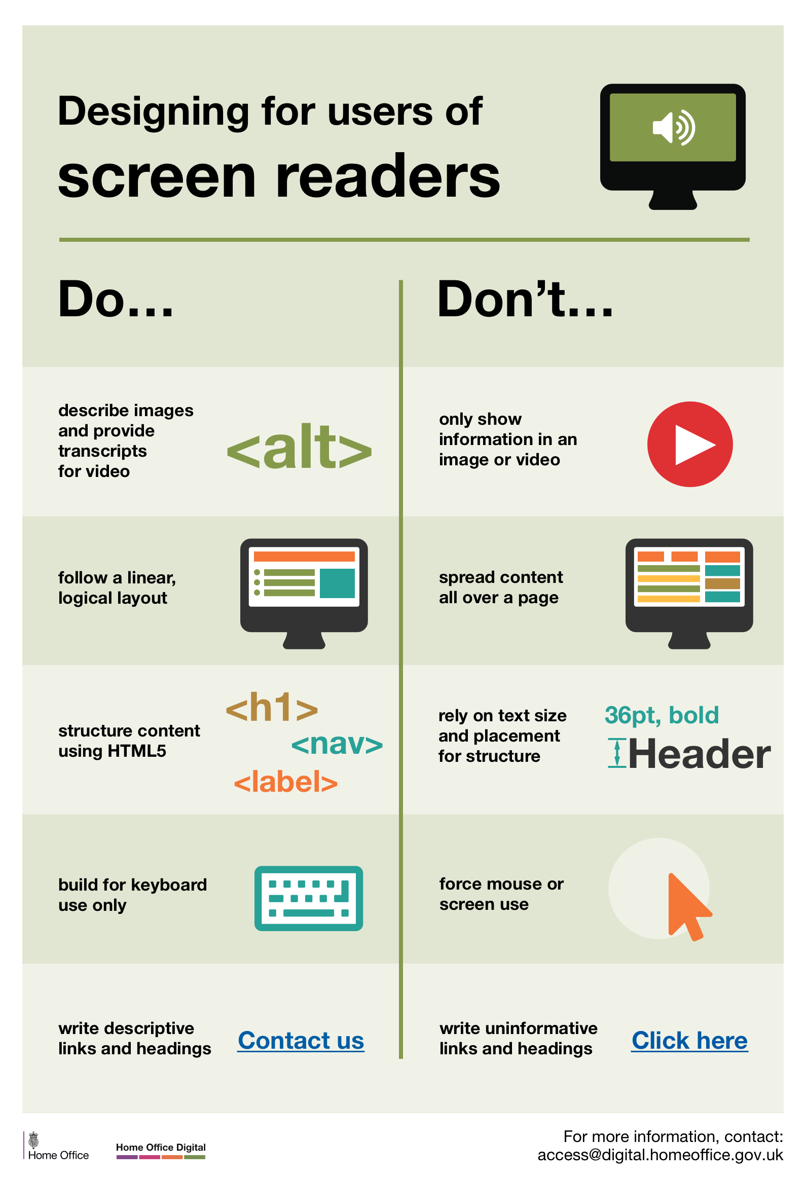
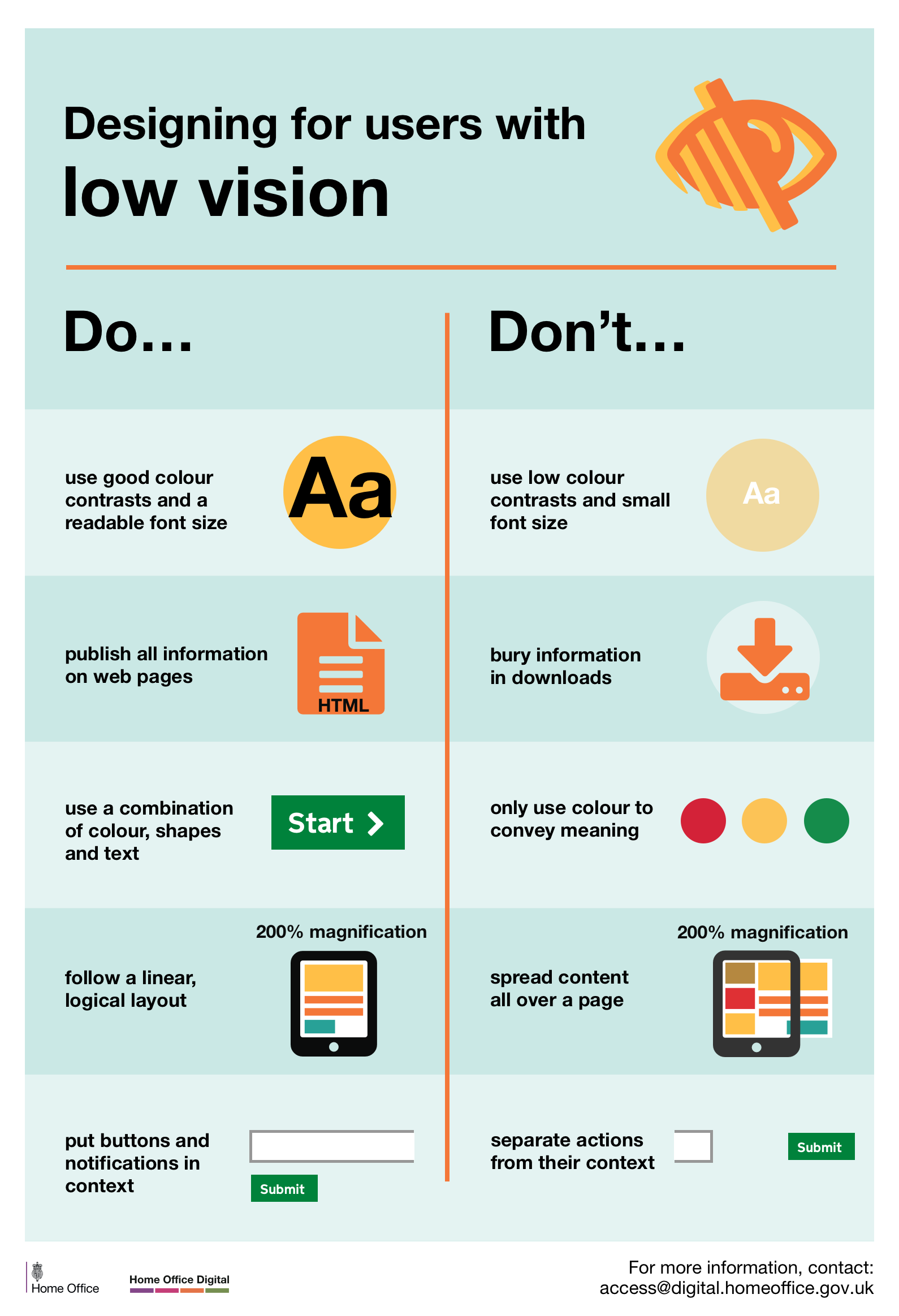
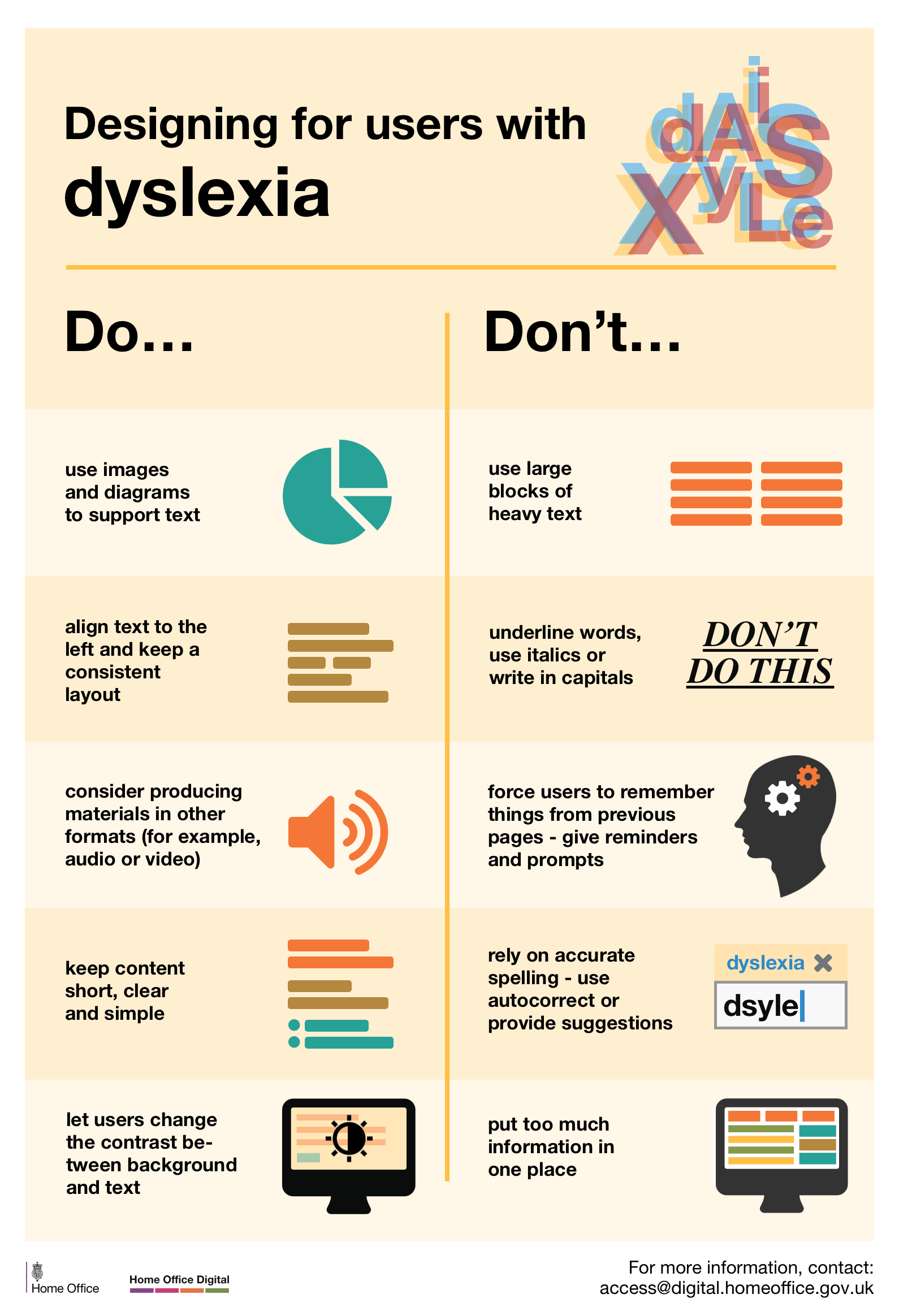
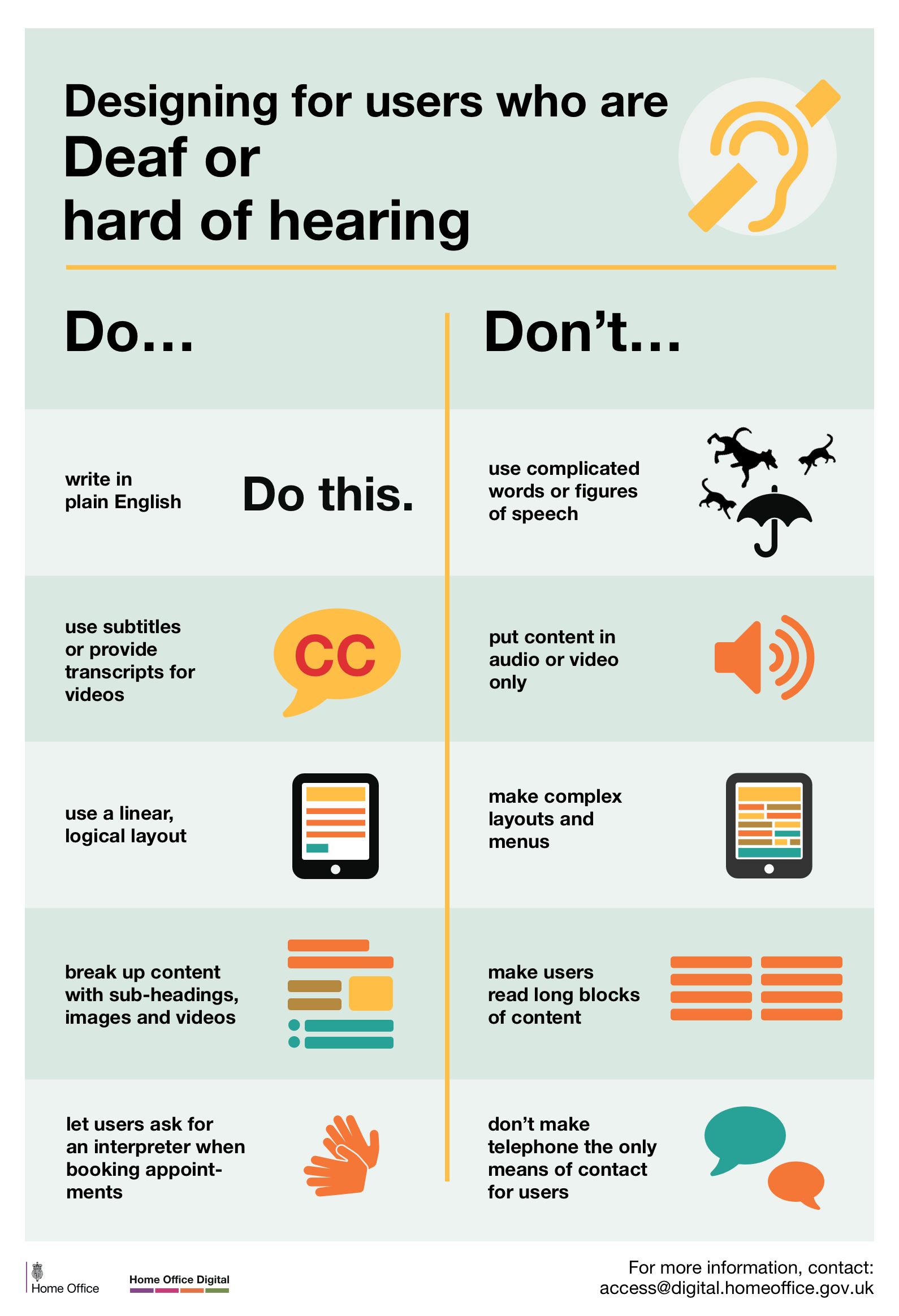
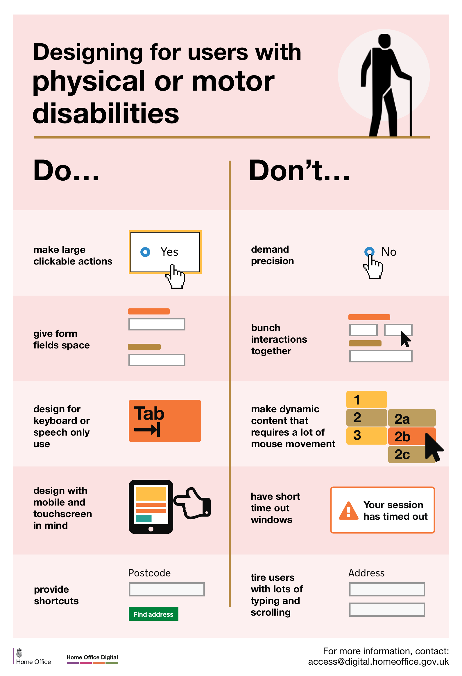
The UK Government has a series of six digital design posters for designers. The aim is to raise awareness of people with different digital access needs. To keep things simple, the posters are divided into Do and Don’t. The content of each poster is listed on the webpage titled, The Dos and Don’ts on designing for accessibility.  Also available in 17 languages.

One of the six Do's and Don'ts Posters, mobility, showing a short list of do's and don'ts of accessibility.
Do’s and Don’ts Poster

The posters help designers make online services accessible. They cover low vision, deaf and hard of hearing, dyslexia, motor disabilities, people with autism and users of screen readers.

The posters are simple and this is what makes them effective. Basically they act as visual prompts to designers rather than offering technical know-how. There are posters for people:

with autism

who use screen readers

with low vision

 with dyslexia 

who are Deaf or hard of hearing

with physical or motor disabilities.

Posters by Barclays Bank 

A screenshot of the inclusive digital design poster showing the principles of inclusive design
Digital design poster

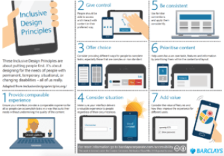
Barclays Bank has developed a set of inclusive digital design posters. They are based on seven design principles. These principles can be applied to other design fields as well as digital platforms. You can download the A3 poster which gives a quick overview. Or download a more detailed  set of A4 posters.

The posters are a good quick reference for web and app design professionals. The seven principles below are explained in more detail: More detail of the seven principles are explained:

      1. Provide comparable experience
      2. Consider situation
      3. Provide comparable experience
      4. Be consistent
      5. Give control
      6. Offer choice 
      7. Prioritise content
      8. Add value

 Artificial Intelligence and inclusion

The way businesses design and develop new technology will determine the inclusiveness of our digital society. Technology has the potential to bring people with disability into the workforce. 

The 24 page PDF report, Amplify You, covers understanding the digital divide, design for humans, AI is the new UI, and more. I the last section, What to Do Now, it has bullet points under headings of: Understand the implications of accessibility, Design accessibility into your business, Build an ecosystem of accessibility – and continuously think about what is next.  

Writing alt-text and choosing colours

A laptop computer on a desk showing several pictures. How to write meaningful alt text and choose colours.When you are in a rush it’s easy to leave out the description of the image in the alt-text box – but should you?. Alt-text is a description of an image that’s shown to people, who for some reason, can’t see the image. Among other things, alt-texts help:

    • people with little or no vision
    • people who turn off images to save data
    • search engines find your website and posts

People with little or no vision probably benefit most from alt-texts. They use a screen reader to navigate the web.  If you don’t include alt-text you run the risk of a screen reader trying to convey something like “publicity_pre_launch.jpg, or “cropped_img32_900px.png”. Find out more from Axess Lab on how to convey context and meaning without writing an essay! Once you get into the habit, it doesn’t take long to do.

Choosing colours for websites

Colour diagram showing the three different types of colour vision deficiencyColour vision deficiency or colour blindness affects around 10 per cent of the population. But each person varies in what colours they can see, which is why it is not “colour blindness”.  So what colours are best if you want all readers to enjoy colours on your website?

Colour choice is not just a matter of making it look good – it can affect the readability of text and graphics as well.

A small qualitative study looked at two websites to assess their readability and usability by people who have colour vision deficiency. The researcher analysed body text, background and links and found they affected usability of the websites. The results should be read in conjunction with the methodology otherwise it won’t make sense. The conclusion section does not provide the specific outcomes.

The title of the article is, The effects of color choice in web design on the usability for individuals with color-blindness.  This is a Masters theses.

Colour kindness for colour blindness

A group of people standing holding a pink banner with the words You are Not Alone, but you can't see the word NOT because it is in pale red and blends into the background colourIt’s one thing to talk about colour blindness, but it is quite another to see what it looks like to the 6-10 per cent of the population that have colour vision deficiency. Axess Lab has produced an excellent set of successes and failures using real life examples of colours used by web designers.

These examples provide really good guidance for anyone involved in web content and design, as well as printed material. The blog page has links to more information. There is a nice pic of what a football field looks like to someone who can’t see red and green – so it’s not all about the web – it’s all around us as the picture shows. If you want to see more on this topic see ColourBlindAwareness Twitter feed. 

The banner in the picture shown should read ‘You Are Not Alone’, instead it looks like, ‘You Are Alone’.


Understanding typefaces for accessibility

Example of typefaces images.
Image courtesy Medium

More people have difficulty reading than most people think. Low vision, dyslexia, low literacy, and learning disabilities are some of the reasons. Previous posts have covered the topic of plain language and Easy Read. But choosing the right typeface is also important for communicating successfully. Without understanding typefaces, things like colour contrast will make little difference. 

Gareth Ford Williams explains key elements in his article. He says claims of some typefaces being more accessible than others are not backed up by evidence. 

lower case 'i' and upper case 'L' and '1' look the same.
Gill Sans upper case ‘i’, lower case ‘L’ and ‘1’

Different typefaces provide different styles in how letters are formed. For example, Gill Sans upper case ‘i’ and lower case ”l’ and ‘1’ look the same. However, in Verdana they are distinct from each other. 

Mirroring is something than young children do. For example, muddling ‘b’ and ‘d’ and ‘p’ and ‘q’. However, the letter flipping effect can be lifelong. 

Spacing or ‘visual crowding’ is another consideration. Some typefaces have the same space between letters regardless of letter width. Helvetica is one example. Calibri has different spacing between letters. A wide letter like m has more space around it than an i or a t. In some cases the letters can look joined up such as ‘ol’ or ‘vv’. Tight letter spacing is not great for people with good vision either. 

The article has several good examples to illustrate points made. The title is, A Guide to Understanding What Makes a Typeface Accessible. Williams makes the point that there is no one right typeface. As always, it depends on your audience. However, this article provides great insights into yet another aspect of communicating accessibly. The article is technical in some places.

Thanks to Dawn Campbell on Linked In for alerting me to this article.

How web design decisions are made

Graphic indicating web design.When choosing a web developer to update your site, don’t assume they know all about accessibility. The guidelines for web accessibility are often treated like tacked on ramps to a building. That is, something you think of after you’ve done the design. To ensure accessibility of your site, it pays to know how web design decisions are made. And you don’t need to be a tech person.

A paper from the United States spells out the development process to show how accessibility gets missed. The authors report that one study found that more than 70% of websites contain multiple  barriers to accessibility. Another study found that almost all homepages didn’t meet the basic web standards for accessibility. 

The Web Content Accessibility Guidelines (WCAG) are a general guide for developers. But they are not the total answer because they are more about code compliance than accessibility. Hence, design briefs need to include usability testing early in the concept stage. 

The process often begins with brand, customers, and the message to be communicated. This stage rarely involves accessibility concerns. Designers make assumptions about users – usually people like themselves – for the next steps. Designs are reviewed by art directors and brand creators. Colours and font choices are considered at this stage but without reference to accessibility. 

If the design team lacks diversity this is where design justice becomes design privilege. Before any coding takes place, images, animations and graphics are created to show what the site will look like. Users are not involved in the testing at this stage. The key issue with web accessibility tools is that they look at code, not these mock-ups. 

Priority is brand message

The prototype stage would be a good point in the design process to begin user testing. It is as this stage colour, font, layout and other critical access features can be addressed. However, communicating brand message takes priority. Responding to the needs of less privileged and less able users is left for coding checks rather than usability checks.

The authors conclude that considering accessibility early in the process can bring greater usability for all. However, industry development processes often result in accessibility being an afterthought. Standards are not enough to meet the needs of all users. Consequently, industry’s internal processes need to change. 

The title of the paper is, Addressing Accessibilty as Advocacy. The authors use the term “special needs”. The article is easy to read and not tech-based. It is more about advocating for social justice in the digital world.

Choosing an IT designer

computer screenThe Centre for Excellence in Universal Design in Ireland has a comprehensive IT Procurement Toolkit. It takes potential purchasers of IT systems through the process of procurement, including assessing potential suppliers, and overseeing the successful implementation of accessibility features. It also shows how to manage the accessibility of the system once the set-up phase is complete. This means ensuring that documents staff produce for the website also meet the accessibility criteria. Each section of the Toolkit is provided separately. It includes: 

    • Writing Request for Tender
    • Assessing Candidates and Tenders
    • Development and Implementation
    • Evaluating Deliverables
    • Maintaining Accessibility.

Cognitive disability digital accessibility guide

Front cover of the cognitive disability digital accessibility guide.The ability to access online content provides access to goods and services, and in COVID times, each other. But content on websites and smart phones is not user-friendly for everyone, particularly people with cognitive disability. However, digital communication is here to stay and it needs to be inclusive. The Cognitive Disability Digital Accessibility Guide explains the important aspects for organisations that publish documents online. 

The Guide is designed to provide practical, step-by-step information for designing and delivering effective best-practice digital communication. Some of the guidance is easy to do, for example, defining abbreviations and acronyms. The Guide provides useful information on:

    • How to support people with cognitive disabilities to use computers and mobile devices.
    • Developing documents structured and written in ways that support people with cognitive disabilities.
    • Guidance on policies and standards for people with cognitive disabilities in an organisational context.
    • Preparing communication messages for people with a cognitive disability.
    • Creating websites that support people with a cognitive disability.

The Guide also covers traditionally-implemented accessibility guidelines of WCAG 2.0 Level AA as well as looking at the increasing relevance of Level AAA requirements. It also delves into the role of affordable consumer devices such as tablets and helpful apps.

Of course, if the design is suitable for people with cognitive disability, there is a very good chance it is going suitable for everyone. This has been shown with the use of plain language summaries

Centre for Inclusive Design (formerly Media Access Australia) produced this guide. Although it was published in 2016, most of the information is still relevant. 

People with cognitive disabilities or impairments include: acquired brain injury, autism, dementia, developmental disability, Down syndrome, intellectual disability, dyslexia, attention deficit disorder, and learning difficulties in general.

Zoom for people with vision loss

The Zoom logo in blue against a white background. Zoom for people with vision loss.The inventors of Zoom could not have predicted the level of use during COVID lockdowns. It is one of the easiest to use and one reason it is popular with business and families. It also has provision for live captioning for people who have difficulty hearing. However, the purpose of video platforms is to see who you are talking to. But what if they are a fuzzy block of faces? Here are some tips on Zoom for people with vision loss. 

Sheri Byrne-Haber’s has some tips to make Zoom meetings more equitable for people with vision loss. 

      • If you send out presentation materials in advance, people using screen readers can download and magnify them. That way, they don’t have to ask the presenter “can you make that bigger?”
      • If you embed text in images they just pixelate when they are magnified. That is, all you can see are pixels – dots.
      • Use good contrast. Low contrast is still difficult to read with a screen reader. Larger does not make it clearer. Neon colours are difficult for some autistic people. Best is off white with charcoal or navy blue. Stark black and white is not best. 
      • No fancy fonts and make them a decent size. No Italics. Bold or colour change is better for emphasis.

Byrne-Haber has more detail in her blog post and it is worth a read. As she says: Don’t be the barrier. Be the solution. 

Universal design is a thinking process. Once you start incorporating these ideas into presentations it starts to become second nature. 

Maps and map accessibility: where to start?

A woman holds a tablet with a map on the screen, She is standing in the street. Access mapsWhen a government department or access committee starts talking about access maps and map accessibility, where do you start? Of course there are consultants to help with this, but it’s good to have some idea of what to put in the brief. It’s also a good idea to know if the right thing has been delivered. A toolkit or guide for maps would be great but there’s a little to be found in lay language.

Technology moves fast. So toolkits and guides for digital maps soon become out of date. Another problem is they can’t stop software updates from stripping accessible features. And then there is is the issue of inadvertently uploading or linking inaccessible content on websites. But not all is lost. 

Access maps and map accessibility are distinct areas of endeavour.  However, we would want a digital access map to also be accessible. City of Sydney has an example of an interactive digital access map.

Access map with many different icons.
City of Sydney access map with all icons


Access map with icon filters applied.
Sydney access map with filters applied

Making access maps accessible

Screenshot of Seattle Access Map.
Screenshot of Seattle Access Map

Many people use Google Maps and similar apps to help them navigate the built environment. They focus on road networks and points of interest but lack information for pedestrians. Google has an option to list individual “accessible places” such as a park. But this is of little use to someone with vision impairment. So how to make access maps accessible?

There are two key accessibility issues. One is collecting and integrating access information into maps. The other is designing digital maps so they are accessible to users with diverse physical, sensory and cognitive abilities. There is a third issue. Some local governments have an access or mobility map, but these are often buried on a website somewhere. Many people don’t know they exist. 

A conference paper has more detail about the challenges faced in designing and creating digital accessible access maps. The title is Grand Challenges in Accessible Maps published on the ACM website.

Resource list

Here is a list of links that cover basic and technical issues of map accessibility including non-digital maps. Thanks to Jo Szczepanska for sharing the list. 

An article by The Paciello Group explains the issues clearly and has other useful links for non technical people. 

A plan for accessible maps is an easy to read webpage that sets out the basics. A good starting point.

The W3C website has a section on different types of accessible maps including tactile maps. Static maps and interactive maps are covered in Map Accessibility.

Accessible Maps on the Web is a magazine article from the US. It’s a bit more technical but illustrates some of the issues. 

A research paper specifically for visually impaired users has recommendations and example solutions. This one is technical.  A more digestible article is Design Accessible Maps – UX guide. 

A UK Government blog page discusses accessible flood maps. There’s also Mapping Standards for interactive maps. Maps for emergency situations also need to be accessible. 

Another resource for digital applications is Gregg Vanderheiden’s Accessibility Masterlist. It covers everything you can think of. Each feature is coded for either blindness and low vision, language and learning disabilities, physical disabilities, and Deaf and hard of hearing. Some links take you to products, others to related research papers. Prepare to spend some time going over the lists and links. 

Inclusive design: more than a checklist

A desk with a large sheet of paper and pink post it notes. A person stands with their hand resting on the table. Inclusive design is more than a checklist.Design is powerful. It connects us to the world around us and shapes our lives. Inclusive design shapes products and services in ways that are useable by everyone. It requires a shared understanding of population diversity. Whether it’s a building a webpage, a policy framework or a town park, it ensures we “leave no-one behind“. Inclusive design is more than a checklist.

A blog page from Automattic says, “Truly inclusive designs are never really finished, and becoming fluent in inclusive design takes more than a checklist. We all need a map when we start exploring any new world”. This is the introduction to a “guidance map” aimed at leading individuals and teams through the processes of creating inclusive thinking and practice.

Although focused on technology, some of the principles and processes can be applied in other design situations. For example, “Learn about your audiences; their motivations, needs, behaviors, challenges, pain points and goals”. The key headings in this article on Design.blog are: 

      • Broadening perspectives and building empathy; 
      • Bringing diversity into teams and processes; and 
      • Building inclusion into designs.  

The article explains each of the three steps in more detail. Some concepts such as colour contrast are well-known to designers. Less considered factors are providing cost-accessible options of designs, and designing for low bandwidth. Designs should be adaptable for longer life and empower clients to continue without more designer input. These ideas really show that client needs are at the centre of the design. Designing out “pain points” is essential for all users. 

Design is a powerful tool and inclusive design has the “potential to unite heterogeneous cultures in shared understanding. To make products and experiences globally accessible.” Good design is inclusive design. 


Why icons should have labels

A brightly coloured abstract painting consisting of painbrush lines going in all directions. That's why icons should have labels.
Icons are like abstract paintings – they need labels

Digital designers are great at creating icon puzzles for users. They make a good guessing game until you learn what they represent. We see icons everywhere – on microwaves, washing machines, and of course, apps. Like abstract paintings, icons have different meanings for different people. We might like ambiguity in art, but not on our smart phones. That’s why icons need labels. 

Icons are used as a way to save space, or where space for instruction is limited. But designers make a lot of assumptions about previous experience with instructions. Hampus Sethfors explains that saving space at the expense of usability is not the way to go.

In his Axesslab article, Sethfors uses the example of trying to download a TED Talk on a smart phone for viewing later. He explains why icons are ruining interfaces and that icons need labels otherwise users give up and become unsatisfied with the app. Sethfors also uses Instagram, Gmail, and Apple apps as examples of what not to do. He goes on to look at icons on a washing machine dial, and then to icons that really work. You can really see the difference in the examples shown below.

Example of icons without labels.
Icons without titles
Example of Icons with titles
Icons with labels


A related article from Axesslab is how to improve web page content. It shows practical examples of how to improve accessibility and how to avoid simple pitfalls. 

The Australian Network on Disability has a blog page on writing accessible social media posts.  

There is more ICT information on this website. 


Reducing cognitive load

graphic of a side-on view of a head with a mosaic of brightly coloured triangles filling the space. Minimise brain drain to reduce cognitive load.Reducing cognitive load means reducing the mental effort required to do something. Making designs easy to use and understand is part of the solution. Whether it’s digital information or walking the street, we can all do with some help by reducing cognitive load so we can process the important messages. 

Jon Yablonski developed seven design principles for reducing cognitive load in relation to user interfaces in the digital world. But these are useful tips for other fields of design. The seven principles make a lot of sense and are explained simply. The principles are:

      1. Avoid unnecessary elements: less is more
      2. Leverage common design patterns: keep things familiar
      3. Eliminate unnecessary tasks: make it easy to stay focused
      4. Minimize choices for easy decision making
      5. Display choices as a group: to help with decisions
      6. Strive for readability: make it legible
      7. Use iconography with caution: they aren’t always intuitive

Yablonski’s website explains further the concept of cognitive load.  Every time you visit a website or a new environment your brain has learn something new. You have to do two things at once – focus on learning how to get around and at the same time, remember why you are there. The mental effort required is called cognitive load. If you get more information than you can handle, the brain slows down. We can’t avoid cognitive load, but designers can help minimise it. 

Academic Coaching for Post Secondary Students

Three female students graduating from post secondary education..Would academic coaching help post secondary students with disabilities achieve their education goals? That was the question for a pilot study. Not surprisingly, the coaching helped. Improved self esteem and confidence helped the students achieve  degrees in STEM subjects. The key component of academic coaching for students was helping students with their executive functioning. 
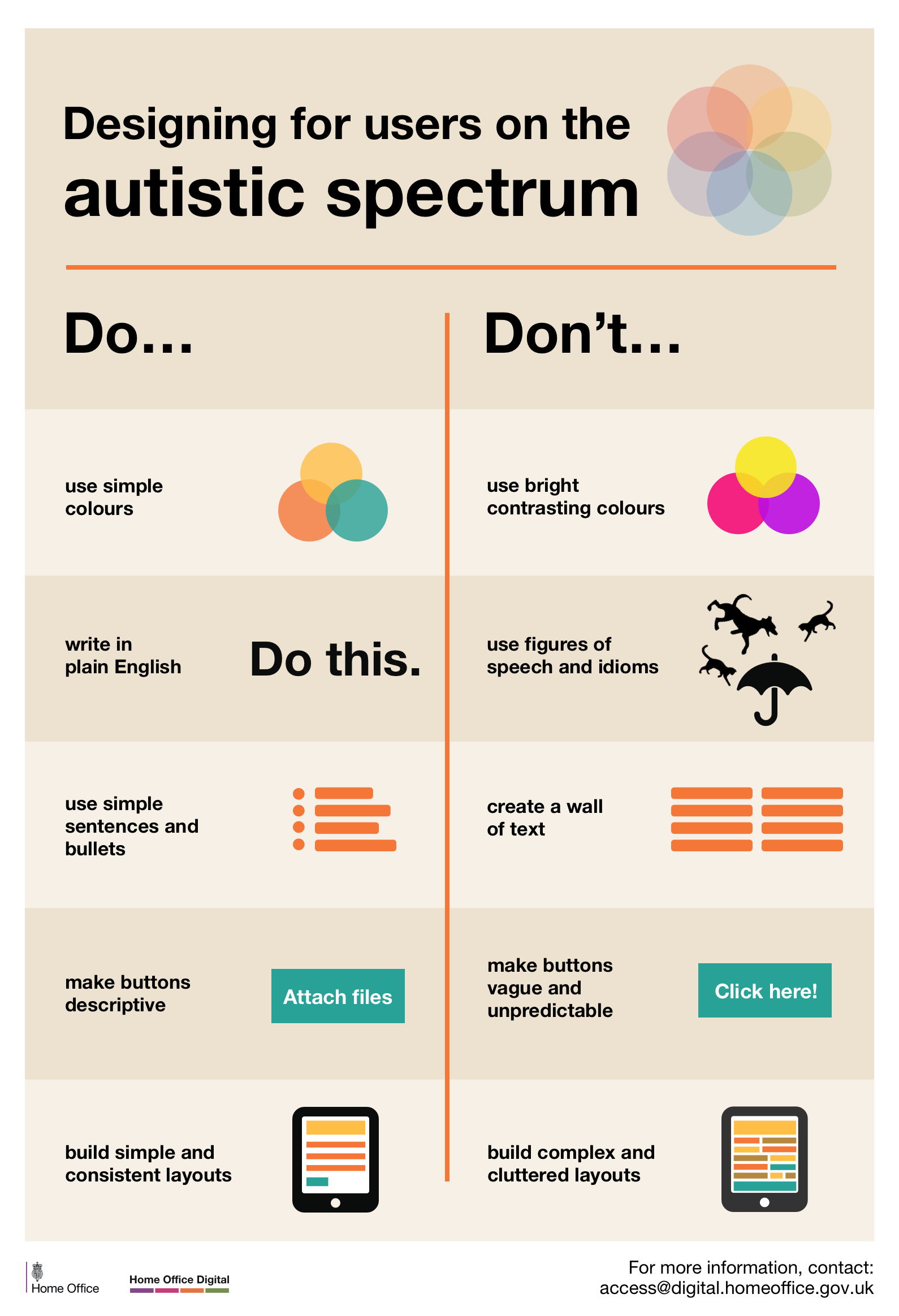
The title of the article is, Academic Coaching: Outcomes from a Pilot Group of Postsecondary STEM Students with Disabilities.

Abstract: Faced with poor retention and graduation rates for students with disabilities, postsecondary institutions have experimented with interventions to help students succeed in college. This practice brief describes a pilot initiative in which 41 students with disabilities pursuing science, technology, engineering, and mathematics (STEM) degrees at three postsecondary institutions engaged in weekly academic coaching sessions primarily aimed at improving students’ executive functioning.

Data collected through an online survey of participants at the end of the initiative suggests that the academic coaching services increased their self-confidence, motivation, and determination to succeed. Participants reported that they gained skills in time management, studying, note taking, organization, prioritization, writing, self-advocacy, and stress management as a result of the academic coaching. Although literature regarding academic coaching and students with disabilities has often focused on students with LD or ADHD, results of the pilot initiative suggest that students with a variety of disabilities can benefit from coaching relationships.

Download PDF of the article.

Accessibility Toolbar