CITY ACCESS MAP is a web application that shows how cities across the world are doing in terms of accessibility. It’s open source and covers any urban area with more than 100,000 residents. It computes walking accessibility down to the block level. It’s a tool for almost anyone who has an interest in cities that have access to services within a 15 minute walk.
A close up view of a city on the CITY ACCESS MAP
The CITYACCESSMAP is interactive and shows the differences in cities across the globe. For example, it shows that Bogota, Colombia is one of the most accessible cities. Orlando USA on the other hand is one of the least accessible. France is generally accessible with many cities reaching high levels of accessibility.
Australia is represented by Brisbane, Sydney, Melbourne and Adelaide. Searching by city brings a close up view of the suburbs. In Sydney, it shows good accessibility in and around the CBD. However, as expected as you move to outer suburbs accessibility reduces considerably.
It should be noted that the term “accessibility” mainly refers to access to services rather than an accessible built environment. The tool is worth investigating as a planner and administrator in any field. If nothing else, it is interesting to see how countries compare.
For IT people wanting to know the detail of the map design there is more information in a separate section. You can download processed data for any city in the application.
The scientific research is also available and you can contribute to the project by contacting Leonardo Nicoletti.
A universal design approach to a project often means doing the best you can with the knowledge, skills and resources to hand. Each time you have a design project, make it more accessible and inclusive than the last. Universal design is not about perfection, or perfection for absolutely everyone. It is an ongoing iterative process.
The notion of perfection reinforces the perspective that accessibility is hard.
A blog post from CanAxess discusses the issue of perfection in digital and web design. Using the example of two people, a celebrity chef, and a special forces soldier, the article discusses “the perfection millstone around the neck”.
If digital designers have a mindset of expecting absolute perfection they will reinforce the idea that accessibility is hard. For example, headings might be incorrectly rendered on a page. For designers this is unforgivable and a “slight on those users who need that support the most”. The risk is that designers will give up and stop trying to improve digital accessibility. And then there is the anxiety, procrastination and fear of falling short.
Having high standards is a good thing, but it needs to be balanced otherwise it makes it hard to get started on a project. So, at these times, “good enough is good enough”. The advice from the blog post is to do better than yesterday and do it well.
It would be good if all designers took their lead from the likes of Apple and Google: inclusion, accessibility and usability are about the design process. Apart from clearly explaining how these terms are linked and can be used together, Google spells out accessible, inclusive and usable in ahalf hour video
Microsoft infographic: Permanent, temporary, situational disability
The video also has some tips and tools for designers and shows how three different users have the same need: a man with a mobility disability (permanent), a boy with a broken arm (temporary) and a woman with an armful of shopping (situational). Microsoft designed an infographic to illustrate the point.
Individual situations might be different but they all have the same need for accessibility. And people have the same goals they want to achieve regardless of their situation.
This instructional presentation is aimed at an audience interested in designing apps, particularly the second half of the video. However, the messages in the first half can be applied to other design disciplines.
Some people think that people who are blind can’t use websites or smartphones because they can’t see the screen. This is not true of course because they use screen reader software to read out the content of the webpage. However, even on reasonably accessible websites, cookie banners can prevent access to the very first page.
Many websites have accessible features, but they are not necessarily linked up. The popup cookie banner can prevent some users from accessing the website entirely.
Clive Loseby’s Tedx talk explains that despite legislation for online accessibility, very few websites meet basic access standards. You can check your easily by doing what people with low vision and people with screen readers do. They use the keyboard and not the mouse. Go to your home page and use the Tab key. Does it progress through the menu or navigation tabs?
It is a legal requirement in most countries to have accessible websites – the guidelines and standards have been around for more than 20 years. What is taking so long? Clive Loseby explains basics and how every organisation or business is missing out on customers.
Some websites use popup banners to advertise something and others use scrolling images as well. These have a similar effect to the cookie banners.
A reminder about attitude
Some of the responses to the talk in the comments section are not positive and in some cases almost abusive. While all YouTube videos get their share of negatives, it is still a reminder that ableism is alive and well.
If you want to create something really useful for intended users, asking them to participate in the design process is a good way to go. And that means the design of anything – guides and toolkits included. From Ireland comes a toolkit for co-designing for the digital world where participants are people with intellectual disability.
A series of iterative workshops involving people with intellectual disability formed the foundation of an accessible design toolkit.
Co-design is important in the area of digital design and computer interaction. However, projects that claim to be user-centred often become technology led rather than user driven. A university in Ireland teamed up with a community service that supports people with intellectual disability. With the guidance of researchers, computer science students and community service users engaged in a co-creation process from which a toolkit was developed.
The collaboration highlighted the need for accessible design resources and training materials for both students and users. While there are many resources on co-design processes, and design thinking, few address people with intellectual disability. Those that do exist are not accessible or suitable for people with intellectual disability.
The toolkit is about co-designing with people with intellectual disability. Two overarching principles emerged. Use simple English with short sentences and simpler grammatical structures. Provide visual aids – icons and images – to overcome literacy limitations.
The paper explains the co-creation process in detail. The authors call the users co-designers, which is confusing because co-design usually means all participants including designers.
Understanding the complex process of consent to participate had to be resolved for the users. Another difficulty was encouraging participants speak up about design flaws or issues.
Existing toolkits and resources to support co-design are not always accessible to designers and co-designers with disabilities. We present a study of a co-design process, where computer science students worked with service users with intellectual disabilities. The aim was to create digital applications together.
A series of co-design focus group sessions were conducted with service users previously involved in a co-design collaboration. The information from these sessions was used to devise an accessible design toolkit. This toolkit is intended to generate a sustainable resource to be reused in the student programme at TU Dublin but also in the wider community of inclusive design.
Editor’s comment: Most guides and toolkits are based on well-researched evidence, but the value of the evidence is sometimes lost in technicalities or too many words. A co-design process will seek out the key information that guideline users want and need.
We are seeing more people with disability in films, tv and stories. Both the presence of people with disability and images depicting disability are being integrated into computing. But are the processes for developing inclusive imagery also inclusive?
If the only images available to illustrate accessibility are pictures of wheelchair users, then it becomes difficult to get people to understand and acknowledge the huge range of unique user needs.
A short article by Emory James Edwards addresses some of the issues related to diversity and inclusion in computing. Designers regularly use personas to help them communicate with developers. They each know what the other is talking about. But these ‘design assets’ as they are called, have not included images of people with disability, non-western users, or older adults.
Although people with disability are getting more recognition, the images are still prone to stereotypes. With luck, as we see more images of people with disability we could see increased understanding of the need for accessible technology.
If people who are blind are only depicted as wearing sunglasses or using a guide dog, but never depicted as using a white cane or walking with a sighted guide, it makes invisible the variety of skills and preferences of people who are blind or have low vision
More images of disability is not enough – they could even reinforce stereotypes. It gives people the illusion of knowing what life is like with a disability.
Tips for inclusive image generation
Edwards explains six key points:
Do not reinforce isolated, sad or pitiable stereotypes.
Avoid being overly “sweet” or creating “inspiration porn”.
Show the diversity of the the disability community. That includes gender and nationality.
Consult with people with specific identities.
Make a commitment to long-term engagement with people.
Make inclusion the default position without resorting to tokenism.
The title of the article is, Putting the Disability in DEI Through Inclusive Imagery. Diversity, Equity and Inclusion is about changing the paradigm in computing and other fields. Technology is an essential part of modern life. The reference list at the end is also useful.
A picture can paint the wrong words
For those who understand the issues with the picture shown, there is no need to explain. But there are others who see two good looking young people, one in a wheelchair being pushed by the other. They are wearing bright colours and looking happy as they make their way through an empty shopping mall. For the uninitiated there are three key issues with these companion pictures.
First, perpetuates the stereotype that wheelchair users must be helped by being pushed rather than mobilising independently. A person walking alongside would be better.
Second, it is clear that both of them can walk as they change places with each other to be pushed in the chair.
Third, the type of wheelchair is usually found in a hospital setting. It is not one that a person would normally own let alone use it to go shopping. Wheelchair-user models would come with their own wheelchair.
Wheelchair users are not the only way to convey diversity or disability. The majority of disabilities are invisible, e.g. low vision, hearing loss, heart disease. So pictures of groups of people from all walks of life are much better. Too many of these pictures show a lone wheelchair user in places devoid of other humans. This is not real life.
Colour blindness is an eye condition that changes the way people see colours. It doesn’t seem like a big thing to people who have normal colour vision. But when it comes to reading things like maps, it matters a lot. Graphs, maps, diagrams and other graphic information types often rely on colour to differentiate between elements and features.
With genetic colour blindness, men are about 16 times more likely to be affected than women. Injury or disease can also affect the ability to see certain colours.
Apart from genetic reasons, some health conditions increase the risk of developing colour blindness later in life. Macular degeneration, glaucoma, diabetes, dementia, and Parkinson’s disease can all affect colour vision. Because it happens later in life it often gets unnoticed and undiagnosed. Some medications might affect colour vision too. For more, see My Vision guides.
You are at greater risk of colour blindness if you are a white male and have family members with colour blindness.
Red-green colour vision deficiency occurs in 1 in 12 males with Northern European ancestry. For women it’s 1 in 200.
The Axess Lab website has some great tips for making graphics more inclusive. For example, putting text into pie charts, and labelling goods with colours not just showing them. Colour contrast matters too as you can see in the picture below.
A pie chart with labels
A serious colour contrast fail in real life
Colours that are accessible
Colour is an important part of designers’ creative work. When it comes to colour accessibility the creative path takes a few twists and turns. That’s because people who say they are ‘colour blind’ are not all the same. Most can see some colours, but not all of them. So how can designers choose colours that are accessible, especially in digital communications?
Adobe has a blog page that explains the importance of choosing colours. Four images show the three different versions of colour vision deficiency, which are:
Protanopia: Referred to as “red weakness,” this variation of red/green color blindness results in individuals being unable to perceive red light.
Deuteranopia: Also known as “green weakness,” this type of red/green color blindness renders people unable to perceive any green light.
Tritanopia: People who suffer from blue/yellow color blindness have difficulty distinguishing between blue and yellow colors. This form of color blindness is far less common than its red and green counterparts.
Graphic designers will appreciate the colour wheels and ways to avoid a conflict of colours. Examples of good colour choices show that designs can still be attractive as well as functional. You can try out the online Material Design accessible colour tool that provides information on colour contrasts for visual material.
Readability and colour choice
Colour choice is also a factor in readability. The video below shows how easily we can be deceived by our eyes. It shows how two different shades of grey are actually the same. That’s why you can’t rely on judging contrast by eye.
New research from Adobe shows we have to re-think optimum fonts and typefaces.
First, font is not the same thing as typeface. What’s the difference? Typeface is a group of letters and numbers in the same design, such as Times New Roman. Font is a specific style of typeface, such as Italic or Bold, and in a particular size, for example, 10 or 16.
By simply changing the font readers can gain incredible reading speed. But there is no one-size-fits-all “best” font.
While reading speed is not something usually considered as a universal design concept, it is a related aspect. Ease of use and comfort for all is one of the tenets. And if you want to extend the attention span of readers then speed and comfort will help.
The study looked at a group of 352 participants aged 18-71 years. Forty-six percent were female, 22 percent bilingual and all self reporting they are comfortable reading English.
The study measured 16 common typefaces and their effects on reading speeds, preferences and comprehension scores. Similarly to an optometrists eye test they toggled letters to ask participants their preferred font.
Different readers read fastest in different fonts without losing comprehension. That means personalisation is the key.
On average an individual read 35 percent faster with their fastest font than with their slowest font. Comprehension was retained across all fonts. But no font was a clear winner for all participants. This means that devices will need to allow reader to personalise their font choices.
The other finding was that the fonts people say they prefer aren’t often the ones with which they read fastest. While there is no best font, there was some typefaces that worked best for older participants. This could be due to familiarity, or visual properties.
In the context of Interlude Reading, we consider if manipulating font choice can improve adult readers’ reading outcomes. Our studies normalize font size by human perception and provide a foundation for understanding which fonts people prefer and which fonts make them more effective readers.
Participants’ reading speeds (measured in words-per-minute (WPM)) increased by 35% when comparing fastest and slowest fonts without affecting reading comprehension. High WPM variability across fonts suggests that one font does not fit all. We provide font recommendations related to higher reading speed and discuss the need for individuation, allowing digital devices to match their readers’ needs in the moment.
The art of typography for digital access
Every time you write something you have an opportunity to consider typography for digital access. This is the technique of choosing and arranging type to make written language understandable and readable. The problem is, some typefaces make it difficult to distinguish separate letters. For example, 5AM can look like SAM, clear looks like dear, and turn looks like tum. Fortunately, Vision Australia has some practical help.
Writing for an app, a website, an email, or a presentation requires thought about the most readable typeface or font. And we have to consider things like payment terminals, keypads and logos. Several people might be involved in making and designing typography. For example, human resource teams and brand and marketing teams.
Vision Australia has a one hour digital access webinar divided into handy chapters so you don’t have to consume it all at once. The chapters are:
Introduction to typography
An inclusive lens on typography
What to look for
8 accessible typeface tips
Which font should I use?
Typographic layout and styling
Design with people with disability
8 Typeface Tips
Choose fonts that have more space for lower case letters so that the main body of a lowercase letter has more room.
Choose typefaces that are more open – for example a bigger gap between the end curves of a ‘c’.
Fonts with larger white spaces between letters are really helpful.
Typefaces with joined letters to look like script are confusing and difficult for screen readers.
Some typefaces have letters and numbers that look the same such as upper case “i” and the number “1” and lower case “l”.
Look at the horizontal spaces between all letters in a word of body of text. They can be too close or too spaced.
Limit using ALL CAPS text. This is due to the shape of the letters and the way we recognise text. Sentence case gives the word it’s shape.
Avoid images of text because when you zoom in they get pixilated and fuzzy. Photos of text can’t be read by screen readers either.
One amusing point about screen readers trying to decipher the acronym FAQ’s: if the apostrophe is left out it reads “farq yous”. However, it emphasises the point of testing with screen readers.
Vision Australia’s advice is there is no one right font. You have to consider context, tone, audience and the content. And of course, the advice in the following chapterin the webinar.
An excellent webinar – one of a series that includes mobile app accessibility, online access policies, and more.
As we improve accessibility in the built environment, it is important to make sure we create and maintain accessible digital designs. A report from the EU, Plug and Pray? outlines the opportunities for emerging tech and people with disability. The report highlights the need to be inclusive and provides practical recommendations.
People with disability are often early adopters of new tech, but these new ideas can also come with unintended barriers for users.
The title of the report is, Plug and Pray? A disability perspective on artificial intelligence, automated decision-making and emerging technologies.
New opportunities
New technologies are emerging every day and hold a promise of greater inclusion for people with disability. For example, devices and operating systems that automatically adjust to the behaviour needs of the user. This is most useful for people with sensory and cognitive conditions.
Many technologies are in early stage of development, so the promise of greater independence needs a note of caution. However, the speed of digitalisation and AI poses risks of creating barriers to use. Another issue is the potential for infringing human rights and widening the equality gap.
Some people have more than one functional disability. For example, speech recognition software not understanding commands by a person with Down syndrome. So design issues are multi-faceted.
Regulating AI
The European Disability Forum hasa position paperon this topic. The Forum welcomes the EU’s proposal for regulating AI in the EU. Briefly, the important points to consider are:
Accessibility of AI-based technologies and practices;
Protect persons with disabilities from potential AI-induced harm;
Strong governance mechanisms, human rights impact assessment, and accessible feedback, complaints and redress mechanisms;
The same legal standards for European AI used outside of the EU;
Involvement of persons with disabilities and accessibility experts in the development of European and national AI policies, as well as promote their inclusion in AI projects and technical development teams.
It is good to see human-centred values and human, social and environmental wellbeing now included. A closer look shows that older people, people with disability, people from diverse backgrounds and children are included in these principles by virtue of including human rights. The Fairness Principle includes mentions of Inclusion and Accessibility. You can find out more detail in a list of insights from the consultations.
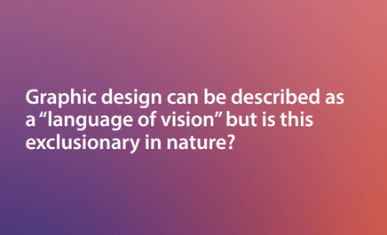
Graphic design is an essential element of communication.
Pictures, photos, infographics, icons – they all convey messages. It is often said that images say more than words. A bar graph gives a visual representation of statistics making it easier to understand. A photo of a landscape in a tourist brochure piques interest in a place. Readily recognised icons send instant messages, such as this is a train station or this is a toilet.
The way text is presented also sends messages. For example, a tiny faint font sends the message to people with low vision that they are not included. A busy page with tightly compressed text is readable but uncomfortable.
When graphic designers consider accessibility and inclusivity in their work, the result is a better experience for all…
Woolley’s research explores how graphic designers learn about, interpret and implement accessibility standards into practice. She used participatory research methods, often referred to as co-design. The outcome is a framework and a set of recommendations for supporting the graphic design industry in Canada.
The thesis discusses many aspects of accessible and inclusive design, and it’s role in equitable access to public information. Woolley has three main pillars of discussion.
Understanding the importance of access – the moral angle
Understanding industry standards and guidelines – the responsibility angle
Understanding accessibility legislation – the legal angle
The framework and recommendations were designed through a collaborative process with participants and represent a collective need for industry support.
Findings
The findings identify opportunities on how the design industry can be supported in their accessible design journey, and in building capacity and motivation to go beyond the minimum requirements, to think critically about accessible design and pursue opportunities for innovation.


 It would be good if all designers took their lead from the likes of Apple and Google: inclusion, accessibility and usability are about the design process. Apart from clearly explaining how these terms are linked and can be used together, Google