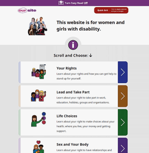
 You might have heard of Easy Read or Easy English for documents. They are great examples of how to reach a wide audience of people regardless of their level of literacy. Now there is a great example of an Easy Read Website from Women with Disabilities Australia.
People can have low literacy skills for several reasons such as a brain injury through a stroke or accident, or a cognitive condition. People with English as a second or other language, and people not used to navigating websites also find Easy Read helpful. So we are not talking about a few people.
This particular website is focused on girls and women with disability. However, the information is good for boys and men as well. Large clear font, graphics, short headlines and few words make this easy to navigate. At the top of the page is a link to turn Easy Read off. But this doesn’t mean lots of words in tiny font. Also very easy to read.
The tabs list key topics: Your Rights, Lead and Take Part, Life Choices, Sex and Your Body, Safety and Violence. The also have a section on the other accessible functions of the website. It includes other languages, screen readers and Auslan.
At last someone is living the message and has truly joined the dots between people with disability and website design.
