Research by Guide Dogs NSW/ACT reveals there are new footpath and urban design challenges faced by people with low vision or blindness. The research is part of a longitudinal study to understand what environmental and footpath clues are needed and used. Tactile indicators are only part of the story even when they are present and properly placed.
A total of 622 people with low vision or blindness from around Australia took part in the survey. Many challenges impact their confidence in getting out and about. New-style urban design features are creating additional challenges.
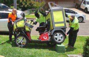
Image from Walking for Everyone Guide

The first survey was conducted in 2015. The 2023 survey revealed new challenges not mentioned in the earlier survey. Micro-mobility, shared paths, shared roads, and crowd protection barriers are now on the list of challenges.
Shared paths
The application of shared paths has increased significantly since 2015. Consequently, this emerged as a major issue in 2023. The speed and unpredictability of cyclists and micro-mobility users means these paths feel unsafe.
Flush finishes
Another new and popular urban design feature is flush finishes. Not surprisingly, 80% of respondents lacked confidence in crossing roads when the footpath and road were at the same level. Places where the road and footpath are level are often found in shared zones and flush finish intersections. Respondents over the age of 65 find these finishes particularly unsafe.
The absence of clear distinctions and continuous finishes hinder straight-line navigation. This is made worse by street furniture, goods displays and outdoor dining positioned along the building line.
Flush finishes at intersections with traffic lights where there are no gutters, kerbs or kerb ramps are a significant challenge. With multiple lanes of traffic in both directions, together with buses and light rail, create high levels of anxiety for safety. Consequently, they are often avoided.
Wayfinding
Key wayfinding factors for safe travel are based on maintaining a straight path, safe road crossings, and knowing where it safe and hazardous. This is regardless of whether the person is using a cane, a guide dog or their remaining sight.
Kerb ramps are vital markers. People who are blind or have low vision know to pause and assess the situation. They also reinforce appropriate guide dog behaviour when approaching roads.
Read more about this research in an article in Access Insight. It’s titled, Environmental clues: Using them and losing them. The article explains why newer street and urban design features are preventing people with low vision or blindness from equitable use of our public domain.
From a universal design perspective, many design features that are essential for some, are also good for others. Children are taught to stop at kerbs for safety, and older people prefer clear separation between footpaths and other zones. People with neurodiverse conditions, including dementia, also need clear signals to navigate the built environment.
Walking is supposed to be good for us, but not if street design causes anxiety and prevents people from making journeys.
Tactile markers vs wheelchairs: A solution?
One paper that sparked a lot of interest at the UDHEIT conference is the thorny issue of pedestrians and wheelchair users negotiating those yellow strips of tactile markers. Tactile markers, known as Braille Blocks in Japan, cause problems for wheelchair users, pram pushers, and others with mobility difficulties.
Based on research by Yoshito Dobashi in the context of public transportation, the solution seems simple. Create small breaks in the line of tactile blocks to make wheelchair and baby buggy crossing points. These crossing points are now installed in Fukuoka city and in some airports, but not yet on a national scale.

Dobashi cautions that, “…improvements need to be made in response to the voices of visually disabled persons who note that the crossing points pose a hazard to them. In his latest study, Dr. Ito of the University of Tokyo proposes a new braille block system that incorporates an improved version of braille blocks with wheelchair crossing points upon verifying its feasibility with wheelchair users and baby buggy users.
Good research paper by a man passionate for his topic and keen to find solutions. The image shows Dobashi presenting at the universal design conference in 2018 in Dublin.

The title of the paper is, Re-examining the Creativity of Universal Design Initiatives in Public Spaces in Japan. You can download the full paper by clicking the download pdf link.
The article is from the open access proceedings of the UDHEIT 2018 conference held in Dublin, Ireland, an open access publication.
Roadblocks to inclusive streets
Streets are essential to mobility and that means pedestrians, not just motor vehicles. Dangerous intersections, pedestrian crossings, steep kerb ramps and those utility vaults make wheeling a nightmare. Steve Wright says that universal design is what we should be aiming for. That’s because there are a hundred ways a street can deny mobility to a wheelchair user. And if they deny a wheelchair user, they can deny people unsteady on their feet and make pushing a stroller difficult. Wright lists his top 8 roadblocks to inclusive streets.
8 Roadblocks to inclusive streets
Narrow footpaths: If two wheelchairs or two strollers cannot pass each other than it is too narrow. Many footpaths don’t even accommodate two people walking side by side. Even where a footpath has sufficient width, there can be other obstructions.
Too many stakeholders: Several agencies have a stake in the footpath – hence the many access covers scattered throughout the paving. And then there is street furniture and rubbish bins.
Crappy kerb ramp: Problems often arise where a steep ramp into the gutter meets a steep rise onto the roadway. The deep V means wheeled mobility devices get stuck half way. Then there is the kerb ramp set on a corner that means people have to roll into oncoming traffic. And of course, there are kerb ramps which don’t line up to create a straight line across the roadway.
Traffic calming islands and safe havens: These must be at least wide enough to take a mobility scooter and an adult pushing a stroller. And not everyone can cross a wide street quickly. Mid-way points are a must if traffic takes priority.
Cross slopes and cambers: Narrow streets also mean that driveways and kerb ramps cut into the footpath creating cross-falls that are difficult for wheeled mobility users.
Footpath closures: Construction projects seem to be blissfully unaware of the havoc they create with their “no pedestrians” or “pedestrians this way” signs. And some of these are not just for a day – they can be for years.
Pedestrian crossing buttons out of reach: While the button might technically be at the right height, sometimes the pole it’s on isn’t within reach.
Transportation decision makers don’t have a disability: Transportation projects go to contractors and subcontractors with many other stakeholders involved. They would do well to embrace some co-design methods.
Wright discusses the issues in more detail from a US perspective. He says: “Universal design is what we should be aiming for, but there are 100 ways that even the most well-intended complete street can deny mobility to wheelchair users due to poor design, implementation, maintenance, and even policy.”


