The UK Government has updated their 2002 Inclusive Mobility guide. The update comes from seeking the views of people with disability, representative groups and practitioners. The principles underpinning the guide remain the same in this 2021 document.
The guidancecovers features compatible with creating an inclusive environment. Pedestrians include people using all types of mobility aids that are meant for use on footpaths. The guide is focused on people with disability, but many others benefit too. Parents with small children, people carrying or wheeling heavy shopping, people with a leg in plaster, and many older people.
“The research for the guide included the needs of people with mental health conditions, dementia, age-related and non-visible impairments.”
The overall aim of the guide is to enable practitioners to create a universally designed public realm, and through that, social inclusion. The document is useful for anyone designing and installing public realm improvements and new infrastructure.
To begin with…
The guide advises practitioners to consider all pedestrians from the outset of the design. This includes any transport or pedestrian infrastructure and planned maintenance. Any conflicts arising between the needs of different disability groups can be resolved by including them in the design process.
“Engagement should continue throughout a project, contribute to the design, and might include user tests and trials.”
People with non-visible impairments also find uneven surfaces, crossing the road, navigating slopes and ramps difficult. Hence they are less likely to make the journey. These users benefit from pedestrian environments that are simpler, with distinct features and provision of clear information. Being confident in knowing where you are going is an essential part of feeling welcome in the public domain.
Human Factors
The introduction to the guide covers basic human requirements for ease of movement. This includes generous allocations of circulation space for people using mobility devices, or pushing baby strollers. Taking a universal design approach will generally suit most people. However, some people need specific designs. A deafblind person needs to know when they have the green walk sign and assistive technology comes into play here.
The guide is mainly concerned with people with mobility, vision, hearing, dexterity and reaching, and cognitive conditions. It discusses these in detail so that practitioners can grasp the full range of human diversity.
Footways, pedestrian crossings, changes in level, tactile paving, car parking, bus and tram stops, taxi ranks and transport buildings are all covered. The section on the use of digital transport is important as many information services are either web or kiosk based.
Home renovations and modifications for ageing in place is big business in the United States. The latest issue of Designs 4 Living is focused on home modifications and the “forever” home. Four contributors provide their design ideas on home renovations American style.
Architect Aaron D Murphy asks, Do you have “Stay at Home” Insurance? He means “can you ensure you can stay longer in your own home?” Fearing loss of independence is no reason to do nothing until it’s too late. Murphy emphasises that universal design is good for everyone and not about “hospital parts”.
The title of Karen Koch’s article is “ADA is HOOEY”. Similarly to the Australian standard for public bathrooms, the ADA is not suited to residential settings. Occupational therapist Koch provides good tips, and uses photos to explain the importance of colour contrast for ageing eyes. However, these photos have lots of grab rails and “hospital parts”. A key tip is not to mount grab bars diagonally because that requires grip strength rather than arm and shoulder strength.
Robert May talks about indoor air quality and how he learned the value of clean air. The pandemic caused him to reconsider his scepticism and learn more about it. He says, “What I learned is that if you are not filtering your air then you yourself are the filter”. May goes on to talk about different products.
Jennifer Rossetti and Todd Brickhouse look at robots and the role they can play in our lives. Some already perform everyday tasks, but the interest is in companion robots. The focus of companion robots is on older people, although there is no reason they should be age specific. However, developers are looking for replacement caregivers in residential aged care.
University campuses have much in common, including the likelihood of getting lost and disorientated. This is largely due to the way each campus evolves with new buildings placed wherever land is available. That makes architectural wayfinding strategies impossible to follow. So if a university campus can come up with a good way of orientating people, it should be good for other situations.
There are a large number of buildings present on Edith Cowan University campuses which cannot be changed to accommodate intuitive, architectural wayfinding practices.
Wayfinding is essential for helping people to get out and about. Getting lost is not just inconvenient, it is stressful – especially if it causes a late arrival. The Wayfinding Signage Manualfor Edith Cowan University outlines how and where signs should be used, designed and built. It is a technical document with a destination hierarchy, application strategy and graphic standards. An access and mobility map and an active transport map are also included.
Wayfinding and signage for walkers
The Queensland Department of Transport and Main Roads also has a guide for people walking. This is another technical document offering specific guidance to wayfinding professionals. While walkers (and wheelers) have specific requirements they need to be woven into signage for cyclists. Well-designed wayfinding and signage encourages people to walk using routes that are safe.
People walking have specific wayfinding needs different from those riding bikes or motorists.
The guide for people walking has a section on accessibility and lists several design elements to support accessible wayfinding signage. The wayfinding manualdeveloped by the Cooperative Research Centre is referenced in this document. Although it was researched and developed in 2007 it remains an excellent reference.
Getting around QUT
Similarly to Edith Cowan University, the Queensland University of Technology (QUT) has a wayfinding signage manual. This rather lengthy document is also technical and was published in 2022. It begins with a wayfinding masterplan, signage principles and accessibility. It’s good to see accessibility at the beginning of the guide – this aspect is often left until last.
Many home designers have argued for improved environmental sustainability while citizens have advocated for universal design. The 2022 edition of the National Construction Code (NCC) has them both covered. At last, universal design meets green building.
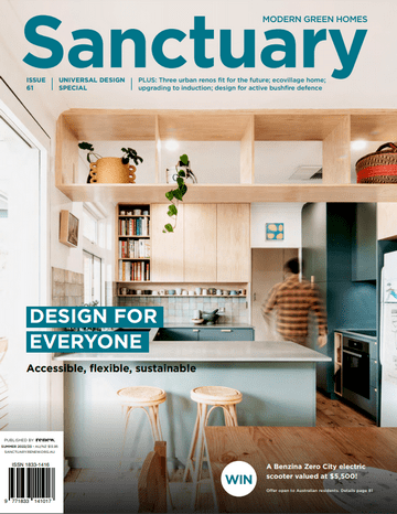
Sanctuary Magazine is a publication for people looking to build and renovate sustainably. Universal design is the focus of their 61st edition. So I was delighted when the editor invited me to contribute on the topic of universal design in housing.
Small things can made a big difference to the ease of use. Things like pedestals to raise washing machines off the laundry floor to minimise bending.
Image by Taylor’d Distinction
My article covers the usual benefits of universal design and how it is good for everyone and the elements of updated NCC for housing. And of course, I referenced the Livable Housing Design Guidelines as a good place to start. I was also given the opportunity to offer additional suggestions based on my experience.
Additional suggestions
My suggestions are based on building my own universally designed home, and from working alongside occupational therapists. Here are some of them.
Ensure easy access to storage by installing drawers instead of cupboards under benches in the kitchen, laundry and bathroom. A pull-out workboard in the kitchen is useful too: placed at a sitting height for an adult, it also provides a workspace for children.
Install lever handles on taps and on every door so that you can operate them with your elbows when your hands are full, or if you don’t have good grip. Consider grip strength and dexterity when choosing drawer and cupboard handles and other opening and closing mechanisms. Also consider raising power points from the skirting board and placing light switches and door handles at hip height for ease of use.
In two-storey homes, think about designing a location for the installation of a lift in the future. This space can begin life as cupboards and then be utilised for the lift later.
The Livable Housing Design Guidelines don’t cover level entry to balconies and alfresco areas, but it’s just as important as level entry into the home. For more space in bedrooms, change the space-consuming walk-in robes to cupboards. You might win space in the ensuite too.
“Universal design is about designing inclusively for as many people as possible, without the need for special types of designs. When applied to housing, it’s a design process that considers the real lives of families and households – throughout their lives. In the end, it’s just good sense to have homes that can accommodate the expected and unexpected situations life brings for all family members.”
Google Maps has two new features to help us find our way and what we are looking for. Live View uses the camera in your phone to give street view directions, and the “Accessible Places” feature marks entrances with wheelchair access.
Accessible Places feature
Google Maps has expanded its “Accessible Places” feature that shows when a place is wheelchair accessible and/or stair-free. It will be interesting to see if this will encourage more places to make their businesses accessible. As we know, when it’s good for a wheelchair, it’s good for prams, bikes and trolleys.
The feature was originally launched in 2020, but it was limited to just Australia, Japan, the U.K., and the U.S. Now, the feature is available worldwide on Android and iOS.
To use this feature, turn on the “Accessible Places” setting in the Google Maps app. You will see a wheelchair icon on the business profile if it has a wheelchair accessible entrance. You will see the same icon with a strikethrough if the location is not accessible. The feature can also check to see if the location offers accessible parking, facilities, and seating.
Steepness of slopes doesn’t appear to be covered, and Google doesn’t say if their access maps are accessible.
It’s up to business owners to update their business profile to reflect whether their business is accessible. It’s unlikely Google will check whether this is true, but user feedback should keep businesses on their toes.
Live View feature
When walking around in new surroundings, Live Viewhelps you keep your bearings. Using the phone camera, the flat map view is transformed into the street view with arrows so you know which way to head. A greatplus for tourists and visitors.
When walking around in new surroundings, Live Viewhelps you keep your bearings. Using the phone camera, the flat map view is transformed into the street view with arrows so you know which way to head. A greatplus for tourists and visitors.
With Live View, users can walk the streets using the camera on their phone and get directions on the screen. The updated version has more information such as cafes, ATMs and transit stations.
Different app developers have tried their hand at creating access maps, but Google brings many features together on the one screen. However, access for wheelchair users does not guarantee access for everyone, and it doesn’t cover all disabilities. It also doesn’t say how welcome people with disability will feel. Nevertheless, it is a good start and Google will continue to improve. The next thing is finding places where you can hear each other talk.
TRIPS is a European transport project for making new mobility solutions affordable, accessible and safe for everyone. People with disability took part in a study to see what their attitudes were towards future mobility. Bike sharing, e-scooters and motorbike taxies are largely rejected in their current format.
“In a nutshell, our findings suggest that a number an interactive, real-time, accessible journey planner would motivate users to travel and make their journey more independent, faster, easier, nicer, and safer.”
553 people with disability from 21 European countries were surveyed for the project. The majority (54%) of respondents had a physical disability, followed by 16% vision, and 8% hearing. 15% of respondents had multiple disabilities.
9 mobility concepts were presented to respondents including ride pooling, micro-transit, motorbike taxi, robotaxi, e-scooter sharing and bike sharing. In general women were less willing to use new mobility systems, particularly ride pooling, motorbike sharing and robotaxis. At this point it is not known why.
Accessibility is a door to door issue. The White paper offers suggestions that include engaging with people with disability in the design of vehicles, services and infrastructure.
Design suggestions
Prioritise a journey planner that provides accessible information about door to door journeys. It would improve willingness to travel. Redesign bikesharing schemes, e-scooters and cycle lanes. Ensure AI solutions are developed with people with disability and accessibility experts to avoid bias in design.
A slide presentation by Alexandra Konig has the short version of the White Paper and short term and long term service recommendations. The title is, The views of persons with disabilities on future mobility.
TRIPS = TRansport Innovation for disabled People needs Satisfaction.
Despite many years of campaigning for disability access across our cities, the results are only piecemeal. But what constitutes an accessible and inclusive city? Australian researchers conducted a global review to find out the enablers and barriers to inclusive design.
“Accessible and inclusive are not common headline city descriptors and even less commonly paired.”
One of the issues is that the concept of accessible and inclusive is multifaceted with many terms alluding to the same thing. The terms that matter most and need to be explicit, are accessible and inclusive. However, these terms are made invisible in the literature and guidelines. Terms such as, Healthy, Age-Friendly, Liveable, Inclusive Smart, and Smart Sustainable have implicit links to access and inclusion. And they are usually aspirational statements without tangible strategies outcomes. That means, they can’t be evaluated either.
“Despite its resonant face validity, ‘accessibility’ is a slippery concept even when applied only to the built environment.”
The researchers include a table of 14 domains of inclusion and access in their paper. Some of these link with the WHO Age Friendly Cities Guide. From these domains they provide a set of key domains that can be used to measure an accessible and inclusive city.
Connectivity (spatial & digital);
Economic participation, employment and education;
Housing;
Community and social infrastructure; and
Processes of engagement and inclusion.
The researchers conclude that the main obstacle is the lack of agreement on access and inclusion factors. Their paper reviewed the global benchmarks of accessible and inclusive cities to provide some exemplars. They also highlighted ways to enhance the experiences of people with disability.
Globally, many built environments fail to meet the accessibility needs of people with disability. This is despite people with disability agitating for built environment accessibility improvement for many decades. This paper reviews the global literature to determine what constitutes an accessible and inclusive city and to discover global benchmarks of accessible and inclusive cities for people with disability.
We identified five (composite) domains that an accessible and inclusive city would include: 1. Connectivity (spatial & digital); 2. Economic participation, employment and education; 3. Housing; 4. Community and social infrastructure; and 5. Processes of engagement and inclusion.
We also identified accessible and inclusive city exemplars, including Breda, the Netherlands and Gdynia, Poland. From the global review of exemplars and definitions, domains and indicators, areas of practical action were identified that require multi-entity, multisector collaborations with influential partners addressing all prioritised domains.
These actions included: the need to include people with disability in the planning and design of environments and services; work across the linked domains of the built form, services, attitudes, and economic participation; and the need to revise construction, design, planning and architectural education to foreground the needs and requirements of those with disability.
The Dangerous by Design report from Smart Growth America has some interesting statistics about road deaths. This 2022 report differs from previous reports because it captures the behaviours of people during a pandemic. People walked more and drove less, but there were more road deaths. The report examines why.
“Seeing driving go down while deaths went up should call into question the long-held belief that traffic fatalities are inextricably linked to the amount of driving.”
Conventional wisdom among policymakers and transportation professionals is that traffic fatalities are inextricably linked to the amount of driving. But the decrease in driving during the pandemic meant less congestion and a significant increase in speeds. Therefore more people were killed. Consequently, speed is the key factor.
Smart Growth America claims that too many transportation agencies and decision makers have been “asleep at the switch”. Their incremental changes to improve safety have not made any positive difference overall.
Those in power, “will have to unwind the deeply embedded, invisible yet powerful emphasis on speed, which is completely incompatible with safety.”
The Dangerous by Design 2022report has several recommendations in terms of policy and design. The guest supplements provide practical experience and add depth to the report. The bottom line of the report is that we have to choose between speed and safety.
Walking and wheeling
The report has a sidebar about “walking” and inclusive language. Of course, some people cannot walk and that is why the term “pedestrian” is used throughout. People using mobility devices are considered pedestrians. However, they are not separated from people using other devices such as skateboards. Consequently, data are difficult to assess in terms of people with disability.
An engineer’s perspective
Charles Marohn writes in a guest supplement that engineers start the process by using the values of their profession. They don’t stop to consider their values might be questioned by others. It’s about standard practice. He says no-one asks questions about speed in proposed road and street designs. Engineers might claim they are not in control of how fast people drive, but Marohn questions this “excuse”. He believes they have a duty to consider it.
Children with disability are the subject of Access Insight, the quarterly magazine from the access consultants association. The focus is on different formal and informal learning environments and how to make them more accessible. The magazine leads with an article on St Lucy’s School in Sydney and the final article is on technical specifications.
Architect Caroline Hart writes about St Lucy’s School which has a history of being a school for the blind. The first stage of the new development was a three-storey building with 16 purpose-built classrooms on two floors. A carpark and drop-off area formed the basement. Hart describes the project in detail, covering acoustics, lighting, communication and accessibility elements.
Designing accessible built environments is the minimum. Facilitating active participation and inclusion of children with different needs, strengths, and abilities informs practitioners’ approach to procurement, design, and delivery of spaces and places.
Image: Stanton Dahl Architects
Designing with children with disability is discussed by Mary Ann Jackson and Illanna Ginnis. Creating a design process with children with disability breaks down traditional communication structures. However, this is not without challenges. But how to make these processes inclusive using mainstream architectural thinking and design processes? Jackson and Ginnis explain their methods in their article.
Lynda Wilem tackles the subject of hearing augmentation and inclusion in the classroom. She discusses the established augmentation systems and their benefits and drawbacks. There is new technology on the way using Bluetooth systems which are already available on smart phones that connect to hearing aids. Wilem adds that augmentation systems are only part of the solution for children with low hearing.
And there’s more…
Indoor play centres is the subject of Vanessa Griffin’s article. She tells the story of advocating for an inclusive play centre in her local government area. Designer, Many Lau, raises the subject of diversity and creating supports for children in early learning centres. Allen Kong gives an overview of “Golden Cubes Awards”, a project run by the International Union of Architects. Technical aspects of handrail design for children is covered by Howard Moutrie.
City life can be noisy, busy and confusing at the best of times. Neurodivergent individuals, such as autistic people, can find this level of stimulation distressing in the built environment. People with dementia and mental health conditions can also find city life and streets distressing. Consequently, it becomes easier to stay home as much as possible. This is counter to our need to be physically active and participate in everyday living activities.
Researchers carried out an observational study of children, with their parents, walking from a transport stop to a park to discover the specific issues. They identified different elements that pose potential issues for the children. From this, they developed potential design solutions.
“It is essential that planners and policymakers change their neurotypically driven mindset of city planning and design.”
While the noises of transport and street activity can be loud, the park is expected to be a quiet place of retreat. But this is not always the case. Mowers, leaf blowers, and excited children raise the decibel level considerably. So knowing when the park will be quiet is therefore very helpful.
Two routes were the subject of the observational study. Both began at a public bus station and ended at an open green space in the city. The aim was to identify aspects that might inhibit access to the park. The routes included common challenges; footpaths, roads and shopping areas. Both routes were approximately 1 mile (1.6km) in length and covered commonplace streetscapes.
Sensory challenges in the built environment
Not all autistic people have problems with sensory overload and those that do might not react to all senses. Parents need to be aware of the unexpected. Loud noises in the form of drilling machines, heavy trucks and police sirens, and flashing lights, for example. On the day the observations were made, it was sunny and bright – not optimal for those who are light sensitive. One the other hand there are those who find lack of light affects their visual acuity.
Apart from sensory issues, there were several others. Street clutter in the form of bins and sandwich boards on narrow footpaths. Traffic lights were a problem because there was no knowing when the lights would change. The solution is a countdown timer and clearer instructions on when it is safe to cross. Wayfinding guidance is also important because clear instructions are essential for feeling safe.
An uninterrupted, smooth and safe journey is what everyone wants. For autistic people it is essential for feeling safe and comfortable along their journey. The researchers provide detailed design interventions such as transition zones, road safety advice, and quiet spaces.
As with many things, design features essential for this group have benefits for everyone. For example, knowing when the park was going to have the noise of mowers and leaf blowers makes it more pleasant for everyone. And everyone appreciates a quiet space from time to time.
“The issue of accessibility for people with disabilities and autism spectrum condition (ASC) should become common knowledge to those working in the built environment sector. To do so, a design guide for creating inclusive cities and communities for people with disabilities, making specific reference to people with ASC, needs consideration at a strategic level, then implemented at a city and town level. Future regeneration projects should include these interventions and design principles in the planning stages and through to implementation.”
Sensory awareness in architecture
An honours thesis by Morgan Harwell address some of the sensory issues in a shopping centre. Lighting, noise, wayfinding, and smells were the primary focus in the boutique case study.
Modern approaches to architectural design and construction have gravitated toward elegance, glossiness, and a bright environment. This is achieved through materials such as marble, glass, white paint, and fluorescent lighting. However, the allure of these choices dismisses their impact on individuals with sensory processing disorders.
This study explores the intersection of lighting, noise, scent, and spatial organization and the sensory overload experienced by some individuals. This study proposes a computer-generated three-dimensional model of a shopping center. The primary focus area is a boutique because its stereotypical lack of sensory awareness in commercial settings.
This space incorporates features that highlight where accessibility and inclusion meet architectural design and construction. Sensory considerations will be prioritized for lighting and noise, wayfinding, and aroma presence. It is the hope that this model and research will emphasize the work required to make buildings inclusive in addition to accessible.
Brusilovsky covers the neurobiology in terms of senses, perception, cognition, attention and spatial development. This is followed by design practice using examples in different contexts. Playspaces, classrooms, cinemas, and libraries are discussed in more detail.
The book deals with design and architecture: the route of spatial recognition from the perspective of autism. The objective is to create a framework to approach the design of environments and buildings, in order to facilitate spatial development in everyday life.
Urban planning for autism
This article explores how urban environments impact autistic children and their quality of life. It highlights challenges such as noise and sensory overload, intense visual stimuli, and lack of safe spaces.
Green spaces, acoustic comfort and inclusive design are some of the planning solutions offered. The article examines the various ways in which the urban environment influences the lives of autistic children.