The disability discrimination case involving the Sunshine Coast University Hospital provides a few important learning points. The hospital was found to have caused indirect discrimination to people with vision impairments. Rectifying the long list of breaches of the Disability Discrimination Act reaches into the millions of dollars. But does compliance make for inclusion in the prescribed solutions?
The Sunshine Coast University Hospital (SSCU) was the subject of the late Peter Ryan’s complaint. As a legally blind person he claimed disadvantage in the way access was provided for him. The main point was inadequate wayfinding.

Learning from the court case
A blog article from the Humanics Collective website discusses the issue of the Court’s demands for specific features to be rectified and/or applied. The Court ruled that the hospital did not meet the obligations of the Disability Discrimination Act (DDA) and the Access to Premises Standard.
Many areas of the hospital did not contain tactile or Braille signage or a functional wayfinding strategy. This included lack of luminance contrasts, small fonts, and appropriate signage. In addition, floor surfaces and other finishes, including the use of colour, came under scrutiny as well. This impacted Ryan’s ability to navigate the spaces independently and with dignity.
Beyond compliance is required
Humanics Collective was engaged to improve compliance with the Court’s ruling. They assert that complex environments need to consider more than compliance to standards. That’s because it doesn’t guarantee usability, and equity isn’t always achieved through uniformity. Indeed, many people experience issues with finding their way around hospitals.
In their list of solutions, Humanics Collective includes the use of hospital volunteers to assist people with vision impairment. The use of volunteers was used as a defence in the court case, but the key issue is that many aspects of the building and surrounds did not comply with the Access to Premises Standard. You cannot use volunteers as a work-around to make up for deficiencies in the design.
Wayfinding not just about signage
The goal of a wayfinding strategy is to help people find their way. So installing more of the same signage isn’t necessarily the answer. However, the strategy should at the very least provide the statutory minimums.
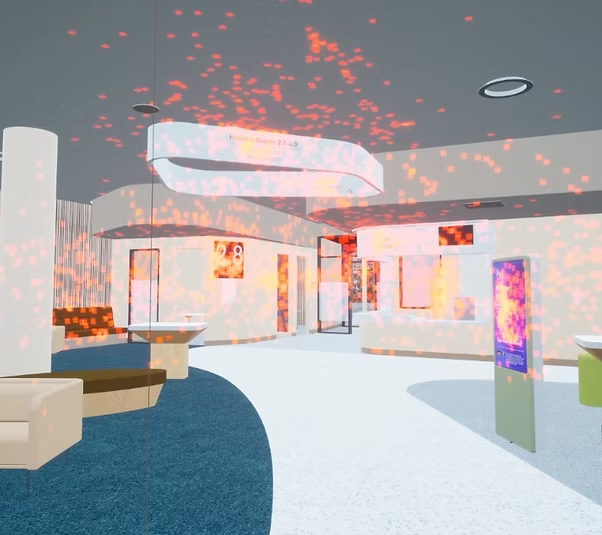
‘One key point of contention in the ruling was the interpretation of “replace.” We argued that replacement shouldn’t mean reinstalling flawed signage in the same location, but improving usability through better placement, higher contrast, and greater visibility.’ Image from Humanics Collective.
The Humanics Collective blog suggests the answer is not in more signage but in smarter support. This includes meaningful pre-visit information and training front of house staff to assist people with vision impairment.
Their on-site testing with user groups found that their proposed changes beyond compliance made the space feel easy to navigate. Importantly, users consistently said there is no single vision impairment experience. Consequently, different people use different tools to get around – a cane, a guide dog, signage, and now wayfinding apps on their phone.
The title of the blog post is, “What We Learned from the Court Case: The Sunshine Coast University Hospital ruling and its impact on inclusive wayfinding”. The real learning is not to think management strategies, such as volunteers, are the answer to failings. And make sure you comply with the Access to Premises Standard as a very minimum. Taking a universal design approach to go beyond compliance minimises the risk of indirect discrimination and an action under the DDA.
It’s about the whole journey to and within the building
Everyone should be able to arrive by any means, make their way to the main entrance and to a toilet. They should also be able to find their clinic and practitioner. Hospitals are now relying on digital applications to guide patients. These include screens on which to register arrival and machines to produce a ticket number. Then patients are to locate a screen within the clinic that tells them when their number comes up. Then they are to make their way to the consulting room.
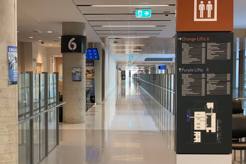
The tall signboard on the right hand side of the image has a black background and very small light grey font. It lists places under Orange Lifts and Purple Lifts. The corridor has a high glaze with lots of reflection and glare. Image from ABC News.
The journey from the front entrance to the consulting room is fraught with difficulty for many people, not just people with vision impairment. It assumes many different abilities in sight and hearing, speech, dexterity, mobility, and digital literacy.
The Court ruled on two things: the breaches of the Access to Premises Standard, and the indirect discrimination under the DDA. It seems from the blog that Humanics Collective wants to do better than just compliance.
Background to the court case
The 2021 court ruling in Queensland is a reminder to designers and builders not to ignore disability access. But many do, and that is probably because they are unlikely to be called to account. Complaints under the Disability Discrimination Act that go to court are rare.
That’s because the person who experiences the discrimination has to make the complaint. And that’s tough. Court cases are very stressful for complainants who often have fewer resources to cope.
The Hospital supposedly complied with the National Construction Code and the Access to Premises Standard. However this was not the case and calls into question the issue of building certification.
This case highlights conflicts of interest could be more common than we know. Both the building certification firm and the access consultants are owned by the same group. Consequently, conflicts of interest can lead to builders ignoring disability access.
The building won numerous awards for Architecture. So this raises questions about what is judged as a good building. Time to start including accessibility for all in the judging criteria for these awards.
Unfortunately Peter Ryan passed away before the Judge handed down his decision. A Sourceable article written by Bryce Tolliday has a lot more detail. The title of the article is Non-Compliant Hospital Costs Queensland Taxpayers Millions.
The Human Rights Law Centre has a summary of the Court findings.
ABC News in 2023 has an article about the delays in implementing the remediation work after two years. In 2025 the remediation work is still lacking which could lead to another complaint under the DDA.


 A significant number of people find certain aspects of the built environment uncomfortable, distressing or a barrier due to neurological differences. To address this, the British Standards Institute has a guide for designing built environments to include people who are neurodivergent. The whole population is neurodiverse, individuals might be neurotypical or neurodivergent.
  Design for the Mind