New residential developments in Queensland must be walkable and encourage physical activity. Specific legislation requires among other conditions, connectivity, footpaths and street trees. Blocks must be no longer than 250 metres and residents must be within 400 metres of a park or open space. To help with planning walkable neighbourhoods there’s a guide. The Street Design Manual for Walkable Neighbourhoods supports the Government’s policy. And Walkable, should also mean Wheelable.The manual is designed to help engineers, designers and planners to design more walkable and liveable residential areas. The Institute of Public Works Engineering Australasia prepared the guide in conjunction with the Queensland Government,The guide covers open space, lot design, street design, active travel, public transport, landscaping and much more. At 160 pages is it comprehensive. There is a brief mention of people using mobility devices, children, older people, and parents with strollers. These street and road design guides divides pedestrians into types of users according to their assumed demands. This implies that different people use different streets for different reasons. For example, only consider children in school locations. But children can be present on any street, and older people take children to school.
This post has four different smart cities playbooks. They are by UNHabitat, the Smart Cities Council, 3Gict’s Smart Cities for All, and the fourth is by two urban planners.
UNHabitat – People-Centered Smart Cities Playbooks webpage introduces a series of playbooks as basic components of their smart cities program. The aim of the playbooks is to empower local government to take a co-design approach to digital transformations. This is so that cities can work on sustainability, inclusivity and human rights for everyone. The playbooks are titled:
Centering People in Smart Cities
Assessing the Digital Divide
Addressing the Digital Divide
Shaping Co-creation and Collaboration
Infrastructure and Security
Building Capacity
Connected Games Playbook
The Smart Cities Council is on the front foot preparing their thinking for the Brisbane 2032 Olympic and Paralympic Games. They are focused on the digital aspects of the Games and have devised two smart cities playbooks.
Smart Cities Playbook No 1 sets the digital scene for the Games covering transport, facilities, housing and urban development.
Smart Cities Playbook No 2 provides guidance on the development of a South East Queensland Regional Data Strategy. Data is one the most valuable assets within the region but is undervalued and under utilised. The Strategy should support good governance and lead the implementation.
Five Pillars of Inclusive Smart Cities
A smart city uses communication technology to enhance liveability, workability, and sustainability. While the tech gets smarter it’s not getting more accessible. The most significant barriers to inclusion are lack of leadership, policy, and awareness, and limited solutions. James Thurston lists the five pillars in the Smart Cities for All Toolkit as:
Strategic Intent: inclusion strategy and leadership
Culture: citizen engagement and transparency
Governance & Process: procurement and partnerships
Technology: Global standards and solution development
Data: Data divide and solutions
The Smart Cities for All Toolkit empowers city leaders and urban planners to make their programs truly “smart” by being inclusive and accessible by design.
Toni Townes-Whitley, Vice President, Microsoft.
You can see a 13 minute video of one of James’ presentations that covers similar ground.
Busting myths about smart cities
Chelsea Collier and Dustin Haisler’sSmart Cities Playbook begins with myth-busting. The myths include: it’s all about technology; it’s only for big cities, it costs a lot; and only governments can do it.
The second part of their playbook focuses on best practices covering infrastructure, people and intelligence. The third part introduces seven steps to a smart-er community with practical worksheets for guidance.
When you gotta go, you gotta go and it doesn’t matter who you are or how you identify. Historically, the use of public toilets has been studied from four different and separate perspectives. These are gender, public health, ergonomics, and the spaces people like between themselves and others. Public opinion plays a role and this makes the creation of inclusive public toilets a site of cultural conflict.
Trans* rights are getting more attention these days and public toilets seem to be an area where public opinion plays a big part. But the trans population is not the only group that has trouble with toilet rooms.
Public toilets have been around for more than 2000 years. They are both public and intimate places at the same time. This gives rise to an emotional response to our need to eliminate and dispose of our waste. We care who we share this public yet intimate space with.
Steinfeld, Thibodeaux and Klaiman have taken up the issues with a view to solving issues by design. That is, to make these public amenities more inclusive. In doing so, it might provide some insights into making other public facilities more inclusive. The title of their research paper is, Public Restrooms: A Site of Cultural Conflict.
The research paper outlines a literature review and the qualitative research methods. The aim is to identify strategies for inclusive restroom design that is acceptable to the US population generally.
From the conclusions
The researchers note that in many parts of North America, any attempt to depart from the conventional binary women/men design will be politicised. Hence they can expect little, if any change. The conventional euro-centric gender segregated restroom is a reflection of a culture that supports a rigid idea of gender identity. Unfortunately, it neglects the realities of diverse needs.
Supporters of trans access to restrooms have focused on changing laws. However, laws do not address the whole problem. They can still face violence and abuse. The design of public toilets needs to be addressed too.
A simple strategy for improving trans access is re-signing single user restrooms to be “all-gender”. It is an good initial first step because trans and cisgender people with additional needs can use these restrooms.
From the abstract
Public restrooms have become the major locus of conflict over trans rights. But this is only the latest manifestation of cultural conflicts related to restrooms. Historically, the restroom has been studied through four aligned, but separate, lenses: gender studies, public health, ergonomics, and proxemics.
These four lenses are both interdependent and intersectional. A review of literature paints a picture of how this conflict represents the gulf between embedded cultural values and the lived experience of a diverse population. We hypothesize that there is strong consensus on what people desire in toilet rooms, particularly regarding safety, hygiene, and privacy. However, these desires conflict with a cultural legacy based on hetero-normative values.
This hypothesis was tested through a review of research and preliminary findings from a survey that targets the intersections of gender identity, public health, ergonomics, and boundary regulation. This research leads to a holistic picture of the public restroom and situates the contemporary conflict as the result of polarized public opinion.
Demographics and ideology play an important role in forming opinions. While the public restroom is the main focus, this research improves our understanding about the larger issues. How might our built environment adapt in response to a more nuanced view of gender? How might urban spatial practices serve as catalysts for social change.
*Note that the term “trans” is used to encompass a wide range of gender identities including transgender, intersex, gender non-conforming and others.
Major sporting events offer great opportunities to design and build inclusive infrastructure and services. The FIFA World Cup in Qatar is no exception. The Accessible by Design: Building a legacy of inclusion report sets out Qatar’s challenges and solutions.
The aim is to “ensure stadia and the entire experience, inside and outside the stadium, are fully accessible to all. This includes designing and planning for accessible hotels, transportation, tourist attractions and more”.
The policy recommendations in the report “provide solid and practical guidelines to design and redesign cities that are equally accessible to all”.
Qatar has worked with organisations representing people with disability to meet their pledge to deliver the most accessible World Cup to date. This means both inside and outside the stadia – hotels, transportation, and tourist attractions. The aim is to leave a lasting legacy and a national priority for greater accessibility across Qatar.
Report and recommendations
The report is in four sections with an executive summary with a focus on urban design and the FIFA World Cup event. The first section discusses the prevalence of and disadvantages for people with disability. Five levels of accessible and inclusive urban design are presented based on the UN’s Economic and Social Affairs work.
The second section relates specifically to the World Cup with diagrams and explanations of how Qatar will achieve its aims. The third section is about what to expect at the tournament. With eight stadia all within a relatively close proximity to each other. That means fans can see more than one match in a day.
The fourth section has conclusions and policy recommendations. At the end of the tournament it will be necessary to check the experiences of people with disability. And also, whether the tournament left a lasting legacy of service and behavioural change.
The report closes with six policy recommendations. Similarly to the London Olympic and Paralympic Games, setting up an authority to continue the work is one of them. There is not much new in the report for countries that have policies on access and inclusion. However, it is good to see their aims and objectives set out in the report. While people with disability are being considered, we know that there are some other groups who remain on the outside.
The report is published by WISH and draws on the WISH 2022 Forum on Accessible Design and Health recently held in Doha.
The World Health Organization’s guide to age-friendly cities and active ageing set the trend for policy in 2002. The publication, Global Age-Friendly Cities: A Guide, supports the age-friendly framework. This inspired the development of the Global Network of Age-Friendly Cities and Communities. So how successful has this age-friendly movement been?
The longevity revolution is happening now. So it is a good time to review the success or otherwise of the age-friendly movement and the WHO framework for age-friendly cities.
The WHO Guide was initially designed to be a bottom-up participatory process. The flexibility of the process enabled individual cities and communities to work on local issues. However, it hasn’t quite worked that way. As with all participative processes, it comes down to whose voices are being heard at the discussion table. And it depends on whether the city or community is urban or rural and on the resources available.
Edgar Liu has checked out Australian policies across the three tiers of government. He wanted to find out if the WHO guide and framework inspired policy making. And if it did, to what extent. In a nutshell, these policies did not fully reflect socioeconomic and cultural diversity. Also, the policy focus remains on care and support services, which conflicts with the recommendations for connecting with multiple policy areas.
This paper reflects on whether and how the World Health Organization (WHO) inspires age-friendly policymaking across different levels of government. This is done via a case study in which we analyse the policies of Australia’s three-tiered federated government system against the WHO’s eight core age-friendly cities domains.
Findings suggest that membership of the Global Network of Age-Friendly Cities and Communities did not appear to overtly inspire the development of age-friendly policies across Australian governments.
Content analysis shows there is an overwhelming policy focus on care and support services, with little attention to cultural diversity. This reflects an outdated portrayal of debilitation in later life and a lack of recognition of how diverse circumstances impact the ageing process and corresponding support needs.
Our findings also reveal the challenges of a three-tiered federated system, where varying financial and authoritative capacities have influenced how different governments acknowledge and respond to population ageing.
Notably, local governments—the main level of implementation targeted by the WHO—are invariably constrained in developing their own age-friendly policies and may opt to adopt those of higher levels of government instead. These challenges will likely impact other resource-limited governments in responding to the needs of their emerging ageing populations.
CITY ACCESS MAP is a web application that shows how cities across the world are doing in terms of accessibility. It’s open source and covers any urban area with more than 100,000 residents. It computes walking accessibility down to the block level. It’s a tool for almost anyone who has an interest in cities that have access to services within a 15 minute walk.
A close up view of a city on the CITY ACCESS MAP
The CITYACCESSMAP is interactive and shows the differences in cities across the globe. For example, it shows that Bogota, Colombia is one of the most accessible cities. Orlando USA on the other hand is one of the least accessible. France is generally accessible with many cities reaching high levels of accessibility.
Australia is represented by Brisbane, Sydney, Melbourne and Adelaide. Searching by city brings a close up view of the suburbs. In Sydney, it shows good accessibility in and around the CBD. However, as expected as you move to outer suburbs accessibility reduces considerably.
It should be noted that the term “accessibility” mainly refers to access to services rather than an accessible built environment. The tool is worth investigating as a planner and administrator in any field. If nothing else, it is interesting to see how countries compare.
For IT people wanting to know the detail of the map design there is more information in a separate section. You can download processed data for any city in the application.
The scientific research is also available and you can contribute to the project by contacting Leonardo Nicoletti.
Streets are more than a footpath and a stretch of bitumen or cobbles. They are integral to our way of life and have different uses at different times for different people. That’s what makes them complex places. Tensions between type of use and different users are sometimes difficult to solve. So how do you allocate street-space equitably and efficiently?
Community consultations are a great help and result in localised solutions. Perhaps this is a good thing. But is there a better way of doing this? Paulo Anciaes thinks there is and sets it out in a conference paper.
However, appraisal showed that some redesign options go against technical/design standards or political priorities.
Anciaes proposes a new process for streetspace reallocation using various tools. The tools include option generation, performance indicators and comparison of options. His case study using these tools showed that allocating more space to some street users brought benefit to others. But redesign options are not always compatible with technical standards or political priorities.
Lisbon case study
The process of developing the tools and their application were applied in five European cities. A busy street in Lisbon city centre was the subject of this particular paper. There were high demands for walking, cycling, car and bus movement, plus parking, loading and place activities. And street furniture limited the movement of pedestrians.
The political priorities were for walking and not restricting bus movement. Added to these was the need for social interaction and more greenery. This is all in a street only 22m wide.
The allocation of space to different uses in busy city streets is a complex and contentious process. Decisions to reallocate streetspace are usually based on public consultation and modelling of a few street redesign options, but results are not compared systematically. In addition, the set of options considered is usually incomplete.
This paper proposes a new process for streetspace reallocation, including option generation (with online and physical tools), estimation of performance indicators (with microsimulation), and comparison of options (with a new appraisal tool). The process was applied to the redesign of a busy street in Lisbon. Several options were generated, all involving reducing the street-space allocated to general motorised traffic.
Microsimulation showed that allocating more space to some street uses also bring benefits to other uses. The option to allocate more space to both bus users and pedestrians does not deteriorate movement by other modes. However, appraisal showed that some redesign options go against technical/design standards or political priorities.
The great thing about universal design is discovering another level of design solutions. That’s why universal design is not locked in time like a standard. Sometimes a design solution includes some assistive technology. Simulating the experiences of people with different disabilities so that people without disability can understand is not new. But the Wondrous Goggles multi-sensory storytelling design strategy is new.
Creating a culture of inclusion is less about designing for empathy, charity, or diversity and more about designing places that all people can use.
Various methods and technologies for simulating disability have been developed over the years. These include sight-restricting glasses, restrictive gloves and virtual reality technology. But having low vision is more than not being able to see things – it affects the way space and how things in that space are experienced as well.
In a conference paper by Janice Rieger and Marianella Chamorro-Koc, explain the multisensorial experience of the Wondrous Goggles. The goggles were an outcome of an indoor navigation project with the aim of helping museum and venue managers understand the perspective of people with limited vision.
The research project was carried out at Queensland University of Technology. The researchers realised they needed something that went beyond just replicating a type of vision loss. What was needed was a lived experience explanation to go with it. And so the Wondrous Goggles were the born.
More than virtual reality goggles
The difference between these goggles and virtual reality goggles is the audio content. The goggles immerse the wearer in a process of sensing environments differently and at the same time they listen to people with low vision explain their experience of the museum.
Unintended consequences from policy actions are not new. Sometimes things come undone in those little details that seemed unimportant at the time. Sometimes it’s because policy actions come from different parts of an overall system. Transport is a case in point. Transport is about the whole journey – from the front gate to the destination and home again. It’s more than cars, buses and trains – it’s footpaths, information systems and supporting infrastructure. And transport is a key element of age-friendly cities.
Transportation is a social determinant of health – particularly for older people. According to the World Health Organization their “lives are guided by the available transportation system”.
One potential policy outcome is that distinct actions, which address different facets of the same overall approach, undermine one another.
Australian researchers set about assessing policy actions for supporting older people’s transportation in Greater Sydney. The analysis revealed unwanted consequences because some actions were undermining each other. They also found systemic constraints and the failure to account for small, but important, details.
Older people’s mobility applies to land use, open and public space, supplementary transport, and community transport. This means that policy makers need to examine interactions between different parts of the system so they can foresee potential unwanted consequences. Then they can do something about it.
1. Coordinate plans for residential and public transport development.
2. Establish key performance indicators for creating and funding new footpaths.
3. Improve cross-sector information flow.
4. Increase the predictability of funding for health and social care transport services.
From the abstract
Age-Friendly Cities (AFC) is a framework for promoting healthy ageing through local actions. We use systems thinking to assess potential outcomes of actions to support older people’s mobility, undertaken within an AFC commitment in Greater Sydney.
Four approaches to support older people’s mobility were identified and situated to the Multiple Governance Framework: land use, open and public space, supplementary transport, and community transport.
Analysis revealed potential for unwanted consequences associated with each, which can be generalised into three generic potential outcomes for other jurisdictions to consider. One recommendation is for policy actors to examine feedback interactions between actions so that they can foresee a wider range of outcomes and take defensive action against those unwanted.
This research identifies what to look for, in terms of potential outcomes, and where to look, in terms of the level of decision-making. This research offers a new way to assess the functioning of AFC governance networks by their collective outcomes and challenges the standards for the evaluation of AFC.
Ageing and Mobility: Getting out and about
Jane Bringolf participated in a webinar or the Australian Institute of Traffic Planning and Management, which includes anyone involved in transport. She covered 5 basic features older people need to encourage them to continue getting out and about. The content of the presentation, Ageing and Mobility, is on the YouTube video below.
After running 23 workshops with older people and local government across NSW, five key elements emerged. They are footpaths, seating, lighting, wayfinding and toilets. In rural areas, parking was also an issue. These were covered in a previous post along with a straightforward checklist on do’s and don’ts.
The car becomes a mobility device as people get older, which puts them at odds with the policy push to get out of the car. Older people feel safer either as a driver or a passenger. The fear of tripping and falling reduces their confidence for walking on uneven footpaths.
Parking adjacent to shops and services in rural towns was also an issue. This was sometimes due to the main street also being the main highway where street parking is restricted.
Ageing and mobility is more than cycles, buses and trains. Many older people just want to access their local neighbourhood to shop and socialise.
Scandinavians have a reputation for good looking and functional design. But there is a gap in the story of an evolving design culture across society. Designers began involving users in their design processes in the 1970s. So co-design is not new and is not a fad, but it is absent from design history.
Maria Görandsdotter says there are two probable reasons why user-centred design has been left out. One is that history has favoured aesthetics, meanings and impact of design rather than the design process. The other is that little has been written about the way design methods have evolved. It’s all been about Scandinavian design and not designing.
… the design methods movement sought to understand and describe ‘the new design methods that have appeared in response to a worldwide dissatisfaction with traditional procedures’.
Görandsdotter traces different histories inher book chapterincluding collaboration with experts in other fields. In 1971 the idea that only professional designers should design was challenged at an international conference on design participation. This is where the lines began to blur between designer and user.
There could be two reasons…
Görandsdotter presents two design histories to open up thinking about what design has been and what it might be in the future. Ergonomic user-centred design methods expanded the role of designers in relation to users. This was linked to Swedish disability legislation and research funding. Participatory design came about as a result of designers’ and users’ co-development of computer-based work tools. It expanded ideas of what design was, how how it happens, and with what kinds of materials.
For anyone interested in design, and particularly collaborative design, this is an interesting read. It puts co-design into an historical context. In doing so, it shows it is not the latest fashion or fad in designing.
This chapter focuses on the emergence of user-centred and participatory Scandinavian design ideas and practices in 1970s Sweden. Many of the concepts and methods still highly present – supported as well as contested – in contemporary design stem from the turn towards collaborative designing through the late 1960s and early 1990s.
However, in Nordic design history, these radical changes in design practice have been more or less invisible. A shift in perspective is required to address this historical gap.
The two examples: The first highlights how ergonomic user-centred design methods expanded the role of designers and designing in relation to users. The second discusses the challenges of designers’ and users’ co-development expanded ideas of what design was, how and with whom designing took place, and with what kinds of materials.
Co-designing public buildings
An Australian article looks at co-design processes specifically for people with disability. The researchers explored stakeholder perceptions and experiences. The findings support participation of people with disability in architectural design processes.
This study aimed to explore stakeholder perceptions and experiences on co-design processes. Twenty six people with disability, advocates, and design professionals participated in workshops. Four major themes emerged: there are challenges to practicing co-design; co-design is inclusive, accessible, and genuine; co-design is planned and embedded in all design stages; and co-design delivers positive outcomes.
Findings strongly support participation of people with disabilities in architectural design, highlight challenges and limitations to current practice, and provide insight into factors that optimise outcomes and the experiences of those involved.
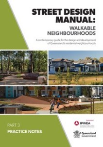
 New residential developments in Queensland must be walkable and encourage physical activity. Specific legislation requires among other conditions, connectivity, footpaths and street trees. Blocks must be no longer than 250 metres and residents must be within 400 metres of a park or open space. To help with planning walkable neighbourhoods there’s a guide.
The Street Design Manual for Walkable Neighbourhoods supports the Government’s policy. And Walkable, should also mean Wheelable. The manual is designed to help engineers, designers and planners to design more walkable and liveable residential areas. The Institute of Public Works Engineering Australasia prepared the guide in conjunction with the Queensland Government,
The guide covers open space, lot design, street design, active travel, public transport, landscaping and much more. At 160 pages is it comprehensive. There is a brief mention of people using mobility devices, children, older people, and parents with strollers.
These street and road design guides divides pedestrians into types of users according to their assumed demands. This implies that different people use different streets for different reasons. For example, only consider children in school locations. But children can be present on any street, and older people take children to school.
New residential developments in Queensland must be walkable and encourage physical activity. Specific legislation requires among other conditions, connectivity, footpaths and street trees. Blocks must be no longer than 250 metres and residents must be within 400 metres of a park or open space. To help with planning walkable neighbourhoods there’s a guide.
The Street Design Manual for Walkable Neighbourhoods supports the Government’s policy. And Walkable, should also mean Wheelable. The manual is designed to help engineers, designers and planners to design more walkable and liveable residential areas. The Institute of Public Works Engineering Australasia prepared the guide in conjunction with the Queensland Government,
The guide covers open space, lot design, street design, active travel, public transport, landscaping and much more. At 160 pages is it comprehensive. There is a brief mention of people using mobility devices, children, older people, and parents with strollers.
These street and road design guides divides pedestrians into types of users according to their assumed demands. This implies that different people use different streets for different reasons. For example, only consider children in school locations. But children can be present on any street, and older people take children to school.
 Real life examples are included in a set of practice notes. They cover: