Accessible and inclusive events

The three minute video from Instagram below is a speedy run-through of the site features that make the place accessible and inclusive. No rocket science here, but some good products. Ability Fest is for everyone – it is not a “Disability Fest”. That is the one problem of using the term “ability” when really meaning inclusive.

Dylan Alcott loves music festivals but they make it almost impossible for people with disability to enjoy them. Hence his Ability Fest project.

People standing watching a band on stage. There are fireworks in the background. Inclusive and accessible events.

The following videos are an education for all major event managers. Alcott showcases all the different features that make events accessible and inclusive.

In the next video, Alcott explains the background to making an accessible festival.

In the following video, the event manager explains the planning and the features required.

A longer interview with Dylan Alcott where he provides his personal motivation for the events, and covers how they cater for different disabilities. He makes a good point when addressing access and inclusion. He says that accessibility and inclusion are two different things, but you need both – one is no good without the other. The video is 17 minutes but you can cut to the chase at 4 minutes.

The detail provided in these videos makes it easy for event and festival managers to make all their events inclusive and accessible. Ability Fest is not a “special” disability event – it is for everyone. At last you can take your friend with a disability with you to a festival. Alcott hopes to make his job redundant because all festivals will be accessible and inclusive.

See also the section on inclusive and accessible events on this website.

Universal design at a food festival

This research has a paywall but the abstract is available. The title of the paper is, Constraints and Facilitators, Universal Design and Event Experience: Accessibility of Facilities at a Food Festival.

Accessibility barriers in festivals inhibit engaging festival experiences for the general public. This study aimed to examine the accessibility of facilities at the Macau Food Festival (MFF) by applying the theories of leisure constraints and facilitators, leisure negotiation and universal design principles. 

Participant observation and qualitative semi-structured interviews with 25 festival participants were conducted. Findings revealed mixed perceptions of the facilities. Several aspects such as unclear festival layout and insufficient toilets were contrary to universal design principles and constrained visitors’ engagement. However, online payment devices and shuttle buses facilitated festival engagement. 

 Accessibility played an important role in influencing visitors’ experiences and behavioural outcomes such as revisit intention, word-of-mouth, and leisure negotiation strategies. This study provides a new approach for evaluating the accessibility of facilities in food festivals. Practical implications regarding accessibility of festival and event facilities are suggested along with numerous avenues for future research.

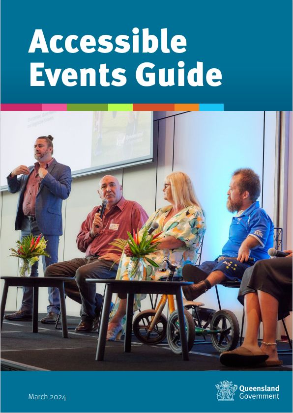
Accessible Events Guide

The Queensland Government has produced an accessible events guide for organisers that covers everything from conception through to the finale. As indicated by the title, the focus is specifically on disability access. However, to be accessible and inclusive, other underrepresented groups also need to be considered. So this post has a list of other event guides as well.

“A successful, accessible and inclusive event is one where all attendees have an opportunity to access and experience every aspect of the event and leave with a sense of enjoyment, togetherness and satisfaction.”

Front cover of the Accessible Events Guide showing four seated speakers on a stage and a man standing signing Auslan.

Universal design principles underpin the guide

The guide begins with the usual introductory sections including definitions of disability, and design principles of universal design and co-design. The seven principles of universal design are listed with examples of where each principle might apply. However, these principles are not intended as a checklist. Rather, they are concepts to consider in all designs. The key to designing universally is to co-design with users.

“Consultation is key to the universal design process. Without it, designers and creators are limited by their personal experiences and imagination.”

An international group of adults stand behind a big board. It says, Make Things Happen. There are lots of coloured post it notes on the board.

The Communication section covers all the details – everything from Easy English and colour contrast to using CamelCase in social media. The next section of the Guide outlines the practical steps for accessible events – major and minor. It covers indoor and outdoor events from registration through to transport, catering and exiting the event.

Online events

The online environment is good if transport is an issue or the attendee needs to feel safe in a familiar environment such as the office or home. Online events include award ceremonies, seminars, meetings and workshops. Commonly used software is best especially if it has in-built accessibility tools such as captioning. This section of the guide has a case study that explains the key elements of a successful event.

The full title of the guide is, Queensland Government Accessible Events Guide and there is a list of resources at the end.

Accessible Events checklist

Queensland Government Accessible Events checklist is a comprehensive and a great supplement to the guidelines. The checklist has sections on:

  • Event planning for platform and online events
  • Venue and location considerations
  • Getting to the event: transport and parking
  • The event itself: seating, staff, supplies
  • Ending the event
  • Getting feedback afterwards
Image from the Accessible Events Guide showing an older man and woman walking under a canopy of open umbrellas with rainbow colours. The woman has a black guide dog with her.

Other guides to accessible events

The City of Sydney Inclusive and accessible event guidelines includes information on why events should be inclusive. It has information on the different types of disability people experience. It has four sections covering indoor and outdoor events and a set of checklists:

  • Accessible venues and spaces
  • Opportunities for inclusive participation
  • Accessible materials and information
  • Staff awareness and attitudes
Front cover of City of Sydney guidelines.

The Victorian Government has an accessible event guideline and checklist which is downloadable in Word. However this is looking a little dated. The Brisbane City Council has a webpage with basic information which is a good place to start. 

The New South Wales Government has an Event Starter Guide webpage which includes a section on accessibility. The guide covers transportation, parking, signage, and communicating access features, and more. The 2023 Toolkit for accessible and inclusive events has a checklist and accessibility symbols. 

It is New Year's Eve on Sydney Harbour. A man is standing in front of people seated. He is audio-describing the harbour and the fireworks.

The Zero Project guidelines are based on real experience of running conferences. The Canadian guide is detailed, and explains the development of the guidelines. 

Front cover of Zero Conference Accessibility Guidelines.

Accessible conferences: Why you should care!

Aerial view of a crowded conference scene where the session has finished and people are standing, sitting and walking about.

A Pulse article posted on Linked In by Nicholas Steenhout covers the basics. His personal experiences have made him acutely aware of how the little details count for so much. He covers websites, name badges, venue, registration desk, conference rooms, amphitheater, bathrooms, carpets, hallway, dining halls, presentation, cabaret style seating, interpreters, slide designs and font sizes, handouts, social events, and transportation.

Good for a quick grab for the essentials – you never know who you might be missing out on and that means both speakers and delegates. 

Subtitles for slide shows

What if you could turn your slide notes into automatic subtitles during your presentation? That would be good for everyone. The advantage is that you can write out the presentation and then deliver it perfectly without having to use lots of text on your slides. As you give your talk you click through the subtitles (captions) in the same way as you click through your slides. Best part, this subtitles for slide shows tool is free from the Cambridge Inclusive Design Team.

The audience gets a better experience with the actual words, because there’s no reliance on speech recognition and no time delays.

Screenshot of the Cambridge PowerPoint slide ribbon showing the subtitles for slide shows option.

Presenting from pre-made subtitles is great for presenters who are prone to lots of ‘ums’ and ‘ers’. It’s also good for speakers who:

  1. Have to give a presentation in a language other than their native language
  2. Have a quiet voice, or substantial accent
  3. Need to customise the length of a presentation to an exact time slot
  4. Want to make a video of their presentation
  5. Have to deliver a presentation that was written by someone else
A young woman sits in an audience and is applauding the speaker.

How do the subtitles work?

The Cambridge Subtitles for PowerPoint tool splits the text in your slide notes into short subtitles and adds these to the slide as animated text boxes. The tool adds a new toolbar to your ribbon which adds subtitles to your slides from the slide notes. The tool is offered free until the end of 2024 and available separately for Windows and Mac. You can download from the links on their webpage.

This tool is now part of the Cambridge Inclusive Design Toolkit.

Dubai Universal Design Code

The Dubai Universal Design Code covers everything you need to know about accessibility in the built environment. It’s a good example of joining dots between the accessible built environment, accessible transport and wayfinding. This is a very detailed document and appears to be a collation of standards documents from around the globe.

This document brings together all the elements of the Australian access standards with those that are missing but also essential. Under the three headings of built environment, transport and wayfinding are details of every design feature.

Front cover of the Dubai Universal Design Code. There is a graphic depicting the Dubai skyline in shades of purple, green and red.

Built environment

The section on the built environment covers the usual elements such as ramps, doors, and sanitary facilities. In addition, it includes details such as glass surfaces, tables and chairs, and window hardware.

Public spaces

The section on public spaces is about urban design, pedestrian crossings, parking bays, restaurant terraces, construction works, bus shelters, and playgrounds. The buildings section includes a note for gender equality, stages and backstage, hotel rooms and mosques. Housing is included in this section along with libraries, schools, laboratories and car parking buildings.

Transport

The transport section includes details for urban buses, metro trains, trams, marine vessels, school buses, accessible taxis, and accessible websites and apps. Service details are covered with signage, seating, announcements, fares and ticketing. Accessible taxis have their own sub-section including vehicle design, and pick up and drop off points.

Wayfinding

The wayfinding section has a similar amount of detail: typography, symbols, layout and line spacing, Braille, and tactile maps. There are more than 300 pages to this document which indicates the level of detail. The document includes 3 annexures: drawings, anthropometrics, and required accessibility for each building type.

The Dubai Universal Design Code is in plain English language and as such it can serve as a basic design guide to check for forgotten details on any project. A valuable contribution to the literature on standards, codes and guides for accessibility in one document.

Expo 2020 Dubai – a review of accessibility

This study gathered the experiences of people with disability and accessibility experts at the Expo 2020 with a view to making future large events accessible to all. One of the findings is that the efforts of access consultants was patchy because they were not involved from the start of any project. As a consequence, it was not possible to correct design errors.

While the provisions for people with disability were better than expected, they were incomplete or disconnected. Some lessons for the 2032 Brisbane Games?

Logo of the Expo 2020 Dubai UAE. Features a daisy type design with lots of circles forming a circle in brown orange and yellow.

The title is, Accessibility of large events: an empirical study of the Expo 2020 Dubai.

From the abstract

Event management is a growing sector in the tourism industry and one of the fastest growing industries in the world. The sector contributes significantly to global economies and provides substantial employment opportunities.

The objective of this paper is to contribute to understanding the accessibility of large events in an increasingly technology-dependent industry.

We evaluated the accessibility of the Expo 2020 in Dubai. Expos are attended by millions of visitors and showcase the latest technologies and innovation. These factors make these events the ideal breeding ground for the implementation of advanced technologies.

The study draws on data from observation, in-depth interviews and online, qualitative questionnaires. The participants are people with disabilities (PwDs), the organizations in charge of the accessibility of the Expo and staff that worked at the event—some of whom were also PwDs.

We discuss the experiences of PwDs at the event, the accessibility provision in place and the challenges and insights of accessibility experts involved, as well as the implications and recommendations for managing the accessibility of large events.

Inclusion, learning and hybrid events

The pandemic forced may activities online and into the virtual world. It was a steep learning curve for everyone, especially in terms of making and keeping things inclusive. While many prefer in-person conferences and learning events, there are others who prefer online participation. The pandemic has therefore given people choice through hybrid events – they can choose which one suits them best.

The anytime, anywhere availability of the internet provides flexibility for learning and for participation in conferences.

A laptop screen is open showing participants in an online meeting or hybrid event.

Anne Fensie reflects on her experience as a teacher, learner and conference delegate in a short piece, Inclusion Possibilities. She is unable to travel and the hybrid option is perfect, and she sees this as an issue of equity. As a person with ADHD and a sensory processing disorder it makes it difficult to focus in large venues with lots of people.

“There are many financial, logistic, physical and social barriers to attending these events in person… particularly people with disability…”

picture of a large audience watching a presentation.

Fensie urges conference organisers to consider the principles of Universal Design for Learning (UDL) when planning a virtual or hybrid event. That means, multiple means of engagement, representation, and action and expression. Her “musings on hybrid events are an easy read where she explains things from a user perspective. As she says, “Designing an event that benefits any person improves the experience for every person.

Inclusive online conference planning

Graphic showing a laptop computer screen with coloured squares each with a face of a person. Inclusive online conference planning.Virtual and hybrid conferences have become more popular since the advent of the recent pandemic. But are they accessible and inclusive? A paper from Canada addresses the issues of inclusive online conferences. Using the recent Parks Accessibility Conference as a case study, the authors describe their experiences. As a Canadian event, they also had to consider two languages in their planning. 

Some people with disability or impairment find online events less stressful than attending in person. They can avoid travel stresses and the regular access barriers. Others who find crowds and noise difficult, tuning in from home is a more comfortable. Consequently, conference planners need to take care to plan for easy access and inclusion.

And it should be for every conference, not just conferences with a disability component.  However, this is a good place to begin and to learn from first hand experiences. The Parks Accessibility Conference is one such example.

Key strategies

The authors provide a list of their key strategies: 

    • Make visual elements accessible to attendees with vision impairment
    • Make audio elements accessible to attendees who are Deaf or hard of hearing
    • Avoid overstimulation for individual who are neurodiverse or with a cognitive condition
    • Create ways to incorporate multi-sensory experiences remotely
    • Finding the right virtual conference platform.

The planners worked with presenters to help format and organise their presentations and materials. They hosted a pre-conference session with attendees to explain how to use the various features of the online platform so they knew what to expect. 

The paper reads like a story, explaining every step along the way so that others might learn from their experience. There are eight recommendations for future conferences based on what they learned. Top of the list is to include people with disability from the beginning.

The title of the paper is, Virtual Accessible Bilingual Conference Planning: The Parks Accessibility Conference.

From the Abstract

The objective of this paper is to share how our team planned and delivered a virtual conference that was fully bilingual and accessible to individuals with disabilities.

We incorporated closed captions, sign language interpretation, language interpretation (audio), regularly scheduled breaks, and a multi-sensory experience.

We describe our approaches to planning the conference, such as including individuals with disabilities in decision-making, selecting virtual conference platforms, captioners, and interpreters, and how we incorporated a multi-sensory experience.

The paper also summarizes feedback we received from our attendees using a post-conference evaluation survey and our team’s reflections on positive aspects of the conference and opportunities for improvement. We conclude by providing a set of practical recommendations that we feel may be helpful to others planning virtual accessible bilingual conferences in the future.

People with complex communication needs

A hand holds a globe with several communication icons on it. It's against a sky blue background. See a separate paper, Supporting Communication Accessibility and Inclusion in Online Meetings for Persons with Complex Communication Access Needs. This is a Masters thesis on running online sessions for people with complex communication needs. 

From the abstract

This community-based, participatory research study explores how online sessions can be designed to support complex communication access needs. The use of a community-led co-design approach resulted in a deeper understanding of the individual communication accessibility requirements, barriers, and lived experiences of persons who use AAC, within the online meeting context.

Participants (‘co-designers’) designed and took part in collaborative design sessions aimed at developing ideas for supporting communication access and inclusion throughout the process of meeting online. Through cross-community collaboration, we co-designed an open-source communication access toolkit for online meetings.

The toolkit includes accessibility guidelines with a protocol for holding accessible and inclusive online sessions; suggested accessibility features and plugins for meeting platforms; and a template for a collaborative participant notebook.

The design outcomes provide guidance to the general population on how we might ensure that online meetings of all forms are inclusive and accessible for diverse and complex communicators, as we all have a right to communicate with dignity in ways where we understand and are understood.

Inclusive online events: captioning

Captioning is an important part of making events inclusive, and more people than we realise rely them. People who are hard of hearing can capture words and names that they miss or are unfamiliar. For people who are deaf they are essential, especially if there is no-one to sign. People with English as a second language find captions helpful too.

Although most Australian venues say they have hearing loops for those who can use them, they are often not working or switched on. Or they are set to pick up all ambient sound, which makes them next to useless. So, captioning is essential if you want an inclusive event.

The image shows an additional screen for live captioning at an event. However, newer technology now supports captioning similar to that on a TV screen. This can still be done with live captioning rather than AI.

A speaker stands at a lectern and captioning screen is behind his right shoulder.

The move to hybrid events has taken the live captioner out of the room in favour of AI captioning. Zoom and Teams offer automatic captioning, which often fails to pick up the very words that people miss. For example people’s names and place names. If the listener misses the word or words, it is likely the AI captioning will too. For example, in Australia, AI captioning has no idea of how to translate Aboriginal place names.

8 Steps to a more inclusive event

Sheri Byrne-Haber’s article, Eight steps to a more inclusive event goes through the different things you can do to make captioning really work.

  • Choose the correct type of captioning: Automatic is free but low quality. Live captioning uses court reporting systems to keep up with speech rates.
  • Send presentation material to captioners and interpreters before the event. This is so they can prepare product names and technical information in advance.
  • Send participant’s names in advance. This speeds up the captioning time.
  • Ask speakers to practice speaking more slowly.
  • Ask speakers to incorporate pauses to give time for captioners and interpreters to catch up. It gives time for listeners to absorb the information too.
  • Formalize the approach to land acknowledgement and visual descriptions. For example Mi’kmaq is pronounced ‘meeg-maw’ which is nothing like the English spelling.
  • Captioners are always behind the scenes but sign language interpreters need to be spotlighted simultaneously with the person they are signing for.

The video below shows how captioning is done.

Video by the Australian Government

Inclusive online conference poster sessions

Screen view of Padlet app for inclusive online conference poster presentations.

Looks like hybrid conferences are here to stay. That means conference organisers are finding new ways of working, and maximising digital capabilities. Conferences with a high academic content usually have poster sessions. Posters are a good way for emerging academics to present and discuss their work. But how to make online conference poster sessions inclusive?

Getting the best from digital presentations is based on both process and technology. Using the most suitable digital platform is part of the story. In their article on inclusive and virtual poster sessions, the authors discuss real time and on-demand presentations. Having both options allows for time zone differences especially for international conferences. 

The title of the paper is, A Guide to implementing Inclusive and Accessible Virtual Poster Sessions. There is a separate section in this paper on virtual poster sessions in the undergraduate classroom.

Suggestions for virtual poster sessions

  • Use combined real-time and on-demand options for sessions
  • Use short video or audio introductions
  • Utilise Zoom for breakout rooms for real-time sessions
  • Provide demonstrations on how to use the poster platform and how to view posters and access Zoom rooms
  • Give more time between notification and the presentation date to give more time to prepare and submit before the conference
A laptop screen is open showing participants in an online meeting or hybrid event.

The advantage of online posters is the amount and depth of feedback received by presenters. The disadvantage is the lack of opportunity to network.

People who feel uncomfortable in crowds or noisy environments will appreciate this mode of delivery. The cost of paper and print are avoided and the poster can be stored digitally.  Virtual sessions allow for captioning, and Auslan interpreters. The authors list several benefits of virtual poster sessions and provide guidance for conference organisers. 

From the abstract

Poster sessions are an integral part of conferences. They facilitate networking opportunities and provide a platform for researchers at every career stage to present and get feedback on their work.

In Spring 2020, we designed and implemented a no-cost and accessible, asynchronous, and synchronous virtual poster session. Here, we outline our goals for hosting an inclusive virtual poster session (VPS). We also demonstrate a “backward design” approach and our rationale for using the Padlet and Zoom platforms. At the 2021 Conference we shared lessons learned to help future poster session organisers to be accessible and inclusive. 

Virtual poster sessions have great potential to improve collaborations and science communication experiences at scientific conferences and in undergraduate classrooms.

Audio Describing for TV and Movies

Cinema packs of popcorn. Audio describing is good for everyone.The art of audio describing has improved considerably since it was first trialled some sixteen or so years ago. Australian produced television programs signal when a program is audio described with a distinct sound. And more movies and stage shows are offering this option. Audio describing (AD) is designed for people with vision impairment, but could sighted people benefit too? 

A group of researchers looked at two questions – the quality of the AD, and the additional benefit to people who are sighted. Currently, the AD process sits outside the creative process. It’s added later in a similar way to captions and subtitles. However, lack of integration can cause misunderstandings about the plot and the characters. 

The research group carried out an experiment with people with vision impairment and sighted people. A short film was shown with enhanced sound effects. For example, bed spring sounds for someone sitting on a bed. Their article explains in more detail and applies the seven principles of universal design to their method. 

In conclusion, the study showed that sound design – that is, non-verbal cues – can replace verbal cues in some films. The enhanced audio description was accepted by both vision impaired and sighted audiences. One sighted participant said that because the AD was integrated into the film it didn’t feel like they were listening to AD. 

It’s universal design!

The article shows the potential for everyone to have an enhanced experience at the cinema and in their lounge rooms. It indicates a strong case for considering AD in the creative process and not leaving it as an afterthought. Integration of AD into the design process is another example of universal design. 

The tile of the article is, Enhancing Audio Description: Inclusive Cinematic Experiences Through Sound Design. The introductory page has both and abstract and a lay summary. Be prepared for a long but easy read. 

Lay summary

Audio Description (AD) is a third person commentary added to film and television productions to make them accessible for visually impaired audiences. Traditionally, AD is added to productions after they have been completed, meaning that the creative and accessibility teams do not work together to produce the accessible version of the production.

This paper explores an alternative to traditional AD, called Enhanced Audio Description (EAD), whose methods are integrated to filmmaking workflows. EAD moves away from a focus on verbal descriptions and instead focuses on sound design strategies. In EAD the traditional third person commentary is replaced by the combination of three techniques.

The first is the addition of sound effects to provide information on actions, convey abstract scenes as well as indicate time, place, and the presence of characters. The second is the use of binaural audio (3D audio over headphones) to convey the position of characters and objects portrayed on the screen. Finally, first-person narration is used to portray feelings, gestures, colours as well as certain actions.

The application of EAD methods results in a form of accessibility that can cater for both visually impaired and sighted audiences, championing inclusive cinematic experiences. Focus groups with audiences of visually impaired and sighted people demonstrated the potential of the format to be widely enjoyed, and to be offered alongside traditional Audio Description (AD) in order to provide accessible experiences which cater for different aesthetic preferences.


Can everybody hear me? Protocol for meetings and events

Front cover of the protocol for meetings and events.
Protocol for meetings and events

People who can’t hear well at meetings tend to avoid them. They also avoid events at restaurants and even family gatherings because it’s frustrating and tiring trying to concentrate on listening all the time. People with hearing loss tend not to disclose at meetings, which makes matters worse. When speakers announce, “Can everybody hear me?” few, if any will respond. Besides, without a microphone, nothing improves. The Ideas for Ears Protocol for meetings and events has some great tips.

Unless people with hearing loss are catered for, their voices will be left out of focus groups and community consultations. Their exclusion then becomes self-perpetuating. People with hearing loss should be able to participate in civic events and activities on the same basis as others. 

Ideas for Ears in the UK actively advocates for people with hearing loss and has developed the Hearing Access Protocol for meetings and events. It provides guidance on how to run meetings so people with any hearing ability can hear and follow them. The Protocol was developed by people with hearing loss and it comes in PDF version and a short online Hearing Access booklet. 

Also see the related post, “I don’t need a microphone”. But yes, you do.  

Festivals and markets for everyone

Events, festivals and markets need to plan for inclusion.Organisers of festivals, markets and events need to think about accessibility and inclusion in their planning. Ordering an accessible Portaloo doesn’t suddenly make the event accessible. The layout of stalls and entertainment areas also need to be considered. 

Lee Wilson makes a plea to organisers of festivals and markets for more inclusive thinking in his post on Linked In. He gives an overview of things to think about and that includes emergency procedures. Information should also be accessible, particularly to people who do not read English well, or have low vision. Auslan interpreters and audio describers make festivals and events enjoyable for people who are deaf or blind. There are several good resources on making events inclusive:

Accessible Events Checklist from the WA Government

Accessible Events Guide from Meetings and Events Australia

Event Accessibility Checklist from Australian Network on Disability (AND)

The City of Sydney’s Vivid Festivals have a high level of accessibility which is planned from the outset.