In 1998 a group of passionate people came together with the aim of creating a centre for accessible design. They consulted widely and held two symposia, one in Sydney and one in Melbourne. The findings from these symposia are documented in Accessible Design in Australia.
For various reasons, the project ended at this point and no further action was taken. However, soon afterwards a small group, led by Dr Max Murray, started the Association of Consultants in Access Australia, (ACAA). This has become the professional body for access consultants in Australia.
Centre for Universal Design Australia has picked up the threads of the original idea to follow through on the aim of having a central point or body for creating an inclusive Australia.
A group of architects, product designers and engineers devised the 7 Principles of Universal Design in the mid nineties. The late Ron Mace led this team and is often referred to as the “father of universal design”. The principles were devised at a time when the focus was on the built environment and designers were responsible for getting it right.
However, some people find the 7 principles a good starting point for thinking about design from an inclusive perspective. With thought they can apply to any building, open space, service, product, phone app, website or document. Briefly they are:
Equitable Use
Flexibility in Use
Simple and Intuitive to Use
Perceptible Information
Tolerance for Error
Low Physical Effort
Size and Space for Approach and Use
Universal design in the built environment was a relatively new idea in the 1990s. It was soon realised that access for wheelchair users was good for everyone. It’s a universal good. Hence the the term “universal design”. Universal design has evolved and recognised as an inclusive design thinking process. Consequently it applies to all things designed including processes and policies.
It is more than buildings
Many still believe universal design is only about the built environment. Others believe universal design is a one-size-fits-all approach which means designers cannot be creative. Indeed, it requires a good deal of thought and creativity.
There is one other important misconception and that is, universal design is about access standards. This is where the term “universal access” belongs – it is not the same as universal design. Building, product and web standards are about compliance. Universal design is about creative designs that include compliance to relative standards.
A world comfortable for all
The video below covers people at home, in public transport, in the street, at an airport, at a computer, at the entrance door and in the parking space. “Universal Design is the design of anything (city, service, thing) to make the experience of using it comfortable for anyone”.
A great little video for anyone new to universal design, or for others wanting to share their understanding. It’s 2 minutes long and great for education purposes.
More resources
Steinfeld and Maisel devised an update to the 7 principles of universal design in 2012. The 8 Goals of Universal Design are more action based than the principles, and include cultural inclusion.
In 2006 Steinfeld and Danford also ‘cross-walked’ the principles to the ICF. This is a handy reference for academics utilising the ICF for activities and participation. You can download a copy of their slideshow.
Universal design has gone through many iterations. It is no longer just about access to buildings, but access to anything and everything for everyone.
The latest thinking and practice is co-designing with users – a really iterative design process that shares the design power between users and designers.
The Danish Design Ladder takes universal design thinking yet another step forward. It shows how to apply universal design thinking to organisations and business strategies.
The 7 Principles of Universal Design emerged from the built environment, but things have moved on since the 1990s. Steinfeld and Maisel joined the dots between universal design and the ICF and devised the 8 Goals of Universal Design.
The Goals of Universal Design are more practical than the 7 Principles. They emerged from work that links the concepts with the World Health Organisation’s, International Classification of Functioning, Disability and Health (ICF).
Universal Design Guidance and the ICF demonstrates the application of universal design for developing design guidance standards. It uses a set of linking rules together with related classifications to represent the interaction of human functions, activities, and environmental factors. These classifications are continuously evolving as new knowledge emerges.
This opinion piece, Universal Design: Is it Accessible? critiques the 7 Principles of Universal Design. Several aspects of universal design are questioned including the terminology and inherent difficulties in understanding the concepts. Jane Bringolf argues that the 7 Principles of Universal Design are not themselves universally designed.
The article was published by Multi:The RIT Journal of Plurality and Diversity in Design. It is also available on ResearchGate.
The article was written in 2008 before the 8 Goals of Universal Design were devised by Steinfeld and Maisel in 2012. These goals have a more practical focus. More recently, the concept of universal design has evolved to embrace diversity and inclusion in their broadest sense.
The beginnings of the universal design movement are attributed to Ron Mace, a polio survivor who went on to be an architect.
From the abstract
Designing products and environments to be usable by the majority of people is the underpinning concept of universal design. In some aspects, however, universal design fails to meet some of its own principles. This has resulted in a lack of understanding of the concept, and has allowed the terms “accessibility” and “disability” to inhabit the language of universal design.
Consequently, universal design is bounded by concepts of accessibility, regulations and disability rights. As a result, the creative challenges in designing for the whole of the population bell curve are lost.
The universal design movement acknowledges that making headway is proving difficult. Market research, however, indicates universal design is branded as a disability product. This has implications for consumers, practitioners, and for the universal design movement in general.
This paper discusses the influence of terminology on the direction and perceptions of universal design, and the dilemmas of applying a regulatory framework as an implementation strategy.
From the Editor: I prepared a 2000 word version of my PhD thesis for easier reading. The title is Barriers to Universal Design in Australian Housing. I wanted to find out what the barriers are and if we could do something about it.
The simple answer is that the industry runs on regulations which holds the house building system together. So nothing will change without regulation. Outdated ideas about market segmentation, general resistance to change, and risk avoidance are key issues. Cost was cited most often as a barrier, but without any evidence of the costs.
The graphic shows that the house building industry is a system with several stakeholders. This system relies on everyone doing the same thing in the same way. The best way to achieve this is through regulation.
The full thesisis available from the Western Sydney University archives. I did my best to make it as readable as possible within the constraints of academic writing.
(FICCDAT is, Festival of International Conferences on Caring, Disability, Aging and Technology.)
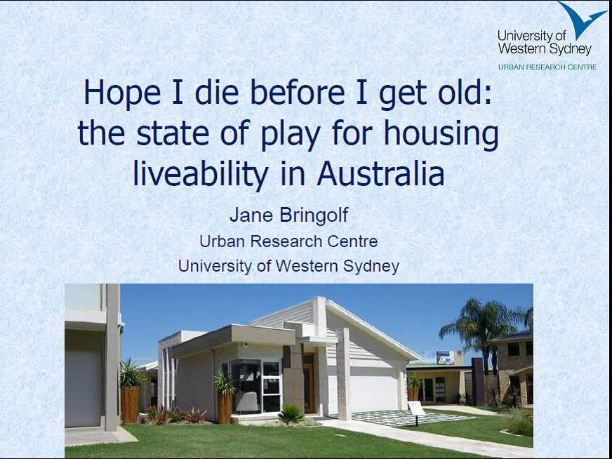
Hope I die before I get old
I presented this paper and presentation at the 2011 State of Australian Cities Conference (SOAC). It raises the issues of housing an ageing population in a context of industry believing retirement villages and aged care are the places to put older people. However, the majority of people will age in their current home – a home that is not suitably designed for this purpose. Around 200,000 new homes are built each year – each one a lost opportunity.
The cost of NOT including accessibility in new homes
When talking about the costs of including basic access features in new homes, we should also discuss the cost of NOT including those features.
Download an academic article from the Journal of the American Planning Association, by Smith, Rayer and Smith (2008) that spells out the economic argument using economic methodologies. The key point is that conservatively, a new home built today with a minimum of four different households over its lifetime is 65% likely to have an occupant with a permanent disability. If we include visitors the likelihood rises to 91%. It is often forgotten that people with disability live in families – not alone. This is an open access article.
The Landcom Universal Housing Design Guidelines were published in 2008, but the information is as relevant today as it was when first published. The designs are well researched with sample plans for all types of dwellings. The design process included costing the features. Any additional costs are minimised when considered at the outset of the design.
You can download the Universal Housing Design Guidelines asa Handbook or quick reference Factsheet. Apart from key design features it has a section on model houses – single and double storey detached homes. These Guidelines underpined the Livable Housing Design Guidelines (Silver and Gold levels) in 2012. The National Construction Code used these for the Livable Housing Design Standard.
2023 Update: Many of the features in these guidelines are in the National Construction Code and will take effect from October 2023. Most jurisdictions have agreed to adopt the Livable Housing Design Standard but are yet to do so. Queensland, ACT and Victoria were the first adopters. As of 2025, because of housing industry lobbying, NSW and WA have refused to adopt this standard
Note: the Landcom Guidelines are difficult to find on the Landcom website, but are archived in Trove (The National Library of Australia). The housing guidelines were part of a suite of guidelines that aim for liveable neighbourhoods.
 In 1998 a group of passionate people came together with the aim of creating a centre for accessible design. They consulted widely and held two symposia, one in Sydney and one in Melbourne. The findings from these symposia are documented in Accessible Design in Australia.

 This opinion piece,


