It would be good if all designers took their lead from the likes of Apple and Google: inclusion, accessibility and usability are about the design process. Apart from clearly explaining how these terms are linked and can be used together, Google spells out accessible, inclusive and usable in ahalf hour video
Microsoft infographic: Permanent, temporary, situational disability
The video also has some tips and tools for designers and shows how three different users have the same need: a man with a mobility disability (permanent), a boy with a broken arm (temporary) and a woman with an armful of shopping (situational). Microsoft designed an infographic to illustrate the point.
Individual situations might be different but they all have the same need for accessibility. And people have the same goals they want to achieve regardless of their situation.
This instructional presentation is aimed at an audience interested in designing apps, particularly the second half of the video. However, the messages in the first half can be applied to other design disciplines.
If you want to create something really useful for intended users, asking them to participate in the design process is a good way to go. And that means the design of anything – guides and toolkits included. From Ireland comes a toolkit for co-designing for the digital world where participants are people with intellectual disability.
A series of iterative workshops involving people with intellectual disability formed the foundation of an accessible design toolkit.
Co-design is important in the area of digital design and computer interaction. However, projects that claim to be user-centred often become technology led rather than user driven. A university in Ireland teamed up with a community service that supports people with intellectual disability. With the guidance of researchers, computer science students and community service users engaged in a co-creation process from which a toolkit was developed.
The collaboration highlighted the need for accessible design resources and training materials for both students and users. While there are many resources on co-design processes, and design thinking, few address people with intellectual disability. Those that do exist are not accessible or suitable for people with intellectual disability.
The toolkit is about co-designing with people with intellectual disability. Two overarching principles emerged. Use simple English with short sentences and simpler grammatical structures. Provide visual aids – icons and images – to overcome literacy limitations.
The paper explains the co-creation process in detail. The authors call the users co-designers, which is confusing because co-design usually means all participants including designers.
Understanding the complex process of consent to participate had to be resolved for the users. Another difficulty was encouraging participants speak up about design flaws or issues.
Existing toolkits and resources to support co-design are not always accessible to designers and co-designers with disabilities. We present a study of a co-design process, where computer science students worked with service users with intellectual disabilities. The aim was to create digital applications together.
A series of co-design focus group sessions were conducted with service users previously involved in a co-design collaboration. The information from these sessions was used to devise an accessible design toolkit. This toolkit is intended to generate a sustainable resource to be reused in the student programme at TU Dublin but also in the wider community of inclusive design.
Editor’s comment: Most guides and toolkits are based on well-researched evidence, but the value of the evidence is sometimes lost in technicalities or too many words. A co-design process will seek out the key information that guideline users want and need.
Designing technology for all
It’s not just a matter of fairness. Technology is generally better for everyone if it’s designed for people with disability. People who are blind use the same smartphones as sighted people. They also use computers by using screen readers. But screen readers can’t improve the way websites are designed. A website that causes problems for a screen reader is likely to be more difficult for anyone. So designing for disability is designing technology for all. That’s universal design.
An article in The Conversation explains the issues in more detail. One of the issues for web designers is that prototyping software is not compatible with screen readers. Consequently they can’t get blind users to test their designs. It also means a blind designer wouldn’t be able to make mock-ups of their own.
The researchers said that accessibility is the hallmark of good technology. Many technologies that we take for granted were developed around disability. The article concludes that no matter how much empathy a designer has, it doesn’t replace the benefits of technology built by people who actually use it.
The title of the article is, “Why getting more people with disabilities developing technology is good for everyone”.
Inclusive design is often misunderstood as designing specifically for people with disability. Similarly, the term “diversity and inclusion” is associated with people from diverse backgrounds. Designing for diversity means both – designing for as many people as possible across age, ability and background
Dan Jenkins makes an important point in his article – the number of excluded people is often underestimated and capability is frequently thought of in terms of “can do” and “can’t do”. However, this black and white approach doesn’t cater for those who “can do a bit” or “could do more” if the design was tweaked. But then there is the role of designers themselves.
The Role of Designers
How do we design for the full-spectrum of user experience, if the designers themselves do not present a variety of experience and perspectives? Inherent in their role, user experience designers, or UX designers, are required to design the overall experience of a person using the product.
Fabricio Teixeira and Caio Braga believe that diversity generates diversity. Touching on topics such as diversity in the design industry, inclusion, equality and equity and gender, this series of five articles explores design from within the industry to explore the impact that designers have on people’s lives.
Universality in design gets a mention in the Handbook of Anthropology in Business. Megan Neese’s chapter raises a good point about terminology in the business world. She says, “Marketing teams talk about consumers. Research teams talk about respondents. Engineering teams talk about targets. Designers talk about users. These terms tend to be used simultaneously and somewhat interchangeably in corporations…”. So finding common ground is not always easy when developing a product.
Neese’s chapter discusses the many layers needed in any design, such as, culture, function, regulations, industry initiatives, and social trends. It is thoughtfully written and easy to read.
How “the User” Frames What Designers See: What Cultural Analysis Does to Change the Frame” is in the Handbook of Anthropology in Business, 2016.
The term ‘Diversity’ is often thought of as a cultural thing just as ‘Accessibility’ is thought of as disability thing. The concept of universal design doesn’t separate these and doesn’t separate them from what’s considered mainstream. That’s the meaning of inclusion and inclusiveness. But let’s not get hung up on the words.
Diversity covers gender, ethnicity, age, size and shape, income, education, language, culture and customs. There is no Mr or Ms Average – it’s a mythical concept. Dan Jenkins writes about diversityas inclusion for the Design Council and makes this observation;
“Often, it’s a perceived efficiency-thoroughness trade off – a variant of the 80:20 rule, that crudely suggests that you can get it right for 80% of the people for 20% of the effort, while it takes a further 80% of the effort to get it right for the remaining 20%. However, much of the time it is simply that the designers haven’t thought enough about the diversity of the people who wish to interact with the product that they are designing, often because it’s not in the culture of the company.”
It’s not just disability
Similarly to Kat Holmes, Jenkins says to think of capability on three levels:
1. Permanent (e.g. having one arm) 2. Temporary (e.g. an arm injury) 3. Situational (e.g. holding a small child)
“The market for people with one arm is relatively small, however, a product that can be used by people carrying a small child (or using one of their arms for another task) is much larger. As such, designing for the smaller market of permanent exclusions is often a very effective way of developing products that make the lives of a much wider group of customers more flexible, efficient and enjoyable.”
Jenkins reminds us that all our capabilities will be challenged eventually, either permanently or temporarily. That’s why designers need to think of the one arm analogy in their design thinking. Excellent easy read article from the Design Council. Infographics are taken from the article.
Much of Jenkins’ content is similar to Kat Holmes material and the Microsoft Inclusive Design Toolkit. There are three articles on this website that feature Kat Holmes:
Colour blindness is an eye condition that changes the way people see colours. It doesn’t seem like a big thing to people who have normal colour vision. But when it comes to reading things like maps, it matters a lot. Graphs, maps, diagrams and other graphic information types often rely on colour to differentiate between elements and features.
With genetic colour blindness, men are about 16 times more likely to be affected than women. Injury or disease can also affect the ability to see certain colours.
Apart from genetic reasons, some health conditions increase the risk of developing colour blindness later in life. Macular degeneration, glaucoma, diabetes, dementia, and Parkinson’s disease can all affect colour vision. Because it happens later in life it often gets unnoticed and undiagnosed. Some medications might affect colour vision too. For more, see My Vision guides.
You are at greater risk of colour blindness if you are a white male and have family members with colour blindness.
Red-green colour vision deficiency occurs in 1 in 12 males with Northern European ancestry. For women it’s 1 in 200.
The Axess Lab website has some great tips for making graphics more inclusive. For example, putting text into pie charts, and labelling goods with colours not just showing them. Colour contrast matters too as you can see in the picture below.
A pie chart with labels
A serious colour contrast fail in real life
Colours that are accessible
Colour is an important part of designers’ creative work. When it comes to colour accessibility the creative path takes a few twists and turns. That’s because people who say they are ‘colour blind’ are not all the same. Most can see some colours, but not all of them. So how can designers choose colours that are accessible, especially in digital communications?
Adobe has a blog page that explains the importance of choosing colours. Four images show the three different versions of colour vision deficiency, which are:
Protanopia: Referred to as “red weakness,” this variation of red/green color blindness results in individuals being unable to perceive red light.
Deuteranopia: Also known as “green weakness,” this type of red/green color blindness renders people unable to perceive any green light.
Tritanopia: People who suffer from blue/yellow color blindness have difficulty distinguishing between blue and yellow colors. This form of color blindness is far less common than its red and green counterparts.
Graphic designers will appreciate the colour wheels and ways to avoid a conflict of colours. Examples of good colour choices show that designs can still be attractive as well as functional. You can try out the online Material Design accessible colour tool that provides information on colour contrasts for visual material.
Readability and colour choice
Colour choice is also a factor in readability. The video below shows how easily we can be deceived by our eyes. It shows how two different shades of grey are actually the same. That’s why you can’t rely on judging contrast by eye.
A case study from the Netherlands describes an inclusive process for designing energy-efficient home renovations. A neighbourhood of 280 apartments is the subject of the study. With a mix of homeowners, renters and social housing tenants, it was essential to involve residents in the renovation process.
Involving residents in major renovations is essential for bringing together the technical and social aspects of design.
The principles of civic and energy justice underpinned the approach to the project. Given that the resulting designs will largely be the same for every home, they need to be inclusive and considerate of ongoing energy costs for everyone. That means an inclusive design process is required.
Participatory action research
Expert stakeholders and six residents were interviewed and 50 residents were observed and interviewed during a tour of the demonstration apartment. Mutual learning was a key part of the iterative process involving prototypes.
Attention was paid to diversity, accessibility of research materials and interview materials were both verbal and visual. Technical design features were part of the results, but values emerged from the process. These values were health, sustainability, property value, cost of living and comfort.
The paper goes into more detail on the findings and the process. As part of the process, researchers developed a renovation guide to help residents understand what the proposed changes mean for them. They acknowledged time constraints which meant residents did not have time to experience the apartment. Rather, they only had time to view it.
Recommendations
Recommendations for improving the process include:
Location. Any sessions should be in the neighbourhood and in an accessible venue.
Time. Different meeting and interview times will suit different people.
Invitations. The guide acts as an invitation but might not work for everyone.
Language. Dutch is a second language for some people so a session in English might be necessary.
Other options. Apart from meetings, phone and email should be available. Not everyone feels comfortable in a group.
The lessons from the paper could be applied in housing situations such as social housing and co-housing. It also adds to the literature on inclusive design and co-design, and participatory action research.
The title of the article is, Values arising from participatory inclusive design in a complex process. There are diagrams to illustrate the complexity of designing an entire home and it’s technical systems, indoor climate, the lives and values of residents, and connection to systems and services.
From the abstract
This paper addresses inclusive design in a situation of complexity and how to improve it. The focus is on the inclusive design of a complex process and its tools, which is increasingly an issue in systemic design challenges. The current situation of climate change means we need to work on sustainability and inclusion at the same time.
The paper presents a case study of an energetic renovation process and the stakeholders’ activities and views in it. In a research-through-design process, the paper traces the possibilities to intervene in the process with communication tools to increase inclusivity of both process and outcomes.
Energy efficiency and universal design
Are energy efficiency and universal design incompatible? Potentially. Energy efficiency has an engineering approach and universal design has a sociological approach. This is what makes them incompatible according to researchers in Belgium. Energy efficiency is a measurable product whereas universal design is a process. So how can they both be addressed in home renovations? This was the topic of a conference paper in 2016.
Thinking has moved on and we now talk about sustainability from both perspectives and the importance of having both. However, this paper brings the concepts into the same conversation and highlights areas of potential conflict. The paper has some interesting and explanatory graphsand comparisons that are worth a look especially for academics and theorists.
The title of the paper is, Energy Efficiency and Universal Design inHome Renovations – A Comparative Review
Discussing universal design and inclusive practice helps individuals to understand the concept of inclusion. But it’s organisational culture where the change is needed. Everyone has to have the same universal design mindset. The Danish Design Ladder is one way to apply universal design to organisations.
Extended Danish Design Ladder
Design isn’t just for products and websites. Design thinking is also good for designing business strategies and operations. It shapes the brand and business concept. In short, it is good for business, as Matt Davies says.
The Danish Design Ladder is useful for understanding the power of design within organisations. Universal design thinking comes onto the ladder at Rung 3 – Design as a Process.
Rungs of the Danish Design Ladder
1 Non-Design: Design is invisible, product development is done by untrained designers. The user or customer has no part in decisions.
2 Design as Styling: After the product is developed it is given to a designer to make it look nice.
3 Design as Process: This is where design is not the result but a way of thinking. Customers are now the focus of the design process.
4 Design as Strategy: Design is embedded in the leadership team to shape the overall business.
5 Design as Systemic Change: Design is a way of changing systems to solve complex social problems.
6 Design as Culture: Design is a common mindset, as a way to innovate, a way to listen and and a way to lead.
An article by Bryan Hoedemaeckers, Are you getting the most out of Design explains more on this. The Ladder is a good way of conceptualising how to weave universal design thinking into the fabric of organisations.
The Brisbane Olympic Games are less than 10 years away. There is talk of wanting them to be the most accessible games ever. The top three rungs of the Ladder, universal design as strategy, change and culture, will be essential for this outcome. The Legacy Strategy moves to the 4th step of the ladder, but the strategy is about places and things, not culture change.
Australian researchers used the Danish Design Ladder in an action research project. The title of their paper is, Climbing the Design Ladder; Step by step.The researchers discuss other intermediate “steps” for bringing about culture change. The article is open access.
Advances in Design for Inclusion
This book covers several topics in design: universal design; design for all; digital inclusion; universal usability; and accessibility of technologies regardless of users’ age, financial situation, education, geographic location, culture and language.
It has a special focus on accessibility for people with auditory, cognitive, neurological, and visual impairments, ageing populations, and mobility for those with special physical needs.
The title of the book is Advances in Design for Inclusion. It is an academic text, published by Springer, from the proceedings of the International Conference on Design for Inclusion held in Washington DC in July 2019.
The chapters are diverse and specific. For example, yacht design; automated vending machines; prisons; parking meters; garden objects; housing; city maps, built environment and much more. Chapters can be purchased separately if you don’t have institutional access.
Australian Easy English is for people with low or few literacy skills. It is not the same as Easy Read.
According to Cathy Basterfield, Easy English is not the same as Easy Read. Her comparison of the two highlights some important differences.
Australian Easy English assumes almost no literacy skill. Material is presented with just three or four short sentences of 5 words on a page. Each sentence is accompanied by a relevant picture or graphic. This means there is a lot of white space which prevents visual confusion caused by lots of words. The aim of Easy English is to tell the reader what to do. It is not about conveying information.
Australian Easy Read on the other hand has an average of 10 words in a sentence. The document includes information which can make if difficult to find the “what to do” instruction. This format assumes a reading level of Grade 4. Unlike Easy English, images are used without headings and there is little white space.
44% of Australian adults do not have the literacy skills for everyday reading tasks such as reading product labels.
Long documents often have an Easy Read version which makes it easier for competent readers as well. After all, why read a long and complex report when you can get the same information with less words?
Making a document easy to read and understand is not itself an easy process. The development of Easy English and Easy Read is a mix of language, sentence structure, images and user testing. It’s a design challenge to analyse each element to see what works best.
Comparing the two
The examples below show some of the differences between Easy English and Easy Read. Cathy Basterfield has a succinct three page comparison of the two styles with clear examples.
Editor’s note: Even as a person with good literacy skills, I find Easy English a quick and easy way to understand the key points. I think much of the confusion in the community is due to politicians and others using lots of words when fewer would do, and speaking quickly. When journalists ask questions of politicians they add to the confusion because the politician says the same thing again only using different words.
Co-design in an academic context is part of participatory action research, or PAR. It’s used to understand, inform and change the design of policies, programs and services. But what are the essential elements of co-design?
As we know, community engagement or consultation is not the same as co-design. Including diverse stakeholder and user perspectives is essential for developing best practice.
Gabrielle Brand and her team have identified five core co-design principles in the field of health education. Briefly they are: inclusive, respectful, participative, iterative and outcomes focused. These principles apply in other fields too.
Core co-design principles
Inclusive: Involve key industry stakeholders and consumers from the initial proposal design. That includes the development and framing of learning focus to final educational outcome and delivery.
Respectful: Health care consumers are considered “experts by experience”. All input is equally valued in design, development and delivery of education.
Participative: The research process is open, responsive and empathetic in co-creating education. It generates new understandings of health and healthcare experiences.
Iterative: A cyclic, collaborative process that takes time. It embraces movement towards a shared education vision. It includes the risk of failure.
Outcomes focused: The focus is on achieving a shared educational outcome co-created during the co-design process.
Brand and her team used conversational interviews transcribed verbatim for analysis. An organic iterative approach to data analysis developed shared understandings. Artefacts were also used in the process for eliciting sensory triggers for participants and for developing vignettes.
The article details part of a vignette to explain how it was used with learners. It’s based on a mother of an adult son with a psychosocial condition. Members of the research team benefited from knowing they had valuable and legitimate expertise on a research project.
One of the issues with co-design and PAR is passing ethics approval processes. When an ethics committee labels particular groups as ‘vulnerable’ they apply different approval criteria. However, including the voices of a broad range of people involves the participation of vulnerable groups.
The end result of this kind of research is to “transform hierarchical health care relationships towards a more humanistic model of care”.
From the abstract
Context: Community and consumer involvement in health professions education (HPE) is of growing interest among researchers and educators. It prepares health care graduates to effectively learn from, and collaborate with, people with lived experience of health issues.
Approach: We describe the background to our work with health care consumers including the five core principles for successful co-design and how to apply them as a research approach in HPE.
We used arts and humanities-based teaching methodologies including engagement, meaning-making and translational education strategies. This illustrates how this research approach has been applied to reframe mental health education and practice in Australia. Furthermore, we share some reflective insights on the opportunities and challenges inherent in using a co-design research approach in HPE.
Conclusions: For the consumer voice to be embedded across HPE, there needs to be a collective commitment to curriculum redesign. This paper advances our understandings of the educational research potential of working with health care consumers to co-design rich and authentic learning experiences in HPE.
Co-design research approaches that partner with and legitimise health care consumers as experts by experience may better align education and health professional practice with consumers’ actual needs, an important first step in transforming hierarchical health care relationships towards more humanistic models of care.
Two New Zealand researchers in health science say it is time to apply universal design principles to health education research. They take the universal design principles that originated in architecture and translate them to universal design for research.
The researchers use the The three pillars of universal design for learning (UDL) as the means to crosswalk from architecture to research. The aim is to embrace and enact diversity in research design. This, of course, means engagement with people most often excluded from health education research.
Colour contrasts can be deceiving because we are subject to optical illusions. The video below shows how two different shades of grey are actually the same. That’s why you can’t rely on judging contrast by eye. Fortunately there are colour checkers to help with colour choices especially for websites. And why do you need colour contrast checkers? Because more than 8% of the population has colour vision deficiency (colour blindness).
UPPER CASE is not good for readability
Colour choice is one factor in readability. Others include using sentence case. Using upper case or capitals does not convey important messages more urgently. The image shows that using upper case to indicate a low bridge did not stop a truck driver from driving under it. Upper case is harder to read because the shape of the words are unfamiliar.
Colours for reading and learning
The processes of how we read text has an impact on how we take in information. Colour coding can help readers quickly identify key information and assist their reading and writing. Colour coding has gained popularity in classrooms to support student learning and reading.
Color coding, a technique assigning specific colors to cluster information types, has proven advantages in aiding human cognitive activities, especially reading and comprehension. The rise of Large Language Models (LLMs) has streamlined document coding, enabling simple automatic text labeling with various schemes.
This has the potential to make color-coding more accessible and benefit more users. We conducted a user study assessing various color schemes’ effectiveness in LLM-coded text documents, standardizing contrast ratios to approximately 5.55:1 across schemes. Participants performed timed information-seeking tasks in color-coded scholarly abstracts.
Results showed non-analogous and yellow-inclusive color schemes improved performance, with the latter also being more preferred by participants. These findings can inform better color scheme choices for text annotation. As LLMs advance document coding, we advocate for more research focusing on the “color” aspect of color-coding techniques.
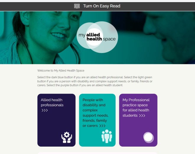
Website readability
The most accessible websites are those that have an Easy Read option. A good example is the My Allied Health Space. At the top of the home page is the symbol for Easy Read and this is where you click to turn it on. Below is first, the standard webpage followed by the Easy Read webpage.
My Allied Health Space home page with option for Easy Read at the top of the page.
My Allied Health Space with Easy Read option turned on
Thanks to Dr Em Bould, Senior Research Fellow at Monash University for the inspiration for this post. Dr Bould has great advice on this topic based on research.
 It would be good if all designers took their lead from the likes of Apple and Google: inclusion, accessibility and usability are about the design process. Apart from clearly explaining how these terms are linked and can be used together, Google spells out accessible, inclusive and usable in a half hour video


 Inclusive design is often misunderstood as designing specifically for people with disability. Similarly, the term “diversity and inclusion” is associated with people from diverse backgrounds. Designing for diversity means both – designing for as many people as possible across age, ability and background
 How do we design for the full-spectrum of user experience, if the designers themselves do not present a variety of experience and perspectives? Inherent in their role, user experience designers, or UX designers, are required to design the overall experience of a person using the product.
 Universality in design gets a mention in the Handbook of Anthropology in Business. Megan Neese’s chapter raises a good point about terminology in the
  The term ‘Diversity’ is often thought of as a cultural thing just as ‘Accessibility’ is thought of as disability thing. The concept of universal design doesn’t separate these and doesn’t separate them from what’s considered mainstream. That’s the meaning of inclusion and inclusiveness. But let’s not get hung up on the words.
  for another task) is much larger. As such, designing for the smaller market of permanent exclusions is often a very effective way of developing products that make the lives of a much wider group of customers more flexible, efficient and enjoyable.”


 Co-design in an academic context is part of participatory action research, or PAR. It’s used to understand, inform and change the design of policies, programs and services. But what are the essential elements of co-design?