Architects play a critical role in creating environments that are aesthetically pleasing and also sensory-friendly. But how can architects design and organise elements such as acoustics, lighting, colour and space planning to make this possible? A magazine article on designing with autism in mind has some answers.
Architects can design clear circulation paths, minimise clutter and visual distractions. Distinct zones for quiet reflection provides comfort when needed.
The article begins with an overview of some of the current thinking about autism and autistic people. However, there is debate over whether it is a disorder, as in Autism Spectrum Disorder, or just a different way of being.
The article briefly covers acoustics, lighting, colour, and space planning and distribution. There is an image of an autism friendly group home describing the common areas. This information is applicable in any building and the features are welcoming for everyone.
People who are neurodiverse often struggle to shed the the idea that they have some kind of disorder. A medical diagnosis is part of the problem – they become a category, a label. This is particularly the case for people with autism. And there are no two people alike. But what they do share in common is a relatively high suicide rate. Why would this be the case?
Richard Woods explores how the social model of disability can be, and should be, applied to this group. But it might not be enough. Negative language is a major barrier to inclusion based on the medical diagnosis label. Woods argues that the social model fails to explain how any disability is experienced by individuals.
Categorisation under a label is limiting and does little to shift community attitudes and improve individuals’ mental health. In conclusion, the paper calls for the “full emancipation of the autistic population”.
Neurodiverse advocate Siena Castellon, wrote a book for teenage girls based on her own experiences. In a New Scientist article Siena relates the common misconception that she should look different in some way. Because she doesn’t, most people think that she can’t be autistic. This is not a compliment. You can see more of Siena’s story in the New Scientist article, Autism isn’t a defect – here’s why we should embrace neurodiversity. There are more links in the article for further reading.
Voices of autism in a book
The autism research field has changed a lot in the last 20 years. We now know the impact the research process itself has on people with autism. With this in mind, a new version of a text book has sections written by autistic contributors from all walks of life.
There is a separatelink to the discussion on how the authors went about including people with the lived experience of autism. This link also gives a short chapter by chapter review of the book’s content.
The title of the book is, Autism: A new introduction to psychological theory and current debate. It’s by Sue Fletcher-Watson and Francesca Happe.
Gender refers to the social, cultural and economic attributes and roles associated with being male, female or non-binary. These attributes can significantly influence how individuals experience and navigate spaces. This is how we end up with “gendered spaces”. Understanding these nuances is essential for creating inclusive and equitable environments.
The traditional division of labour can influence spatial patterns. For example women bear the primary household tasks which can affect their travel patterns.
A short article by Kavita Dehalwar highlights three aspects that require consideration in spatial planning. Safety and security, universal design and accessibility, and participation and decision-making.
Safety and security
Women and transgender individuals may experience harassment which reduces their perceptions of safety. When this occurs it restricts freedom of movement and limits social and economic activity. Lighting, surveillance mechanisms can mitigate safety risks and engender a better sense of safety.
Universal design and accessibility
Gender-sensitive design considers how spaces are used by men, women and non-binary individuals. Gender-neutral facilities accommodating diverse identities and preferences reduces stigma and discrimination. Taking a universal design approach includes accessibility and convenience for everyone.
Participation and decision-making
Gender dynamics also influence participation in decision-making processes. Marginalised groups are often underrepresented in planning processes. This results in policies and intervention that inadvertently fail to address their needs. Co-designing with marginalised groups is one way forward.
Design impacts on the way we can navigate the world and participate. Gender equity in design is yet another element of designing inclusively.
Rights, responsibilities and opportunities should not depend on gender. Treatment of women, men, trans and gender diverse individuals are often subject to stereotyping or generalisations about roles. But for many designers and policy makers gender equity is a new concept. So the Gender Equity in Design Guidelines are a great help.
The City of Whittlesea in Victoria produced the Guide. As a local government authority the guide focuses on community facilities. It introduces the case for gender equity and has a focus on issues for women. While there is an emphasis on safety and easy access for women with children, gender diverse groups are included.
What the guidelines cover
Many of the features capture the essence of universal design. The twenty page document covers site planning, concept design and documentation for:
Community centres
Maternal and child health
Youth facilities
Community pavilions
Aquatic and major leisure facilities
The Guidelines acknowledge that any building project goes through several stages and has different stakeholders. Consequently, it only covers planning, concept design and detailed design and documentation. The construction phase is dependent upon the follow-through from planning and design.
The aim of the Guidelines look through a gender lens and is therefor not prescriptive. Consequently, regulatory standards and building code compliance and accessibility are outside the scope of the document.
Gender Inclusive Urban Planning
A city that works well for women, girls, and gender non-conforming people of all ages and differing levels of capability supports economic and social inclusion. The World Bank ender inclusive planning and design is:
Participatory: actively including the voices of women, girls, and sexual and gender non-conforming people
Integrated: adopting a holistic, cross-cutting approach that centres gender throughout and promotes citizen-city relationship building
Universal: meeting the needs of women, girls, and gender non-conforming people of all ages and abilities
Knowledge-building: seeking out and sharing robust, meaningful new data on gender equity
Power-building: growing the capacity and influence of under-represented groups in key decisions
Invested-in: committing the necessary finances and expertise to follow through on intentional gender equity goals
Chapters cover the rationale for gender inclusion, foundations of planning and design, processes and project guidelines, case studies and further resources.
Urban planning and design shape the environment around us — and that shapes how we live, work, play, move, and rest. This handbook highlights the relationships between gender inequality, the built environment, and urban planning and design.
This collection investigates gender-sensitive spaces that challenge the complex social and material structures that shape inequities of access and inclusion in the urban environment.
Designing Gender Sensitive Spaces for Consenting Cities: Practices and Provocations centres intersectional, gender-sensitive approaches to design in the urban environment as an integral strategy in combating spatial inequities.
This volume offers new thinking and practical approaches to demonstrate how design might shift towards safer and more inclusive cities for women, gender-diverse people, and LGBTIQ+ communities. It includes design-led methods, case studies, activist interventions and processes of resistance.
Research by Guide Dogs NSW/ACT reveals there are new footpath and urban design challenges faced by people with low vision or blindness. The research is part of a longitudinal study to understand what environmental and footpath clues are needed and used. Tactile indicators are only part of the story even when they are present and properly placed.
A total of 622 people with low vision or blindness from around Australia took part in the survey. Many challenges impact their confidence in getting out and about. New-style urban design features are creating additional challenges.
The first survey was conducted in 2015. The 2023 survey revealed new challenges not mentioned in the earlier survey. Micro-mobility, shared paths, shared roads, and crowd protection barriers are now on the list of challenges.
Shared paths
The application of shared paths has increased significantly since 2015. Consequently, this emerged as a major issue in 2023. The speed and unpredictability of cyclists and micro-mobility users means these paths feel unsafe.
Flush finishes
Another new and popular urban design feature is flush finishes. Not surprisingly, 80% of respondents lacked confidence in crossing roads when the footpath and road were at the same level. Places where the road and footpath are level are often found in shared zones and flush finish intersections. Respondents over the age of 65 find these finishes particularly unsafe.
The absence of clear distinctions and continuous finishes hinder straight-line navigation. This is made worse by street furniture, goods displays and outdoor dining positioned along the building line.
Flush finishes at intersections with traffic lights where there are no gutters, kerbs or kerb ramps are a significant challenge. With multiple lanes of traffic in both directions, together with buses and light rail, create high levels of anxiety for safety. Consequently, they are often avoided.
Wayfinding
Key wayfinding factors for safe travel are based on maintaining a straight path, safe road crossings, and knowing where it safe and hazardous. This is regardless of whether the person is using a cane, a guide dog or their remaining sight.
Kerb ramps are vital markers. People who are blind or have low vision know to pause and assess the situation. They also reinforce appropriate guide dog behaviour when approaching roads.
Read more about this research in an article in Access Insight. It’s titled, Environmental clues: Using them and losing them. The article explains why newer street and urban design features are preventing people with low vision or blindness from equitable use of our public domain.
From a universal design perspective, many design features that are essential for some, are also good for others. Children are taught to stop at kerbs for safety, and older people prefer clear separation between footpaths and other zones. People with neurodiverse conditions, including dementia, also need clear signals to navigate the built environment.
Walking is supposed to be good for us, but not if street design causes anxiety and prevents people from making journeys.
Tactile markers vs wheelchairs: A solution?
One paper that sparked a lot of interest at the UDHEIT conference is the thorny issue of pedestrians and wheelchair users negotiating those yellow strips of tactile markers. Tactile markers, known as Braille Blocks in Japan, cause problems for wheelchair users, pram pushers, and others with mobility difficulties.
Based on research by Yoshito Dobashi in the context of public transportation, the solution seems simple. Create small breaks in the line of tactile blocks to make wheelchair and baby buggy crossing points. These crossing points are now installed in Fukuoka city and in some airports, but not yet on a national scale.
Dobashi cautions that, “…improvements need to be made in response to the voices of visually disabled persons who note that the crossing points pose a hazard to them. In his latest study, Dr. Ito of the University of Tokyo proposes a new braille block system that incorporates an improved version of braille blocks with wheelchair crossing points upon verifying its feasibility with wheelchair users and baby buggy users.
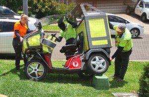
Good research paper by a man passionate for his topic and keen to find solutions. The image shows Dobashi presenting at the universal design conference in 2018 in Dublin.
The article is from the open access proceedings of the UDHEIT 2018 conference held in Dublin, Ireland, an open access publication.
Roadblocks to inclusive streets
Mail delivery vehicle crashes into an electrical services box. Note no footpath only grass.
Streets are essential to mobility and that means pedestrians, not just motor vehicles. Dangerous intersections, pedestrian crossings, steep kerb ramps and those utility vaults make wheeling a nightmare. Steve Wright says that universal design is what we should be aiming for. That’s because there are a hundred ways a street can deny mobility to a wheelchair user. And if they deny a wheelchair user, they can deny people unsteady on their feet and make pushing a stroller difficult. Wright lists his top 8 roadblocks to inclusive streets.
8 Roadblocks to inclusive streets
Narrow footpaths: If two wheelchairs or two strollers cannot pass each other than it is too narrow. Many footpaths don’t even accommodate two people walking side by side. Even where a footpath has sufficient width, there can be other obstructions.
Too many stakeholders: Several agencies have a stake in the footpath – hence the many access covers scattered throughout the paving. And then there is street furniture and rubbish bins.
Crappy kerb ramp: Problems often arise where a steep ramp into the gutter meets a steep rise onto the roadway. The deep V means wheeled mobility devices get stuck half way. Then there is the kerb ramp set on a corner that means people have to roll into oncoming traffic. And of course, there are kerb ramps which don’t line up to create a straight line across the roadway.
Traffic calming islands and safe havens: These must be at least wide enough to take a mobility scooter and an adult pushing a stroller. And not everyone can cross a wide street quickly. Mid-way points are a must if traffic takes priority.
Cross slopes and cambers: Narrow streets also mean that driveways and kerb ramps cut into the footpath creating cross-falls that are difficult for wheeled mobility users.
Footpath closures: Construction projects seem to be blissfully unaware of the havoc they create with their “no pedestrians” or “pedestrians this way” signs. And some of these are not just for a day – they can be for years.
Pedestrian crossing buttons out of reach: While the button might technically be at the right height, sometimes the pole it’s on isn’t within reach.
Transportation decision makers don’t have a disability: Transportation projects go to contractors and subcontractors with many other stakeholders involved. They would do well to embrace some co-design methods.
Wright discusses the issues in more detail from a US perspective. He says: “Universal design is what we should be aiming for, but there are 100 ways that even the most well-intended complete street can deny mobility to wheelchair users due to poor design, implementation, maintenance, and even policy.”
More than twenty years ago the various levels of government committed to an upgrade of Toronto’s waterfront area. The Waterfront Toronto organisation was formed at that time. Since then parking lots and derelict buildings have given way to distinctively designed neighbourhoods. At the end of 2023 the Waterfront Accessible Design Guidelines were published.
“A key part of Toronto’s waterfront revitalization is providing safe, easy and enjoyable access for everyone to the shores of Lake Ontario.”
The Guidelines aim to go beyond minimum compliance and refer to many other guidance documents. For example, street design, pedestrian crossings, and cycling infrastructure.
An accessible waterfront
The section on the Waterfront covers docks and piers, gangways, canoe and kayak launching, and recreational fishing nodes. Boardwalks, pedestrian bridges, and water’s edge all receive attention. The Wave Deck is an interesting feature – more of an art installation than a place to walk or wheel. It is described architecturally as “whimsical” and inspired by the undulating shorelines. Because of the design, a separate and level path of travel is provided.
Liveable communities
The focus of this section is on the design of streets, play spaces, seating, and wayfinding. The advice for streets without kerbs is to have different surface finishes for the different zones. However, it is not clear how people who are blind or have low vision can negotiate these streets. This section does not include housing developments.
Why do some people appear unable to take in what is happening around them in an emergency? Being able to act quickly requires a good sense of the situation. However, not everyone has a sense of emergency awareness. Consequently they find decision-making difficult and fail to act appropriately. A Norwegian study has investigated a universal design approach to mitigate this lack of awareness.
In an emergency, sight, hearing, use of hands and ability to concentrate can all be impaired. Smoke, dust, cold, noise and paralysis from fear can affect anyone’s ability to think clearly. Smart phone apps are a good way of reaching people quickly with important information, but do they account for likely cognitive and physical changes?
The issues and solutions for “situational disability” are outlined in a technical paper from Norway. It raises our awareness that individuals are likely to behave in unexpected ways during a disaster. With an increased rate of climate-based disasters, and the move to digital information systems, this is a timely study. The underlying concern of how people respond is an important one. The paper shows that universal design principles can guide the way in compensating for a lack of emergency awareness.
The full title of the article is, Towards Situational Disability-aware Universally Designed Information Support Systems for Enhanced Situational Awareness.
Emergency Design: Designing as you go
Designing FOR an emergency IN an emergency requires a different design approach to existing tried and true methods. When urgency is the driver of design, processes and methods need a re-think. COVID-19 is a clear case of designing for an emergency during the emergency. So how can “designing-as-you-go” be done?
Designs for emergencies, such as wars or an earthquake, are usually devised before the event. Or they are designed after the event in preparation for future events. The COVID pandemic arrived without notice and few countries were prepared. Hence the need to design for the emergency while it is happening.
A different approach
A case study from Brazil shows how a totally different design approach was required. Rather than using standard methods the researchers took an organic approach to the problem. It was basically designing on the run. The process encouraged the inclusion of people who are often marginalised. While history tells us that Brazil is has not fared well during the pandemic, the study still has value for future situations.
Their approach is based on qualitative techniques. They relied on the knowledge of local people and processes of working together in a horizontal rather than hierarchical format. This approach also allowed participants to see how they could deal with the current situation as well as improvements for the longer term.
“As a path, we point out the importance of identifying areas of convergence of interests, the creation of win-win policies and the daily encouragement of a culture of collaboration at the differing levels.”
The title of the paper is Design amid Emergency. It charts what they did, how they did it and what they learned from the process. Identifying areas of common interest and developing win-win policies to encourage a culture of collaboration was key. In summary, they found the co-creation design process the key to success. It can lead to improved quality of life in both the short and longer term. It also helps to embed resilience within the population.
The government saw the value of co-design with citizens. It remains to be seen if they actually follow through on this networking approach to solving issues.
From the abstract
This article presents the process for the “Design of services under the COVID19 emergency social protection plan”. It was drawn up by a team of researchers and designers from Porto Alegre in collaboration with the Porto Alegre City Government. The focus was on the provision of essential benefits to homeless and other vulnerable people during the pandemic.
The process was developed for the designers involved: without prior notice, within very short time frames and completely remotely, using only digital platforms. As such, the process was developed to respond to the emergency and amid the emergency. The objective of the article is to discuss how to design amid emergency.
The experience was guided by the methodological principles of action research and research through design. In addition to presenting the design results solutions aimed at the short, medium and long term. This article highlights the need to aim for the recognition of difference, the suggestion of alternative views, social innovation, the systemic transformation of society and sustainability.
Taking a cognitive perspective to architectural design is something architect Berta Brusilovsky Filer is passionate about. So she has written a book about it, Evaluating Cognitive Accessibility. Her free book is open access with the help of La Ciudad Accesible with the hope of reaching more people.
Cognitive accessibility is a fundamental aspect in the design of public spaces in the urban environment. At last this topic is receiving more attention in schools of design. The concept takes in easy reading, spatial orientation, signage and processes of interaction.
We rely on our brains to process information to make sense of the environment around us, but we don’t all process information in the same way. Consequently, if we design in a way that assists attention, perception, memory and problem solving, everyone benefits. Reducing cognitive load (too much going on) and maximising comprehension are key principles for independent movement around urban environments.
The book draws on the disciplines of architecture, social science and neuroscience, and presents an evaluation methodology for designers. However, it also provides a recent history of neuroscience and the role our brains play (or not) in making sense of things.
Lots of examples and photographs enhance this PDF publication. The chapter on recommendations covers the many elements of spatial orientation. The concluding chapter addresses the importance of involving people with cognitive conditions in the design process.
Designing aged care facilities is a specialised endeavour but it can include some universal design thinking, such as co-design processes. Some aspects of these specialised designs have application in the design of mainstream homes and neighbourhood places and spaces. The new National Aged Care Design Principles and Guidelines are worth looking at for that reason.
Design Principles:
Enable the person
Cultivate a home
Access the outdoors
Connect with community
Plus, co-design processes involving all stakeholders.
The Aged Care Design Principles and Guidelines is a comprehensive, evidence-based resource designed for anyone with a stake in residential aged care. This includes accommodation providers and design professionals, staff, regulators and policymakers, and older Australians and their families.
The four design principles underpin the guidance which includes residents with dementia. Around half of aged care residents have dementia and half have reduced mobility. As expected, the designs benefit others with age-related health and care needs. Staff needs are also included. The key point is the importance of ‘home’ to residents – a place that reflects people’s needs and aspirations.
Six Personas
Personas cannot take the place of real people, but they are useful for explaining design ideas. That’s because they often provide the ‘why’ of a design. The guidelines use three resident personas, and three staff personas.
Each design principle has an objective and details on how to achieve it. For example, the objective for ‘Enable the Person’ is to support people to maintain health, wellbeing and sense of identity. Scenarios for residents and reasons why some things are important lead to checklists and a narrative for positive outcomes.
Mainstream applications
Considerations such as noise and clutter are just as relevant for people with dementia living in their own homes. Acoustic comfort is especially important for people with hearing loss, and everyone benefits from clean air and good lighting. Tonal or colour contrast becomes more important as people age rather than the fashionable all-white colour schemes.
The guidelines for bathrooms, ensuites and kitchens also have elements that help people in their own homes as well as home care staff. The main point is make them safe without looking like a hospital.
Architect Guy Luscombe recently returned from a study trip in Europe focusing on living arrangements for older people. His comprehensive report featuring case studies from Portugal, Spain, Switzerland, Germany, Denmark and Netherlands, reveals eight key design features important to older people. Windows was top of the list.
He says, “The traditional ‘nursing home’ and ‘retirement village’ are not only outdated, they can actually foster separation and ‘otherness’, isolating people from their family, friends and interests. The aim of this project is to explore how architects can design better environments for older people that improve their enjoyment of life. It starts with rethinking some of our design language.” Many in the universal design movement would agree with this.
Luscombe found 8 key design features with windows as the first priority for both light and seeing out into the neighbourhood. He makes some good comments. For example,
“Aged-care buildings are necessarily beset with constraints and regulations, some good, some outdated. However, many of the regulations put in place to ‘protect’ older people are very often seen as key design features of the building. They become the ‘end’ product. Buildings are seen as either compliant or non-compliant, rather than, say, promoting wellbeing and liveability.”
Population ageing is a global phenomenon and the policy response is to focus on aged care and congregate living. The majority of older adults live in ordinary neighbourhoods, in ordinary homes. This policy blind spot means that anything to do with ageing is seen as a health or care responsibility and not an urban planning one. We need places and spaces for all ages and that means planning policy has to catch up with demographics.
It’s likely that ageist stereotypes underpins the policy blind spot. The World Health Organization’s Age-Friendly Communities Framework covers all aspects of life. Assumptions based on ageist stereotypes might also be why education is not on the WHO’s list.
Image: Eight Domains of Age-Friendly Cities by WHO.
An article in Rethinking the Future briefly covers the issue of population ageing from a global perspective. High income countries are reaching the peak of their population ageing where up to 30 percent of the population is over 60 years old.
Making cities age-friendly is everybody’s business. It is the business of policy, planning, housing, transport, social services, corporations, small business, etc. The article introduces three guides for age-inclusive cities and public spaces.
The Alternative Age-friendly Handbook for the Socially Engaged Urban Practitioner discusses actions such as mapping, auditing, fixing and collaborating.
Age-Inclusive Public Space is a book that documents interaction with 19 practitioners – architects, geographers, psychologists, and social scientists. Each has a view of designing, using and transforming public space to be more inclusive.
Shaping Ageing Cities focuses on 10 European cities facing ageing populations. This report looks at the built environment, housing, mobility and digital environments.
The article concludes by saying cities will have to adapt to changing needs with inclusivity – age-inclusive design practices. There is a short reference list at the end.
The Autumn 2023 Access Insight magazine has an article by John Van der Have on designing for autism. He introduces a design guide by Magda Mostafa and her work on design for the autistic community.
Van der Have begins his article with an older medical description of autism (ASD) and some statistics. As many people know, sensory overload is common for people within the neurodivergent community. Too many sights, sounds, smells and tactile experiences can cause stress and anxiety. That’s why the choice of building materials and systems need additional consideration.
Minimising noise and unwanted sounds through good acoustic design is a vital criterion. But how much acoustic insulation is enough, and how much is too much? Questions such as these have implications for construction costs.
Biophilic principles are beneficial for everyone, but for the autistic community, these elements can enhance their sense of wellbeing. Natural lighting, natural ventilation and views of nature are especially helpful.
Van der Have discusses educational settings and a time-out room where children can still learn in a supportive environment. A calming space at home, as well as a room fitted out to suit a child’s preferences is also a good idea.
As we begin to understand autism and neurodiversity, it’s possible there will be moves to regulate suitable designs. However, regulation should not be needed if designers take action themselves to be more inclusive. Van der Have’s article is on page 18 of Access Insight. It is titled, Design for People on the Autism Spectrum and introduces the work of Magda Mostafa.
Autism friendly design guide
Magda Mostafa, an architect and researcher, developed a design framework for incorporating the needs of the neurodivergent community. The framework is based on 7 design concepts:
Acustics
Spatial Sequencing
Escape
Compartmentalisation
Transition
Sensory Zoning
Safety
In Cities People Love, Mostafa talks about her experiences as an architect working as an autism design consultant. She says designers have to rethink the tools they need. A human-centred approach to design, such as focus groups, assumes everyone is able to speak and participate. She wants to see the principles from the Autism Friendly University Design Guideapplied more widely.
The Autism Friendly University Design Guide was developed in collaboration with the Dublin City University and is applicable in other settings. The first half of the 116 page detailed guide covers the research, and the second has the guiding principles. Mostafa’s work is worth following for anyone interested in designing for neurodivergence.
This Autumn 2023 edition of Access Insight also has an article on water safety for autistic children on page 4.
Autism: What we have heard
The Olga Tennison Autism Research Centre has responded to the NDIS Review Committee’s interim report, What we have heard. In responding they draw on evidence from their research and from autistic people.
The report has 29 recommendations that go beyond the NDIS review to all sections of society. The focus is on children – one in ten Australian children are participants in the NDIS. The recommendations are based on providing supports in everyday early childhood settings and with collaboration across governments and community services.
Longer term support needs are minimised if neurodevelopment vulnerability is detected early and community-based supports are put in place.
When setting up the NDIS the Productivity Commission’s assumption was that about 1 in 150 children would need support. Research at that time showed it was closer to 1 in 69. Currently the estimation is 1 in 31 children are autistic. This figure is similar to those in other countries and indicates diagnoses not prevalence. In addition, autistic people are just as likely to have some of the same challenges neurotypical people face. Intersectionality applies here too.
Community supports in everyday settings
With the right community supports, children can make significant developmental gains and increase their chances of participating in mainstream settings. State and local governments should be key players in the quest to include autistic people in community activities, education and employment.
La Trobe University pioneered an autism screening tool which is used on children as young as 11 months. The SACS-R tool, or Social Attention Communication Surveillance Tool, is based on 15 years of research. Key points are infrequent or inconsistent use of:
gestures (waving, pointing)
response to name being called
eye contact
imitation or copying others
sharing interest with others
pretend play
La Trobe University has devised a free app, called ASDetectto help parents detect autism in their child. the App is 83% accurate and is for children from 11 to 30 months.
This research paves the way for more autistic people to participate in everyday life and feel included.
University lecture theatres
An article from the UK discusses the different design elements needed for students to feel comfortable in university lecture theatres. Autistic students were asked about their experiences in higher educational settings.
Several elements were reported as distracting such as bright lights, echoey rooms, smells, and textures of seats. Coping strategies were also explored. The title of the article is,
The aim of this study was to explore autistic university students’ lived experiences of teaching spaces and how aspects of these spaces affect them.
We conducted a qualitative study comprising one-to-one semi-structured interviews with 10 autistic students from three UK universities. Participants were asked about the aspects of teaching spaces that affect them, the effect these aspects have, and the adaptations they would consider helpful.
We identified 3 themes: Aspects of Teaching Spaces, Outcomes, and Coping Strategies and Adaptations, each of which contained sub-themes. Aspects of Teaching Spaces included sensory aspects, people, seating, screens, and predictability and control. Outcomes included physical symptoms (e.g. headaches, nausea), mood (e.g. anxiety) and cognition (e.g. attention). Coping and Adaptations included personal coping strategies (e.g. wearing headphones, dressing in layers) and environmental modifications (e.g. have dimmer switches).
This study identifies both personal and environmental modifications and adaptations that would support university students’ learning experiences.
While the principles of universal design aim to enable people to stay in their own home for as long as they wish, the principles are also applicable to aged care settings. Four principles underpin the Australian Government’s National Aged Care Design Principles and Guidelines. These principles are:
Enable the person
Cultivate a home
Access the outdoors
Connect with community
The four principles are, of course, applicable to any dwelling or place of accommodation. This is an example of universal design where specific features are essential for some and good for everyone. Consequently, the document is useful for anyone designing any type of home.
The guideline provides detail on each principle. For example, the first principle covers acoustics, air quality, lighting, tonal contrast, supportive seating and comfortable temperatures. Before and after illustrations as shown below provide additional information. At the end of each sub-section is a checklist.
The authors have chosen to use six personas to bridge the gap between abstract concepts and lived experience of residents and staff. Three personas for each group is possibly too few and runs the risk of limiting a designer’s vision of the breadth of diversity. For example, cultural diversity is considered, but other characteristics such as marital status and sexual orientation are not.
The outcomes for the resident personas are explained alongside each checklist. They provide some of the “why” certain features are required by individuals.
Overall, this is a useful guide for aged care in any context – indeed for all people. After all, home is the centre point of our lives. Below is a page from the guidelines showing before and after illustrations.

 People who are neurodiverse often struggle to shed the the idea that they have some kind of disorder. A medical diagnosis is part of the problem – they become a category, a label. This is particularly the case for people with autism. And there are no two people alike. But what they do share in common is a relatively high suicide rate. Why would this be the case?
 Neurodiverse advocate Siena Castellon, wrote a book for teenage girls based on her own experiences. In a New Scientist article Siena relates the common misconception that she should look different in some way. Because she doesn’t, most people think that she can’t be autistic. This is not a compliment. You can see more of Siena’s story in the New Scientist article, Autism isn’t a defect – here’s why we should embrace neurodiversity. There are more links in the article for further reading.
  The autism research field has changed a lot in the last 20 years. We now know the impact the research process itself has on people with autism. With this in mind, a new version of a text book has sections written by autistic contributors from all walks of life.