Colour contrasts can be deceiving because we are subject to optical illusions. The video below shows how two different shades of grey are actually the same. That’s why you can’t rely on judging contrast by eye. Fortunately there are colour checkers to help with colour choices especially for websites. And why do you need colour contrast checkers? Because more than 8% of the population has colour vision deficiency (colour blindness).
UPPER CASE is not good for readability
Colour choice is one factor in readability. Others include using sentence case. Using upper case or capitals does not convey important messages more urgently. The image shows that using upper case to indicate a low bridge did not stop a truck driver from driving under it. Upper case is harder to read because the shape of the words are unfamiliar.

Colours for reading and learning
The processes of how we read text has an impact on how we take in information. Colour coding can help readers quickly identify key information and assist their reading and writing. Colour coding has gained popularity in classrooms to support student learning and reading.
The title of this paper is, What Color Scheme is More Effective in Assisting Readers to Locate Information in a Color-Coded Article?
From the abstract
Color coding, a technique assigning specific colors to cluster information types, has proven advantages in aiding human cognitive activities, especially reading and comprehension. The rise of Large Language Models (LLMs) has streamlined document coding, enabling simple automatic text labeling with various schemes.
This has the potential to make color-coding more accessible and benefit more users. We conducted a user study assessing various color schemes’ effectiveness in LLM-coded text documents, standardizing contrast ratios to approximately 5.55:1 across schemes. Participants performed timed information-seeking tasks in color-coded scholarly abstracts.
Results showed non-analogous and yellow-inclusive color schemes improved performance, with the latter also being more preferred by participants. These findings can inform better color scheme choices for text annotation. As LLMs advance document coding, we advocate for more research focusing on the “color” aspect of color-coding techniques.
Website readability
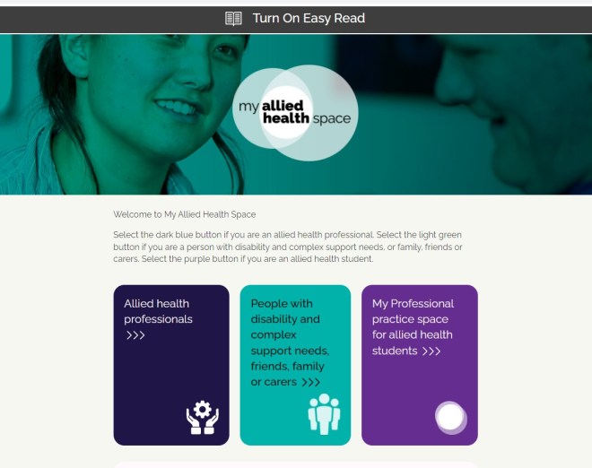
The most accessible websites are those that have an Easy Read option. A good example is the My Allied Health Space. At the top of the home page is the symbol for Easy Read and this is where you click to turn it on. Below is first, the standard webpage followed by the Easy Read webpage.

My Allied Health Space home page with option for Easy Read at the top of the page.

Thanks to Dr Em Bould, Senior Research Fellow at Monash University for the inspiration for this post. Dr Bould has great advice on this topic based on research.
