The Places for Women and Girls Handbook is the result of extensive consultation and research in the UK. Knowledge and good practice underpin the PDF publication which presents the information in the usual government format. There are three sections: Setting the Scene, Gender responsive action planning, and Playbook of Interventions.
The London Legacy Development Corporation developed the Handbook in conjunction with Arup. “This is the next step forward in our work to create more inclusive spaces. It shines a light on the relationship between urban design, planning and gender equality.” Lyn Garner, CEO, LLDC.
Gender informed approach means:
Commitment to systematic implementation in all projects
Governance frameworks to ensure continuity of commitments
Genuine understanding of women’s and girl’s live experience
Evidence-based research at a local level
Cross sector collaboration with key stakeholders
Measuring impact and identifying lessons learned
Five aims define the key attributes of positive space:
Sense of ownership, belonging and identity
Health and hygiene, comfort and safety
Empowered and enriched with choices of where to go
Accessibility and access to public domain and services
Mobility and connectedness with seamless journeys
This is a classic government handbook with every detail covered. It amounts to a training course for developers, planning and design professionals, and local authorities. Examples help illustrate principles of participatory and co-design methods.
This handbook is in a different style to the PDF of the LLDC publication with one page to the screen making scrolling and reading easier. The report is in response to the rise in sexual violence towards women, girls and gender diverse people.
“An intersectional lens is critical to … recognising that safety is different for different people.” Dr Mimi Sheller (2018) from the report.
“There is no neat match between what crime statistics might say about safety of an area and how people actually feel fear and safety in that area.” Dr Claire Edwards, (2020)
A spectrum of experiences
Safety is a spectrum from mild inconvenience to extreme danger. These include the daily inconvenience of having to take a longer route home to avoid certain areas, having to carry a buggy up steps, and being underserved by public transport systems. These are microaggressions that create daily low-level exposure to physical and psychological harm.
This sends the message that public space is not ‘for’ you. When a group is prevented from using a public space easily, it means their experiences and realities were not included in design considerations. Safety issues for these groups were not prioritised. Consequently, exclusion is the common foundation of unequal public space provision.
Safety in Public Space: Women, Girls and Gender Diverse People is a City of London publication. It is easy to read and a good example of plain language for this type of document. The Handbook covers the principles, practice, and the development of the handbook. The section on additional resources with lots of photos is a rich source of information.
Most people have experienced buildings and places with poor wayfinding features. But the anxiety of not knowing which way to go is increased for people who experience sensory overload. Navigating space without sensory overload is one aspect of Berta Brusilovsky Filer’s work. Minimising disorientation through spatial design solutions is the basis of her design thinking.
Reducing high risk conditions for disorientation and those caused by heightened sensory sensitivity makes sense for everyone. But this is more important for people who experience sensory overload.
Berta Brusilovsky Filer’s Model
The model is based on a universal design approach. This means that something essential for one group makes for greater convenience for others. Here is a brief look at the key aspects for reducing confusion.
Neutralise the labyrinth effect: avoid designs that feel like a maze
Ensure clarity at junctions and crossroads: make it clear where to go next
Remove distractions that make it hard to pay attention: consider patterns and colours
Use clear signage: simple texts, pictures and numbers: make signs specific to each area
Design seamless transitions without abrupt changes for a smooth uninterrupted experience.
“Housing as architecture has been extensively studied, encompassing structural, economic and technical factors, as well as original design solutions. This book incorporates the sensibilities, needs, and variables of neurodiversity, opening our eyes and broadening our horizons, enriching architecture by focusing on people’s quality of life.”
Designing housing for diverse users includes specific and particular characteristics of neuroscience, architecture and design, facilities, materials. Specific conditions for a variety of neurodiverse experiences that are not commonly found compiled in a single text as they are here.
Or contact the author directly – there is a PDF available but with reduced links.
According to Cathy Basterfield, there is a difference between Easy English and Easy Read. She says one is led by evidence with people who rarely read (Easy English), the other is led by lived experience (Easy Read).
Easy English:
Is grounded in universal design principles
Applies the ISO Plain Language Standard
Applies academic evidence
Consults diverse people with low literacy
The two examples above of how to make a complaint clearly show the differences. The Easy English example has a clear title with an illustrative graphic. The Easy Read example uses marketing images and branding. This corporate presentation requires knowledge of what the images and brand mean.
The intended audience of Easy Read is people with intellectual disability. They don’t learn differently, they just learn in smaller steps. They need to learn the skills in the place they will use them and will need more repetition.
Speech pathologist Basterfield stresses the lack of regard for Easy English with an emphasis on lived experience advisory panels for Easy Read. She asks why people who experience real difficulty reading remain unheard in written communication. Of course, if they can’t read the invitation, how can they find out about such events?
Easy Read is good for some people, but not all the 44% of people with low literacy.
Chloe, who has an intellectual disability, shares her experience and views in a conference paper about being a research participant in a co-design project. The paper outlines her experience on developing social robots to benefit everyone.
Chloe’s quotes based on answers to questions form the basis of the paper. The academic researcher involved in the project reflects on the process of co-design and the nuances of co-design participants and co-researchers. This is just one of several QUT studies using co-design methods with people with intellectual disability.
Chloe works at the head office of a charity that supports people with intellectual disability. She also receives support as a client. Chloe began participating in co-design research at QUT in 2019.
Image: Chloe sits with a microphone on the left with a QUT researcher on the right. Between them is Pepper the robot.
The co-design approach was conducted through interviews and a prototype of a social robot named Pepper. Chloe provided insights into how social robots can improve the lives of people with intellectual disability. In addition, it has given her experiential knowledge of emerging technology and their benefits.
Chloe has built her skills over time as a research participant in a range of technology research projects. In turn, these skills have made her valuable to the design strategy. She can now spend some of her working time as a key member of the research team in the future.
Social robots as coaches
Robots can assist with aspects such as self-regulation and providing reminders. Chloe says she wants see Pepper help people by saying things like “you are doing too much of this, or not doing enough of that”. Chloe has a health condition that sometimes requires hospitalisation. This is where she thinks it could help her a lot.
“Hospitals would be great because [when]I’m in hospital for two weeks, I walk up and down the corridor because I can’t or won’t sit still […] I try and do what the doctors say, but I might not, I know this may not be working so Pepper may be saying, “Alright, just calm down a minute, Doctor is trying to help you.”
Insights on inclusive design for social robots
Chloe’s reflections highlight the moral support aspects that are too often ignored in the assistive robotics work. It’s not just about physical tasks – gentle encouragements are key to the robot’s purpose. Most research tends to focus on independence and considerations for usability.
Involving people with intellectual disability in research projects builds their expertise which then leads to being a co-researcher. Academia has yet to fully recognise the contributions of co-researchers like Chloe. And ethics committees also need to re-consider some of their ideas on “vulnerable” participants. It will be important to follow Chloe as she continues her journey as a member of the research team. There is much to learn by all involved.
Three practicing architects discuss their perspective on systemic industry failure to create accessible and inclusive cities. This is because traditional thinking pushes accessible design to the margins as an afterthought. And then only in terms of technical and regulatory compliance. So how can we change the mindset to focus on public good and work towards the accessible city?
The architects discuss how their thinking has changed from their early careers to their current thoughts. “None of us conceived the power of the built environment to exclude”. Nor did they realise the complexities of the built environment ‘production system’. The image of the dominoes represents the reliance the many stakeholders on each other to maintain the system.
The image gives an impression of the links between of some of the stakeholders. Clearly, the fragmented nature of the system has an impact on the ability to adapt and change. The key people at each end of the domino line are in local government. Perhaps more could be done to assist them in implementing accessible cities.
With embedded hierarchies, reliance on norms and accepted practices, and “ways of doing things” makes things complex. However, the architects claim a complex problem is not necessarily a wicked problem.
Architects cannot do it alone
In Australia, most architects work with small practices in the private sector. Expanding mindsets within the private market to consider accessibility is therefore problematic. One approach to change is to have people with disability positioned within the industry to be core actors. This will require experts and non-experts working together.
Time to join the 21st Century
The enduring legacy of the charity model in design thinking means people with disability remain excluded as “the others”. This is evidenced by the failure of practitioners to even enforce basic compliance. Industry argues that compliance is both vague and restrictive of creativity.
The architects’ paper provides more detail on their experiences of interacting with other built environment professionals. They discuss the commentary of workshop participants and where progress might begin.
Although there is little professional opposition to the notion of accessible environments, the status quo remains. That’s because the driving force in that direction is countered by a more powerful force in the other. The restraining factors push down to the status quo so the ultimate goal of inclusion remains elusive. The graphic below depicts the imbalance between driving and restraining forces.
Image from the paper.
The architects have both personal and professional experience of built environment inaccessibility. That means they understand the entwining of disability, health and wellbeing. While they share their experiences and have a commitment to change, it “remains somewhat of a mystery” as to how change might be effected.
As practising architects in Victoria, Australia, we see significant, systemic industry failure, impeding the development of accessible and inclusive cities. Contemporary practice and design values push ‘accessible design’ to the margins. It is often considered as an after-thought and only in terms of technical and regulatory compliance.
Built environment practice needs to be challenged into deeper ways of thinking and challenge professional discourse. The industry has both control over built environment accessibility outcomes and its accountability in serving the public good.
Cities invariably comprise neighbourhoods. The design mindset must change to fully engage with socio-ecological, public built environments. Design practice must improve its neighbourhood site analysis approach. It must go beyond private, contractual site boundaries and immediate physical surrounds, to understanding end-user experiences, neighbourhood journeys, and the broader scale of (in)accessibility.
Industry attitudes, practice approaches and the way disability is positioned by industry must change to embrace processes that necessitate diverse actors working together across multiple disciplines and sectors with people with disability being core actors in decision-making.
We believe that opportunities exist in building industry interest and capacity. Research-informed built environment practice embracing systems-thinking, human rights-based approaches, and transdisciplinarity can be effective for aggravating industry change and the way industry positions disability.
This paper adopts an analytical, collaborative autoethnographic approach. We examine case studies of neighbourhood-scale accessibility assessment and outputs from activities. We question why built environment practitioners believe inaccessibility exists, and self-reflection on 10 to 35+ years of working in architectural practice. Importantly, this paper argues that built environment practitioners, and architects in particular, must accept accountability for the impact of their actions on people with disabilities’ lived experiences.
Researchers like to have a set of defined terms for their field of work. It makes communicating with each other clearer and easier and for comparing studies. But when similar concepts begin from different origins, different terms are coined depending on the context.
Universal design is a concept that falls within the field of social science. As such we can expect different terms for the same and similar concepts. Regardless, the participation of all is the ultimate goal.
Societies are not fixed in time and consequently, terminology moves with it. So rather than debate the terms, we should accept and group the different terms as seeking the same outcomes. The concepts have been around for more than thirty years, but there is still significant confusion in how to apply them.
Three Swedish researchers propose a harmonised model and the synergies they create. In their paper, the researchers explore how the concepts of accessibility, usability, and universal design have developed. They explore how these concepts relate to and complement each other to create a 21st century view.
Accessibility: person-environment interaction
This approach implies that problems should be expressed and solved from a person-environment relationship. It is based on norms aspiring to meet the needs of most and underpins standards. As such, accessibility is measurable in terms of dimensions and specifications. It has roots in human rights legislation.
Usability: user perspectives on interactions
This term has found its way into policy documents, legislation and regulations. This definition highlights the importance of functionality and user experience. Practitioners in the field of of digital technologies often use the term user experience. In the case of people with vision impairments this has been a key driver of digital designs.
The International Standard ISO 9241-11 describes usability as the “extent to which a product, a service and the built environment can be used by specified users to achieve specified goals with effectiveness, efficiency and satisfaction in a specified context of use” (2018).
Usability cannot be measured in the same way as accessibility because it relates to personal experience. It is expressed by how the design enables people use the product or service.
Universal design – value based vision
Universal design is gaining global prominence as more people are taking on board the UN Convention on the Rights of Persons with Disabilities (CRPD).
The CRPD presents universal design as the overarching principle. It is the basis for a national commitment for everything new created in society. The concept is used as a verb (to design) and a noun (a design) in the English-speaking world.
Universal design is a value-based concept that takes a broad view of society. It is both a vision and a process. It is most often understood as being about people with disability. But this is misleading.
The definition in the CRPD makes it clear that the concept concerns all people. It is about a diversity of thought and all human functions fall under this concept. Universal design is not a sub-category of design or special process. It is intended to be an integral part of ordinary design.
The concept of universal design has been confused with the definition of accessibility in policy documents. Hence the hybrid term “universal access”. Citing universal design as a standard or regulation is against the original intent. Accessibility and usability are tools for translating universal design into practice at individual, and societal levels.
What does this all mean?
The researchers offer a thoughtful way forward by merging the concepts of accessibility, usability and universal design. While they come from different origins, they have evolved. Universal design must have accessibility and usability as a minimum for people with disability. However, these concepts alone are insufficient for full participation.
We describe recent developments, how the concepts relate to and complement each other, and the synergies they create. We argue that definitions are crucial and that the concepts can be combined and harmonised in a synergistic entity. The participation of all is the ultimate goal of society.
Universal Design is the value-based vision and approach to design grounded in human rights that, through intersectionality and involvement, should permeate all aspects of society to create the best possible conditions for participation for all citizens. We propose a harmonised model where the concepts are explicitly defined and closely connected, with each other.
Where are the humans in Human-Centred Design? Well, they are rarely in the design drawings. So what would happen if designers were asked to put drawings of people in their designs? That’s what an interdisciplinary group of researchers from the University of Michigan wanted to find out.
“The simple intention to include representations of people interacting with design ideas can assist designers in centring humans in design processes.”
Human centred design approaches aim to generate better solutions through understanding people’s social, emotional, and physical needs.
All designs begin with basic line drawings and idea sketches. This study showed that if you include people in those drawings, the designs change. This simple change made designers think more about users. Such a simple technique could make a significant difference to creating more inclusive designs.
The image below is from the research paper and shows that designers don’t have to be good a drawing people – stick figures will do. It’s about making designers think beyond their design to the impact it has on people.
Image from the research paper
Just add people
The advantage of the simple instruction of ‘represent people’ avoids specifying how the process of mental visualisation is to take place. This simple instruction produced design outcomes with a deeper consideration of putting people at the centre.
The researchers found that with the instruction to draw people, students focused more on people’s social and physical context of use as well as their personal preferences and values. They also found that depicting people decreased students’ claims that their designs worked for ‘everyone’. This indicates a better understanding of the ways design decisions impact different people differently.
While the researchers did not measure the diversity of people students considered, they saw a shift to recognise justice, and other social practices. Physical and emotional contexts, and a wider variety of stakeholders also became more apparent.
Although this paper does not explicitly mention diversity or disability, the process shows that this is both possible and essential.
From the abstract
How can designers ‘centre humans’ in their design thinking? Creating design ideas and sketches explicitly representing people can help designers think about how their designs impact people. Using a think-aloud protocol, student designers generated ideas without instructions and then with an instruction to depict people in sketches.
When people were represented in sketches, student designers reflected more about how people were impacted by their designs. Results showed that representing people within design ideas led to considering more physical interactions, emotions, contexts, and stakeholder roles.
The disability discrimination case involving the Sunshine Coast University Hospital provides a few important learning points. The hospital was found to have caused indirect discrimination to people with vision impairments. Rectifying the long list of breaches of the Disability Discrimination Act reaches into the millions of dollars. But does compliance make for inclusion in the prescribed solutions?
The Sunshine Coast University Hospital (SSCU) was the subject of the late Peter Ryan’s complaint. As a legally blind person he claimed disadvantage in the way access was provided for him. The main point was inadequate wayfinding.
Learning from the court case
A blog article from the Humanics Collective website discusses the issue of the Court’s demands for specific features to be rectified and/or applied. The Court ruled that the hospital did not meet the obligations of the Disability Discrimination Act (DDA) and the Access to Premises Standard.
Many areas of the hospital did not contain tactile or Braille signage or a functional wayfinding strategy. This included lack of luminance contrasts, small fonts, and appropriate signage. In addition, floor surfaces and other finishes, including the use of colour, came under scrutiny as well. This impacted Ryan’s ability to navigate the spaces independently and with dignity.
Beyond compliance is required
Humanics Collective was engaged to improve compliance with the Court’s ruling. They assert that complex environments need to consider more than compliance to standards. That’s because it doesn’t guarantee usability, and equity isn’t always achieved through uniformity. Indeed, many people experience issues with finding their way around hospitals.
In their list of solutions, Humanics Collective includes the use of hospital volunteers to assist people with vision impairment. The use of volunteers was used as a defence in the court case, but the key issue is that many aspects of the building and surrounds did not comply with the Access to Premises Standard. You cannot use volunteers as a work-around to make up for deficiencies in the design.
Wayfinding not just about signage
The goal of a wayfinding strategy is to help people find their way. So installing more of the same signage isn’t necessarily the answer. However, the strategy should at the very least provide the statutory minimums.
‘One key point of contention in the ruling was the interpretation of “replace.” We argued that replacement shouldn’t mean reinstalling flawed signage in the same location, but improving usability through better placement, higher contrast, and greater visibility.’ Image from Humanics Collective.
The Humanics Collective blog suggests the answer is not in more signage but in smarter support. This includes meaningful pre-visit information and training front of house staff to assist people with vision impairment.
Their on-site testing with user groups found that their proposed changes beyond compliance made the space feel easy to navigate. Importantly, users consistently said there is no single vision impairment experience. Consequently, different people use different tools to get around – a cane, a guide dog, signage, and now wayfinding apps on their phone.
The title of the blog post is, “What We Learned from the Court Case: The Sunshine Coast University Hospital ruling and its impact on inclusive wayfinding”. The real learning is not to think management strategies, such as volunteers, are the answer to failings. And make sure you comply with the Access to Premises Standard as a very minimum. Taking a universal design approach to go beyond compliance minimises the risk of indirect discrimination and an action under the DDA.
It’s about the whole journey to and within the building
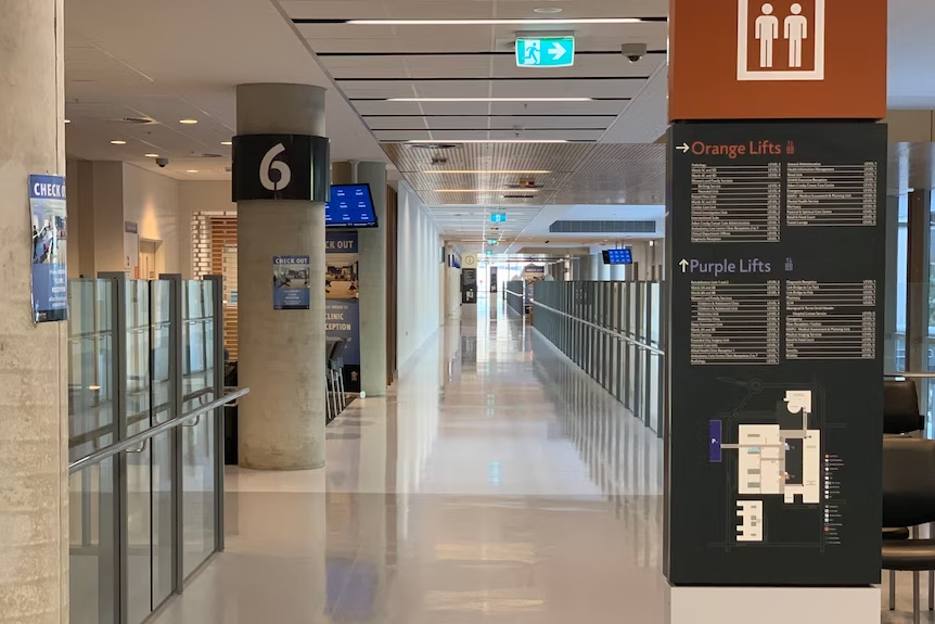
Everyone should be able to arrive by any means, make their way to the main entrance and to a toilet. They should also be able to find their clinic and practitioner. Hospitals are now relying on digital applications to guide patients. These include screens on which to register arrival and machines to produce a ticket number. Then patients are to locate a screen within the clinic that tells them when their number comes up. Then they are to make their way to the consulting room.
The tall signboard on the right hand side of the image has a black background and very small light grey font. It lists places under Orange Lifts and Purple Lifts. The corridor has a high glaze with lots of reflection and glare. Image from ABC News.
The journey from the front entrance to the consulting room is fraught with difficulty for many people, not just people with vision impairment. It assumes many different abilities in sight and hearing, speech, dexterity, mobility, and digital literacy.
The Court ruled on two things: the breaches of the Access to Premises Standard, and the indirect discrimination under the DDA. It seems from the blog that Humanics Collective wants to do better than just compliance.
Background to the court case
The 2021 court ruling in Queensland is a reminder to designers and builders not to ignore disability access. But many do, and that is probably because they are unlikely to be called to account. Complaints under the Disability Discrimination Act that go to court are rare.
That’s because the person who experiences the discrimination has to make the complaint. And that’s tough. Court cases are very stressful for complainants who often have fewer resources to cope.
The Hospital supposedly complied with the National Construction Code and the Access to Premises Standard. However this was not the case and calls into question the issue of building certification.
This case highlights conflicts of interest could be more common than we know. Both the building certification firm and the access consultants are owned by the same group. Consequently, conflicts of interest can lead to builders ignoring disability access.
The building won numerous awards for Architecture. So this raises questions about what is judged as a good building. Time to start including accessibility for all in the judging criteria for these awards.
Unfortunately Peter Ryan passed away before the Judge handed down his decision. A Sourceable article written by Bryce Tolliday has a lot more detail. The title of the article is Non-Compliant Hospital Costs Queensland Taxpayers Millions.
ABC News in 2023 has an article about the delays in implementing the remediation work after two years. In 2025 the remediation work is still lacking which could lead to another complaint under the DDA.
Research abounds on universal design and inclusive access in the built environment. But is there another role for universities in the built environment? A group of researchers in New Zealand thinks there is.
Research on universal design in the built environment doesn’t seem to be going anywhere. So, should universities to do more to improve the built environment? If so, what should they do? Image of Massey University.
Many academic research findings have not led to real improvement. This is because political activism is not the main function of academics. However, academics have a role in the collation of data from all stakeholders and drawing of conclusions as to what might be useful initiatives. Two universities in New Zealand got together to see if they could improve matters. In their paper, they present a case study in bringing together the key stakeholders.
The research paper explains their method of engagement with students, disability advocates and construction stakeholders. They were able to introduce the concepts of a universal design approach to the design and construction courses.
Students collected data on the perspectives of quantity surveyors, construction site managers, project managers and architects. They carried out access audits of buildings and the people that worked in them. This data collection is ongoing in 2025.
Three steps to improvement
First, they formed symbiotic relationships between advocacy groups, disability organisations and academics. The end result was a petition with nine actions to the government to improve access to the built environment for people with disability.
Second, academics who were supervising students got together with construction sector stakeholders. They shared access to data on case study buildings and construction professionals’ shared their perspectives.
In return, fact sheets and short articles were used to increase the knowledge on different aspects of accessibility. Many public buildings in New Zealand are inaccessible, and few construction sector stakeholders know about the need for universal design.
Third, approximately 200 students a year will get Master of Construction degrees from Massey University’s School of Built Environment. Universal design is included in the master’s program. This means future construction lawyers, quantity surveyors and construction managers will know more about this important topic.
The research results were presented to legislators, construction professionals and advocacy groups. It has helped raise awareness amongst stakeholders with a petition to government with recommendations.
Traditional design frameworks often overlook the lived experiences of women, young people, older people, and other marginalised groups. A paper from South Africa proposes a model that integrates and mainstreams gender and intergenerational needs.
This paper draws on policy frameworks and case studies from Vienna, Zurich, Luxembourg, and South Africa. Safety, social cohesion and environmental resilience are key elements for inclusion. Image of a City Tree in Berlin.
Urban public spaces are traditionally designed with a focus on aesthetics, functionality and efficient infrastructure. However, such approaches are no longer addressing the complexities of urban societies.
Vienna, Zurich and Luxembourg
The concept of gender mainstreaming has its roots in gender equality and women’s rights to public space. Vienna, Austria has a Gender Mainstreaming Strategy. The city has invested in lighting improvements, and improved surveillance through the design of open spaces. Transportation systems also fall under this strategy.
Luxembourg City is a pioneer in creating accessible and gender-sensitive public spaces. Urban planning and design considers people with disability, women, children, and older adults. The city has pedestrian-focused urban spaces that are safe and easy to navigate.
As one of the most inclusive cities globally, Zurich, places an emphasis on its diverse social and cultural society. Zurich’s approach is one of participatory planning by engaging with marginalised groups. The aim is to include the varied voices of residents in planning. Image of Rennweg.
This paper has more detail about different European cities and good urban design examples. Cities like Zurich have set a high standard in making public spaces accessible for people with disability. Transport networks are integral to this strategy along with public parks, toilets and street furniture. It goes beyond regulatory compliance to embrace an ethos of universal design.
While South Africa acknowledges the importance of inclusive cities, there are barriers to implementation. These include institutional silos, budget constraints, and limited professional capacity at local government level. Policies are in place but implementation is lacking. However, the case studies of Zurich, Vienna and Luxembourg show that inclusion is achievable.