The terms “visitable housing” and “visitability” are essentially about people who use mobility aids having the same rights to visit friends and family in their homes. It doesn’t necessarily mean they can live there or stay overnight. The three key features associated with visitability are a step free entrance, wider doorways and a usable toilet on the entry level. Part M of the UK building code reflect these features. Visitability differs from full accessibility and universal design. It was devised as a minimal baseline to entice the property industry to get on board with the ideas. Although the concept has been around for twenty years, it has gained little, if any, traction. Visitability is not a concept easy to sell unless the buyer thinks they need it. And few do.
Perceived value of visitable housing
A research project carried out in Ohio in 2015 looked at: home-buyers’ perceived value and perceptions of visitable features; developer, designer and builder perspectives; real estate agent views; estimated costs; and which house buyers were most likely to buy. The aim of the report was to create a persuasive argument for adopting visitability in new homes in Ohio. However, the researchers acknowledge industry resistance and suggest incentives to encourage uptake, or mandating the features.The report is structured into three sections based on their surveys of homeowners and home buyers, industry stakeholders, and real estate agents. All groups were asked to assess photos of visitable features in homes. In all instances, participants believed the homes would sell for more and sell more quickly. Industry stakeholders estimated the features would cost less than one per cent of construction costs. This is in line with other research.The title of the report is, Perceived value of visitable housing in Ohio. It is also available through Academia.edu. Elements of the research are available in their paper, Homeowner and homebuyer impressions of visitable features.In Australia minimal access features are now in the National Construction Code in the form of the Livable Housing Design Standard. States and territories are adopting the Standard into their respective building codes at different dates in 2024 and 2025. Queensland adopted the Standard in 2023.
“Inclusion” is a word used widely, but what do we mean by this? How does it happen? Who makes it happen? Given that we are not inclusive now, it has to be a futuristic concept – something we are striving for. If we had achieved it we would be talking about inclusiveness, and we wouldn’t be writing policies and advocating for it.
A conference paperdiscusses what we mean by inclusion and it illustrates why it is hard to achieve. The difference between inclusion and inclusiveness is more than semantics. They have different perspectives and ask different questions. Inclusion relies on one group looking at another group and inviting them in. It maintains a language of separation, for example, accessible, disabled, elderly and design-for-all. Inclusiveness looks at everyone equally and supports a whole population approach. Economic arguments and solutions are viewed differently. Inclusiveness is not a contest of rights and not one group giving something to others. All costs and benefits are measured from this perspective.
A case study in creating universally designed urban spaces is a good way to showcase how it is done. Universal Design: New York 2 is not a new publication, but the principles are still relevant.It provides guidance for all aspects of an urban environment as well as temporary lodging, workplace facilities and human service facilities. The guide is comprehensive covering circulation systems, wayfinding, seating, public amenities, cultural facilities, renovations and additions, and more. It also lists seven myths about universal design and shows how they are just myths:
1. There are only a small number of people who benefit 2. Universal design only helps people with disability and older people 3. Legislation for disability rights have created equality, so no need to do more 4. Improved medical technology is reducing the incidence of functional limitation 5. Universal design cannot sustain itself in the marketplace because the people who need it most cannot afford it 6. Universal design is simply good ergonomic design 7. Universal design costs even more than accessible design
How do hearing loops work? First, they have to be connected to the sound system and switched on whenever the system is on. It’s not something people should have to ask for – because they won’t. Second, it requires everyone to use the microphone. No more, “my voice is loud enough”.
Systems vary across venues and they are not all the same. Fortunately there are some fact sheets on the various types and when they should be used.
Too often systems do not work or are not turned on and there is a lot of confusion as to how these systems operate. The best way to test a system to see if it is working is to ask someone who is wearing a hearing aid with a ‘T’ switch. Hearing Connectionsis one company that has a technical manager who wears such a hearing aid. This seems the only way to be sure that the system is connected properly, switched on and functioning.
Too many systems fail to work even when technicians claim they do. Here are some of the fact sheets on the Hearing Connections website.
Some technologies are overtaken by new discoveries, but others just keep getting better. One such technology is hearing loops. The basic technology remains the same but improvements are being made over time. Modern hearing aids have not improved so much that people don’t need augmentation in meeting venues. It’s a bit like saying wheelchairs have improved so much we don’t need ramps. Hearing loops are not obsolete technology.
Andrew Stewart at Hearing Connections nicely addresses all the myths and misconceptions about hearing augmentation systems. He says that the hearing loop is still the most efficient and effective for users, and the most convenient for venue managers. Other systems are not popular because of additional equipment that needs to be worn or used, which singles users out from the crowd.
Myth 1: Hearing aids have improved and sufficient by themselves
Myth 2: Hearing loop systems are superseded by other technology
Myth 3: The newer technology is better
Myth 4: Use your smartphone as a receiver
Myth 5: SoundField systems are the modern-day replacement
Myth 6: Bluetooth is the answer
Myth 7: Captions are good enough
An excellent resource for building designers and property managers.
Yes, you do need to use the microphone
There are three types of hearing augmentation systems – but which one to use? The system preferred by most users is a “hearing loop”. It is connected to the sound system in a meeting room or auditorium. People wearing a hearing aid with a telecoil, have the sound sent directly to the device. It screens out all the background noise and gives definition to the speech. However, a microphone must be used all the time. So no more “I’ve got a loud voice, I don’t need a microphone” because it won’t be transmitted.
Hearing Connections website gives an explanation of this system, FM and Infra-red systems. A system with an ambient microphone that picks up all the sound in the room amplifies all the sounds – so background noise is included with the speech. It can defeat the purpose. Also, the system should be turned on automatically – no-one should need to ask for it – that’s the point. Building designers, owners and managers have a legal obligation to incorporate the needs of people who are deaf or hard of hearing.
Online learning is not new for many higher education students and teachers. Accessibility of online content is improving but there is still a way to go. Students with hearing loss are at a greater disadvantage than many others. Hearing loss is not something you only get as you age. Many young people aren’t even aware they have a hearing loss. An article in The Conversationdiscusses the issues and provides links to some resources.Students with hearing loss rarely speak up about it, so lecturers will never know who is missing out or how many are missing out. Regardless, all students learn better with captioning. There are some myths about the cost of captioning. Yes, before Google and YouTube developed Do-It-Yourself captioning, it was expensive to get videos captioned. But times have moved on. However, live captioning with a stenographer is another matter.The title of the article is, How to help students with a hearing impairment as courses move online. It has good, easy to do advice.If you want more tips on making sure everyone is included in videoconferences, have a look at the previous post, Videoconferencing: Zoom in to hear.
The current bathroom trend is freestanding bath tubs. But the glamour of this kind of tub is washed away when you can’t use it or have an accident doing so. The transcript of a podcast by the Universal Design Project discusses the pros and cons of these bathtubs. Here are a couple of pertinent snippets from the discussion:
“A lot of times when someone is curious about universal design or accessibility, they’ll do a quick Google search to see what they can learn about it. Usually, they’ll search for pictures too so that they can get a better idea of how someone might have implemented universal design features in the past. But we’ve found that many times these pictures aren’t really depicting universal design and it’s very possible that architects and builders will see these pictures assume the design works for everyone, and run with it, and that might not be the best thing to do, especially in bathrooms.
“Most of our design advisors agreed … that they are dangerous and not functional. … [One of]the biggest flaws of this tub is that the sides are way too tall, the edges are way too narrow and it’s way too deep. These three flaws have a huge impact on how someone is able to get in and out of the tub.
The podcast goes on to recommend some design improvements, but that “we really needed to go with a regular tub set up”.Freestanding tubs are meant to stand away from walls. There are two problems with this. The tub is usually near a wall but not near enough to put a steadying hand on the wall or access a grab rail if needed, but not far enough away to make cleaning easy. In situations where the shower is over the bath as well, a grab bar is probably essential.The best part about this fashion is that free standing bath tubs are usually set in larger bathrooms. This has to be a plus for accessibility, bathing children and for helping someone in the bathroom. Freestanding tubs, are they safe? is part of The Universal Design Project Good Fit Bad Fit series, and you can access the podcast as well as the transcript.
There are at least two reasons to make podcasts accessible. First, they reach more people, and second search engines like it. It’s the same reason why descriptions of images are important. Both reasons help grow your audience. A third reason is that transcripts help you to find the content at a later date. If you have transcripts for every show, you can search and reference what was discussed on your show at any point. In essence:
It’s the right thing to do People with disabilities benefit Other people benefit You benefit – Your content is indexed Your reach increases There may be legal requirements
The Podcast Accessibility website has more detail on the list above about making podcasts accessible and why it is important for everyone. It also has other useful information apart from transcripts. It’s an easy read.
Social factors influence how people with disability choose to use their technology. So they are sometimes disadvantaged because they don’t want to be “different”. Design for Social Accessibility is an approach that encourages designers to focus on social as well as functional factors in their designs.
Using a workshop method, researchers worked with designers to bring about a change in their attitudes, and to see the effectiveness of the Design for Social Accessibility approach. The results are published in Incorporating Social Factors in Accessible Design. It is a lengthy read because it includes quotes from workshop participants and the reporting is very thorough. They conclude that accessible design is within the reach of professional designers if given appropriate tools and resources. Designing technologies for people with disability does not exclude people without disability. The focus of this study is on people with vision impairment. However, the principles are applicable to the design of any product or place. The article is open source.
Abstract:Personal technologies are rarely designed to be accessible to disabled people, partly due to the perceived challenge of including disability in design. Through design workshops, we addressed this challenge by infusing user-centered design activities with Design for Social Accessibility—a perspective emphasizing social aspects of accessibility—to investigate how professional designers can leverage social factors to include accessibility in design. We focused on how professional designers incorporated Design for Social Accessibility’s three tenets: (1) to work with users with and without visual impairments; (2) to consider social and functional factors; (3) to employ tools—a framework and method cards—to raise awareness and prompt reflection on social aspects toward accessible design. We then interviewed designers about their workshop experiences. We found DSA to be an effective set of tools and strategies incorporating social/functional and non/disabled perspectives that helped designers create accessible design.
There are two points of view about universal design in learning (UDL). Some say it is the way to go, but others say it is not in the best interests of children. An article in the Irish Times presents both views. The National Council for Special Education supports the inclusive approach and cites the model developed in New Brunswick, Canada. Learning together helps create an inclusive society – it’s not just about education itself. Segregated children become segregated adults.
The general secretary of a Catholic schools association makes the case against inclusion and maintaining segregated learning situations. He points to some of the issues not addressed by proponents of the New Brunswick model. These appear to be more on the basis of a philosophy not being a teaching method.
The National Council for Special Education is looking at the issues closely. In their Policy Advice on Special Schools and Classes, they explain the background work they have done on this topic in preparation for their report to the UN in 2020. This is a good reference document for anyone wanting to know more about the UDL approach to school learning.
Incidentally, UDL in higher education is taking off. To an outsider, it is not clear why schools are not following suit. Both institutions are obligated under the UN Convention to establish inclusive education.
Not sure what UDL is about? Have a look at CAST information – it is a leader in this field or go to their websitefor more. There are related posts on UDL in the UD for Learning section on the left hand menu of this site.
No matter where you are in the world, there is one thing all cultures share in common: a need for accessible housing. There is a gap between what we know about ageing populations and people with disability and building homes that are inclusive.
The Global Network for Sustainable Housing has a handbook that aims to bridge that gap. As a global publication it addresses slum upgrading, large-scale affordable and social housing programs. The handbook provides concepts, policy approaches, practical information and technical tools. It also shines a light on the global importance of developing accessible and sustainable urban environments. It is time to apply these solutions so that we can gradually outgrow access barriers for everyone.
The title of the handbook is, “Accessibility of Housing: A Handbook of Inclusive Affordable Housing Solutions for Persons with Disabilities and Older Persons” and is published by UN Habitat. This publication has some good explanations of how and why universal design principles and approaches should be applied universally. On Page 9 it explains,
“Universal design principles, when properly interpreted, can be a solution for low-cost projects as its main concept is to adapt the design to all users. Therefore, every project can be re-thought under this perspective, the same way low-cost solutions are created to attend to a population’s needs with small budgets. Universal design provides infinity of possibilities as it allows the use of innovative solutions provided by professionals involved in the process. It is important to notice, however, that some disabilities require more elaborated strategies and occasionally the use of accessories (lifts, grab bars, lighting or acoustical signs etc.) than others.”
 The terms “visitable housing” and “visitability” are essentially about people who use mobility aids having the same rights to visit friends and family in their homes. It doesn’t necessarily mean they can live there or stay overnight. The three key features associated with visitability are a step free entrance, wider doorways and a usable toilet on the entry level. Part M of the UK building code reflect these features.
Visitability differs from full accessibility and universal design. It was devised as a minimal baseline to entice the property industry to get on board with the ideas. Although the concept has been around for twenty years, it has gained little, if any, traction. Visitability is not a concept easy to sell unless the buyer thinks they need it. And few do.
The terms “visitable housing” and “visitability” are essentially about people who use mobility aids having the same rights to visit friends and family in their homes. It doesn’t necessarily mean they can live there or stay overnight. The three key features associated with visitability are a step free entrance, wider doorways and a usable toilet on the entry level. Part M of the UK building code reflect these features.
Visitability differs from full accessibility and universal design. It was devised as a minimal baseline to entice the property industry to get on board with the ideas. Although the concept has been around for twenty years, it has gained little, if any, traction. Visitability is not a concept easy to sell unless the buyer thinks they need it. And few do.
 “Inclusion” is a word used widely, but what do we mean by this? How does it happen? Who makes it happen? Given that we are not inclusive now, it has to be a futuristic concept – something we are striving for. If we had achieved it we would be talking about inclusiveness, and we wouldn’t be writing policies and advocating for it.
 A conference paper
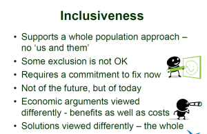 supports a whole population approach. Economic arguments and solutions are viewed differently. Inclusiveness is not a contest of rights and not one group giving something to others. All costs and benefits are measured from this perspective.
  A case study in creating universally designed urban spaces is a good way to showcase how it is done.
  How do hearing loops work? First, they have to be connected to the sound system and switched on whenever the system is on. It’s not something people should have to ask for – because they won’t. Second, it requires everyone to use the microphone. No more, “my voice is loud enough”.
 Some technologies are overtaken by new discoveries, but others just keep getting better. One such technology is hearing loops. The basic technology remains the same but improvements are being made over time. Modern hearing aids have not improved so much that people don’t need augmentation in meeting venues. It’s a bit like saying wheelchairs have improved so much we don’t need ramps. Hearing loops are not obsolete technology.
 There are three types of hearing augmentation systems – but which one to use? The system preferred by most users is a “hearing loop”. It is connected to the sound system in a meeting room or auditorium. People wearing a hearing aid with a telecoil, have the sound sent directly to the device. It screens out all the background noise and gives definition to the speech. However, a microphone must be used all the time. So no more “I’ve got a loud voice, I don’t need a microphone” because it won’t be transmitted.
  Online learning is not new for many higher education students and teachers. Accessibility of online content is improving but there is still a way to go. Students with hearing loss are at a greater disadvantage than many others. Hearing loss is not something you only get as you age. Many young people aren’t even aware they have a hearing loss. An
  The current bathroom trend is freestanding bath tubs. But the glamour of this kind of tub is washed away when you can’t use it or have an accident doing so. The transcript of a podcast by the Universal Design Project
  There are at least two reasons to make podcasts accessible. First, they reach more people, and second search engines like it. It’s the same reason why
  Social factors influence how people with disability choose to use their technology. So they are sometimes disadvantaged because they don’t want to be “different”.
  There are two points of view about universal design in learning (UDL). Some say it is the way to go, but others say it is not in the best interests of children. An