Screen readers and web content

A computer page showing JAWS for Windows screen reader home pageIf you haven’t seen it in action, screen reader technology is not what you might expect. Experienced users listen at a speed most of us couldn’t contemplate. But screen readers are only as good as what they are given to read – it is a machine after all. The way web content is written, described and placed makes a difference to the efficiency of the reading device and the user.

Axess Lab has a four minute video of a how a screen reader works.  If you haven’t seen this before it makes for fascinating viewing. In the video Marc Sutton explains some of the basics. The Axess Lab website also has advice for the more tech side of things as well for desktops and mobile readers.

Web designers might do all the right things in designing the site pages, but sometimes it is the document uploads where things fall apart for screen readers. For example, when you insert a table into a document, have you ever thought about how a screen reader might decipher this? Marc Sutton shows what happens and how to make it more accessible.

Vision Australia has a YouTube clip with a Jaws user explaining how it works for her. Nomesa blog site has additional information. 

Screen readers work with the computer’s operating system and common applications. It relays information either by speech or Braille. The majority of users control things with the keyboard, not the mouse.  If web pages are well structured, screen readers can interact easily. There are good reasons why websites should suit screen readers

Accessible forms, video and chatbots

A young woman sits at a desk with her laptop open. She has her face covered by her hands and is indicating distress

As the digital age moves ahead we need to make sure we aren’t creating a digital divide between those who are up to date and those who aren’t or can’t be. The canaxess website has three on-line and downloadable fact sheets that provide some of the simplest but effective advice.

For example, in Principles of accessible video – don’t set to the video to scroll on opening. In Principles of accessible forms – don’t use an asterisk to indicate a mandatory field – screen readers announce “star”. In Principles of accessible bots – placing in lower right of the screen is difficult for keyboard users. For people who upload information or documents to their website, there are some good tips. For others who know about coding there is really helpful information. 


What is user experience?

Graphic of a male sitting behind a computer screen with the words web design on the wall behind him.Technology has advanced to a point where almost anyone can set up a website – no coding experience needed!  It’s easy to get carried away with glitz, glamour, flashing signs and a swinging carousel of images. This is where user experience, or UX, comes into play. And let’s not forget web accessibility. Many of us have something to do with a website. So whether we contribute to one, manage one, or are commissioning one, there are some basics to know.

First some statistics. Seventeen per cent of users will not return after just one bad experience. Forty-eight per cent of users are annoyed by sites that aren’t mobile friendly. 

The DreamHost blog has two articles, one explaining how UX works, and the other is about web accessibility. It’s a pity they weren’t joined up into one article. Accessibility is not an optional add-on. It should be considered from the outset of the initial design and be a continuous process for ongoing content. 

While the UX article focuses on “target audience” and forgets this audience might need accessibility features, it has some useful advice. No need to get too bogged down with detail here. It covers navigation, content, animation, and responsiveness.

The article, 10 ways to make your website accessible is a good start for anyone new to the concept. It covers many of the basics such as colour choice, adding descriptions to images, and text size. Avoid tables for presenting data because screen readers can’t read them unless they are coded correctly. An accessible site expands the potential audience and helps with search engine rankings.

See also Web accessibility techniques: A guide and the section on ICT guidelines on this website for more information. 

Editor’s note: We do our best with accessibility and rely on in-built coding with the free software we use to keep the site running. We receive no funding to run this service. However, we welcome feedback if you find specific difficulties with this website. 

Colour contrast checkers for web

The colours of the rainbow arranged as a wheel to show colour contrast.Almost anyone can create a website or add content these days. It doesn’t have to be an IT specialist. One the most basic accessibility features is colour contrast. No matter what level of vision we have, we all need contrast. But how much contrast is enough? And what about colour combinations?

Vision Australia has a colour contrast analyser and instructions on how to use it. The analyser is a tool for checking foreground and background combinations. It also has a function to simulate certain vision conditions such as colour blindness. There is more information on their webpage. The contrast information is also useful for printed material.

For the more tech people, the Axess Lab website has links to seven free tools that help you measure color contrasts that meet the contrast requirements in the Web Content Accessibility Guidelines (WCAG). With almost everything in life being linked to the internet, it is important to make sure sites are fully accessible. Colour contrast is important for many with low vision, but accessibility does not have to equal boring. By going to the website you can see more on each of these seven free tools: 

Easy Read Website

A screenshot of the homepage of the website.
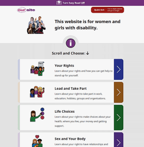
You might have heard of Easy Read or Easy English for documents. They are great examples of how to reach a wide audience of people regardless of their level of literacy. Now there is a great example of an Easy Read Website from Women with Disabilities Australia.

People can have low literacy skills for several reasons such as a brain injury through a stroke or accident, or a cognitive condition. People with English as a second or other language, and people not used to navigating websites also find Easy Read helpful. So we are not talking about a few people.

This particular website is focused on girls and women with disability. However, the information is good for boys and men as well. Large clear font, graphics, short headlines and few words make this easy to navigate. At the top of the page is a link to turn Easy Read off. But this doesn’t mean lots of words in tiny font. Also very easy to read. 

The tabs list key topics: Your Rights, Lead and Take Part, Life Choices, Sex and Your Body, Safety and Violence. The also have a section on the other accessible functions of the website. It includes other languages, screen readers and Auslan. 

At last someone is living the message and has truly joined the dots between people with disability and website design. 

Accessibility begins at the beginning

A graphic with logos of popular social media platforms.Social media platform designers beware. If you “forgot” accessibility for everyone, you will soon be reminded. Then it’s too late and costs more to fix. Costs include lost customers. Twitter found out the hard way when launching “audio tweets” according to a blog article on UX Design. Saying it is an “early version” does not improve the matter for would-be audiences.

It seems Twitter doesn’t have a dedicated accessibility team and that’s where it should start. You can’t tack it on at the end. It’s not the cherry on top, it has to be mixed in with the other ingredients and baked in.

A boy sits in a dark room with three computer screens. He is wearing a headset.The blog article also discusses Naughty Dog, a game developer that has considered just about everyone. That is, people who are deaf or hard of hearing, people who are blind or have low vision, and people with mobility or motor control issues. Their website has a list of accessibility presets.

There’s also a link to a page on how accessibility features assist search engines. Video transcription, image captioning and image descriptions (alt-text) are just the start.

The title of the article is, Digital accessibility matters: Social media is amplifying the need for a clear, empathic approach to accessibility.

Blinded by science: Universal design and data access

The figure of a woman is overlaid with purple and pink computer coding in tiny writing forming a backdrop.It’s all very well saying that information is available to everyone, or that government processes are designed to be transparent. But how many people can access the scientific and long-winded sentences in these documents? Even the abstract below on this very topic needs interpretation into everyday words. It’s easy to talk about universal design. However, academics often make research on accessibility and inclusion inaccessible and exclusive. How about more walking the walk, and talking the talk? We need universal design for data access.

The article on Open Government Data Through the Lens of Universal Design is about accessing data sets. This might include population census data, or data that underpin policy decisions. By casting the lens of the seven principles of universal design over the data sets the authors found ways to improve accessibility. Nine issues were found, three related to the web and the rest to data presentation.

This is an important aspect of inclusion. It helps people with disability and others to see how data are used, and to give them a voice. Information is power. The article includes recommendations for discussion on how to improve the situation.

The article can be downloaded from ResearchGate where you can request the full text from the authors. Otherwise it is available on SpringerLink where you will need institutional access for a free read.  Note the dated use of the term “special needs”.

Abstract

Open Data are increasingly being used for innovation, developing government strategies, and enhancing the transparency of the public sector. This data is aimed to be available to all people regardless of their abilities, professions and knowledge.

Research is showing, however, that open data, besides being physically inaccessible to people with special needs, those are also semantically inaccessible to people who lack data science expertise.

In order to identify specific accessibility challenges associated with open government data portals and datasets, we conducted an analysis using seven principles of Universal Design.

In total, nine challenges are identified based on issues discovered. Three challenges are identified on the web portal interface level, namely: dataset filtering and categorization, access using a keyboard, and breadcrumb and back navigation.

The other six challenges are identified on dataset level: dataset previewing, dataset size, dataset formats, dataset purpose, dataset labelling, and dataset literacy. For each challenge, we propose recommendations as a means to incite a discussion about the features that open data should possess in order to be widely accessible, including people with disabilities and those lacking data science expertise and knowledge.

Inclusive Courts Checklist

This new courtroom has timber backed seats and a long timber desk that seats the justices. A abstract painting covers the wall behind the bench. Daylight comes in through large windows.Courts and justice systems across the world are going through a digital transformation. It’s happening behind the scenes and up front. But are these systems and processes inclusive?  A survey in 2018 revealed that court administrators don’t know about the advances in inclusive solutions. With the current pandemic, reliance on technology has increased. So this matter is more urgent now.

Technology is making it easier for court staff. For example, their payment and filing processes. But we run the risk of making it more difficult for people who find themselves the subject of court processes. The survey by G3ict and International Disability Alliance revealed that people with disability face significant barriers in the justice system – digital and non-digital. As a result of this survey, G3ict has come up with an Inclusive Courts Checklist. It lists 10 Core Capabilities and related Enabling Activities.

The ten core capabilities include, a digital inclusion strategy, leadership, budgeting, and a culture of inclusive engagement, diversity and transparency. The checklist provides a short overview of the issues and the survey, and the checklist is presented as a table. The checklist is on the G3ict website where you can find more useful publications.

Elements of this checklist apply to other organisations that are moving to digital processes and practices. This checklist has a focus on people with disability, but could equally apply to people from diverse backgrounds and to people who have little or no experience of digital applications.


Accessibility is everyone’s business

A brightly coloured graphic indicates different kinds of digital communication: social media, camera, phone and video.“We need to do this for compliance, let’s figure out what to do and then we are done.” What you measure, is what you get and no more so than when standards ask for minimum compliance. It is the same in any field of design.

However, the big tech companies claim they do much better than compliance these days. And it has more to do with company culture than teaching better design.

Accessibility is a fundamental part of good design says Matt May from Adobe. He is an accessibility engineer and was part of bringing Adobe up to speed on this topic. He offers some tips for prioritising accessibility in a magazine article. They could apply to any design discipline:

    • Take the time to educate all teams on the elements of an accessible product. May ran a training to encourage all teams from design to product, engineering, and even sales, on how to think about and prioritize accessibility.
    • Introduce a diversity of users to the team to show how different people engage with the tech. Adobe hosts a speaker series where the company brings in a variety of users to highlight how they interact with tech.
    • Take a holistic approach to accessibility. Adobe’s teams integrate accessible design features in the planning phase to create a more fluid experience for all users.
    • Focus on what each team can do to improve accessibility, rather than making it all about the business value.

The article goes into more detail including making accessibility relevant to each employee’s role. The article is titled, Adobe’s approach to accessibility? Everyone’s responsible. 


Don’t click here for web links

A graphic with six black hands with forefinger pointed each on a circular button.Writing “click here” to link to a web page or electronic document is intuitive for the writer. But not to all readers. This is particularly the case for people who use screen readers. Writing “click here” or “download here” requires the reader to make sense of the words before and after to get the context. This is workable when you can visually read the page. However, a screen reader is a machine and can’t do this for the user.

It’s hard for a user navigating the page audibly if the link text isn’t clear. They can’t be sure where the link will take them. When a link has a focus the link text is announced by the screen reader. If it isn’t created clearly it can be difficult to understand. Link text is clear when it makes sense on its own away from other text

Once you know how a screen reader works, it makes more sense. It makes even more sense when you hear a screen reader working. Online newspapers, such as The Conversation, are good at using clear link text.

CanAXESS blog has a seven minute video explaining why “click here” isn’t helpful and gives examples of how to avoid it.  The key information is in the first five minutes and the last two relate to the WCAG guidelines which don’t cover this very well.


Google Search likes great user experience

A graphic of nine computer screens showing different patterns.Websites that don’t work are very annoying. It’s hard to get the information you need when the site is slow to load or badly designed. Now Google Search is in the process of optimising for more intuitive, user-friendly page design in their searches. Perhaps designers could look no further than universal design. 

From next year Google Search will favour websites with great user experience (UX). It won’t just be looking for keywords – it will be looking for a good user experience. Google is one of the large companies that is also promoting web accessibility. So access features should be included in their user-friendly mix.

The title of this short news item in FastCo is, Google Search will now favor websites with great UX.  

“As part of a new set of best practices, the company will start factoring user experience into its search results, as well as the top stories feature in mobile search. Google is no longer just optimizing for information that’s closest to your keywords, but optimizing for a more delightful web. Intuitive, user-friendly page design is about to become even more important.”

Accessibility Toolbar