Holidays for All is a key section in a new research report by Barclays. It is a pity that this section ends up in the latter part of the report because it applies to all other sections. The tips and case studies in a pdf document cover all aspects of the hospitality and tourism business. Although the report focuses on the UK domestic tourism market, the principles for increased business are applicable elsewhere.
The title of the report is the Great British Staycation. It is a very readable report and the section on holidays for all is worth a look, and it ends with strategies for success with key points from each of the chapters:
Know your demographic
Foster Loyalty
Capture early bookers
Add value through collaboration
Reap digital dividends
Provide options where possible
Take them behind the screen
Be accessible to all
It is not unusual to find references to accessibility and inclusion somewhere in a subheading of a research report. This is unfortunate because this is the one part that applies to all other sections. See also the economic argument from Simon Darcy.
Diversity, disability and disbelief jointly create barriers to creating an inclusive workplace. When the disability isn’t obvious, disbelief by others becomes another barrier to inclusion. Owning up and spelling out what you need is painful enough. So not being believed is the final straw. If you have a mental health condition this can be devastating. A personal story by a library employee highlights how attitudes are just as important as any physical workplace accommodations.
As a library employee with a hidden disability (post-traumatic stress disorder [PTSD]), just going through the accommodation process is difficult. The process is invasive and includes an in-depth interview with a disability specialist who knows nothing about you.
The process also requires a letter from a care provider detailing both the accommodation and why it is necessary. So, the person must first be diagnosed by a medical professional or a psychiatrist. The process is made more difficult and painful when supervisors and administrators do not recognize the validity of the condition for which the accommodation is needed.
This paper explores the accommodation process, its impact on the employee, and the politics and psychology of disbelief and suspicion. Through the lens of personal experience and reflection, I will explore how the library can be a place of ableist views that limit the abilities and potential of employees with disabilities. I will also provide guidelines for combating ableism in the library workplace.
There is a companion article Disability, the Silent D in Diversity, which gives the library experience of wanting to have diversity, but not wanting it to be too difficult.
Diversity and inclusion: why don’t they care?
When the terms ‘diversity’ and ‘inclusion’ fall on certain ears, it raises hackles and is considered a big problem. The Fifth Estate has published a very interesting article titled, Why people hate on diversity and inclusion (and how to get them not to). It’s by the CEO of Diversity Council Australia, Lisa Annese. She quotes David Gaider, “Privilege is when you think something is not a problem because it’s not a problem to you personally.”
Annese discusses the research that shows the more diverse a company’s workforce, the more satisfied the whole workplace is. And that leads to improved productivity. It should also lead to better service for their customers. They are a diverse lot too!
Book reviews can reveal good information in their own right. One such case is the review of Aimi Hamraie’s book, Building Access: Universal Design and the Politics of Disability. The book traces the history of universal design from the 1950s in the United States to current ideas. Hamraie discusses the issues of the politics of disability from both design and disability perspectives.
Chapter 4 of the bookdiscusses how the curb cut campaign in the USA became disability politics in action. Curb cuts cannot be considered universal design because they don’t benefit everyone. They do not further the rights or inclusion of people with disability. However they became a sign that people with disability had rights that were being ignored.
This is an academic text of value to both design and disability studies.
Other articles about Hamraie posted previously are:
Floor finishes, lighting, acoustics, hearing systems, signage and alarm systems are all included in a guide to taking a universal design approach to internal environments and services.
Building for Everyone covers each of the features in detail. Of course, they also have to be considered within the overall design of the building.
There is also a section at the end on human abilities and design. It covers walking, balance, handling, strength and endurance, lifting, reaching, speech, hearing, sight, touch and more.
Universal design approach to fitouts
All you ever wanted to know about reception desks, waiting areas, storage, coin operated machines, kitchen sinks and ticket dispensers? These and other related topics are covered in a guide to taking a universal design approach to facilities in buildings. This is a companion to the internal environments booklet. One of the key issues in creating universally designed places and spaces is that the details are often left until last and not integrated into the whole of design.
Kat Holmes found the origin of include was to “shut in”. Similarly, the origin of exclude was to “shut out”. Maybe “inclusion” is not the right word for describing the inclusion of everyone in products, places and things. So what does inclusion actually mean?
In the video below, Holmes says that diversity is discussed as gender, sexual orientation, religious belief, ethnicity, and race. Disability is usually mentioned last in the list, if at all. “But it is the one category that transcends all other categories”, she says. “Abilities are constantly changing”.
Holmes’ offers an alternative way for designers to consider diversity, and is based on her book, Mismatch: How Inclusion Shapes Design. An engaging talk for all upcoming designers in any field. And not just professional designers either. We all design things every day, so we all have a role to play.
Editor’s Note: I discussed this issue in a 2009 paper. The group that is currently included has the power to either include or exclude. Those who are excluded wait to be invited to the included group. Semantics are important. What we need is inclusiveness – that’s where inclusion has already happened and there are no exclusions. Inclusion is a futuristic concept – it’s something we are striving for. If inclusion was achieved, no further discussion would be needed.
There are many definitions and explanations of universal design. But sometimes the way people talk about it expresses it better. Here are some quotable quotes on universal design.
“The essence of universal design lies in its ability to create beauty and mediate extremes without destroying differences in places, experiences, and things”. Bill Stumpf and Don Chadwick, Designers.
Accessibility vs universal design
Ed Steinfeld explains the difference between accessibility and universal design is, “The space of accessibility and universal design”, in the book, Rethinking Disability and Human Rights:
“Accessibility is a compensatory strategy conceived to prevent discrimination while universal design seeks to change the consciousness of those who create the built environment to address a broader conception of the human body.”
“In simple terms, design thinking is about recognizing the designer’s methods for connecting the user’s needs with what is technologically possible and which provides a real market value.
Apple is well-known for making their products really easy to use. Here is a quote from Steve Jobs, former CEO, Apple.
“Some people think design means how it looks. But of course, if you dig deeper, it’s really how it works.”
The universal design conference held in Dublin 2018 began with the words, “Good Design Enables. Bad Design Disables“. The Centre for Excellence in Universal Design has a good, but wordy description of universal design.
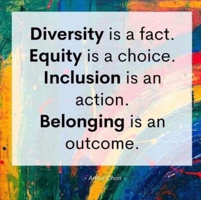
Diversity
The text in the sign by Arthur Chan says:
Diversity is a fact.
Equity is a choice.
Inclusion is an action.
Belonging is an outcome.
They are all are part of a universal design approach.
The late Judith Heumann has quoted this many times. She also said it is easier to change the design of the environment that to change attitudes. Her TEDx talk is worth a look.
“There are only two kinds of people in the world: people with disability and people yet to have a disability.”
Quote from Christina Mallon, Microsoft’s head of inclusive design: The end goal? “It’s that inclusive design becomes the only way to design, so that my job as an inclusive designer is just a designer. I want my job to go away.” FromFastCompany article.
Overheard at a workshop: “So if you design for the extremes you include the middle”
What is the optimal classroom environment for students? Why not ask them? Designing Classrooms for Learning reports on a project that included student opinions about classroom design for learning about science. The project included a survey where students compared their “ideal” design with current design.
The study concludes that lighting, desk layout, places to put belongings and the layout of materials in the classroom all have an effect on student learning. “Student morale and learning can be affected greatly by the physical structure of the classroom, and that the involvement of students in the environment creating process can increase their motivation as well as empower them and develop a sense of community”.
According to the findings, something as simple as desk layout can make a big difference. Most teachers of adults have known this for some time. They take the time to rearrange rows of previously aligned tables and chairs into circular layout or into small group layout.
Given that every student learns differently, instructors need to provide multiple avenues for learning. This links with the theory of humans having different intelligences. You can read more on education, learning and universal design for learning, on this website.
The 2022 National Construction Code has at last included the Livable Housing Design Standard. Citizen advocacy and political will made this happen. But there were strong economic arguments. Research papers have produced solid economic arguments for universal design in housing over many years. However, these arguments failed in their quest. So the issues are beyond those of economics. For those who want the research, here is a list of papers, including the cost effectiveness of home modifications (or not needing them in the first place).
Selected articles on economic arguments
The cost of NOT including accessibility in new homes This landmark article by Smith, Rayer and Smith (2008) uses complex economic methodologies to show that a new home built today has a 60% likelihood of having an occupant with a permanent disability. People with disability live in families – not alone – which is often forgotten. They followed up this work in 2011 with similar results.
A cost benefit analysis of adaptable homes by urban economist Martin Hill of Hill PDA. This 1999 conference paper shows how long these arguments have been running. The context is adaptable housing – the forerunner of universal design concepts in housing.
Home adaptations: Costs? or Savings?A survey of local authorities and Home Improvement Agencies: Identifying the hidden cost of providing a home adaptations service.
If local and state governments aren’t listening to residents about mobility, walkability, and wheelability then perhaps they might consider visitors and tourists with money to spend locally. But are they really interested in the extra tourist dollars? Does the local Chamber of Commerce think it’s all too difficult to create greater access and inclusion? The walkability issue isn’t just about footpaths, seating and toilets – it’s about all the links in the chain to make it happen – joined up thinking. Otherwise we end up with islands of access and inclusion. And you can’t be a bit inclusive – it either is or it isn’t. That means business, community and governments need to work in unison on the design of physical environments, customer service and tourist information. And of course the reverse of the question is, “Can walkability improve tourism?”
A research paper from Turkey, Assessment of factors influencing walkability in shopping streets of tourism cities is also worth a read. They found that “Urban planning and design should focus on how to connect people and places together, by creating cities that focus on connectivity, accessibility, crime security, traffic safety, and comfort
and use’.
You can find some inclusive tourism guides, magazine articles and research papers in the tourism section on this website.
International travel is a great experience for everyone especially when operators get on board with inclusive thinking. In his latest article, Martin Henggoes beyond the rights arguments to explain the economics of inclusive travel. With a growing market of older travellers tourism and travel businesses need to step up to take advantage. Heng also picks up the issue of terminology: “accessible” makes people think of compliance for wheelchair users. But he rightly points out that wheelchair users are a small proportion of the population that has some kind of disability or chronic health condition. That’s why we should be calling it “inclusive travel”.
Heng goes on to list the easy, cost effective things that businesses can do. And not just thinking about the building. Easy to read fonts on menus and other information materials, TVs with captioning options, and websites that provide relevant visitor information about rooms, attractions and services. The article has several pictures showing Martin in various overseas locations. The title is What is accessible travel, and why should we be talking about it? Martin Heng works for Lonely Planet as their Accessible Travel Manager.
 Holidays for All is a key section in a new research report by Barclays. It is a pity that this section ends up in the latter part of the report because it applies to all other sections. The tips and case studies in a pdf document cover all aspects of the hospitality and tourism business. Although the report focuses on the UK domestic tourism market, the principles for increased business are applicable elsewhere.
  Diversity, disability and disbelief jointly create barriers to creating an inclusive workplace. When the disability isn’t obvious, disbelief by others becomes another barrier to inclusion. Owning up and spelling out what you need is painful enough. So not being believed is the final straw. If you have a mental health condition this can be devastating. A personal story by a library employee highlights how attitudes are just as important as any physical workplace accommodations.
 Book reviews can reveal good information in their own right. One such case is the
  Floor finishes, lighting, acoustics, hearing systems, signage and alarm systems are all included in a guide to taking a universal design approach to
  All you ever wanted to know about reception desks, waiting areas, storage, coin operated machines, kitchen sinks and ticket dispensers? These and other related topics are covered in a guide to taking a


 What is the optimal classroom environment for students? Why not ask them?

 If local and state governments aren’t listening to residents about mobility, walkability, and wheelability then perhaps they might consider visitors and tourists with money to spend locally. But are they really interested in the extra tourist dollars? Does the local Chamber of Commerce think it’s all too difficult to create greater access and inclusion? The walkability issue isn’t just about footpaths, seating and toilets – it’s about all the links in the chain to make it happen – joined up thinking. Otherwise we end up with islands of access and inclusion. And you can’t be a bit inclusive – it either is or it isn’t. That means business, community and governments need to work in unison on the design of physical environments, customer service and tourist information. And of course the reverse of the question is, “Can walkability improve tourism?”
 International travel is a great experience for everyone especially when operators get on board with inclusive thinking. In