Smart phone apps have been a game changer for many of our daily activities. And now hearing augmentation in public buildings is taking the same route. There is a lot of hype about Auracast and how it will solve problems hearing in different situations. But it will take time for market uptake to make it mainstream. However, it will eventually replace hearing loops, infrared and FM systems.
Sydney Opera House hasinstalled Auracastin the Drama Theatre, Playhouse and Studio. Currently, patrons collect a receiver and headphones from the cloakroom. The FM and hearing loop systems remain in all other areas.
Auracast claims to help people hear in just about any situation using a smartphone app and either earbuds, headsets or hearing aids. It works with Bluetooth LE and theoretically it is possible on any device that supports Bluetooth 5.2. But not all hearing aids can link with this technology – yet. That’s why the Sydney Opera House has receivers and headphones for people who wear hearing aids.
Specialist in hearing augmentation services, Andrew Stewart, provided the assistive technology sector with a newsletter on this topic. He advises:
“A minimal number of smartphones and some new versions of hearing aids released this year (but not all) currently have Bluetooth LE working. Some manufacturers say their devices have Auracast or are Auracast-ready, which is not entirely true. They need an update via the audiologist’s computer, which is not yet available.”
Uptake will take time and money
Not every model of hearing aid and cochlear processor will immediately have Bluetooth LE. It will take some years for every model of hearing aid and cochlear processor to have it. Plus the high cost of hearing aids means it will take years for people to purchase updated models, and of course the cost of the smartphone.
Hearing loops and FM augmentation systems are here to stay for a while yet. Not all venues with this technology will replace it with Auracast. However, for new and extensively refurbished public buildings it will be much cheaper and easier to install.
Cities for people with hearing loss is an article expressing frustration that accessibility is not just about wheelchair users. 1 in 6 people have hearing loss.
The relevant ministries of the five Nordic countries are concerned that cities are becoming more socially divided. For countries known for supporting social justice and inclusion, this is a relatively new development. So what is going on, and what to do about it? Fortunately Nordic countries have laws supporting the concept of social inclusion through participatory planning. However, it’s more complex than that.
Participation is a prerequisite for democracy. It enables the redistribution of power by involving citizens in making decisions both for their own good and in the public interest. A Nordic group is looking beyond segregation to social inclusion.
Population segregation has emerged as a growing issue in the five Nordic countries and policy-makers are looking to improve social inclusion. Citizen participation is strongly emphasised in national legislation and the governance of municipalities. So the concept of community involvement is already present. However, legislation alone is insufficient to bring about change.
Social inclusion: beyond segregation
A research report looks at all five countries and compares policies and practice. Part three of the report looks at polices for counteracting segregation and encouraging social inclusion. Part 5 looks at the participatory planning aspects in each of the countries. The discussion in part 7 draws together the research findings.
Participatory planning approaches
Part 7 of the report covers the types of participatory planning approaches used. Each country has a national strategy and policy programs emphasising participation. However it falls to the local municipalities to implement the strategies and policies. Some municipalities go beyond the policy requirements and legal frameworks.
Each of the Nordic cities has a good story to tell about creative ways of involving citizens in planning. This includes engaging with children and young people, older people and people with disability.
However, challenges remain, particularly engaging with more silent, passive or marginalised groups. While there is a strong public desire to participate, limited understanding of the processes can hold things back. In other situations, citizens are uncertain whether their voices will play out at the implementation stage.
Limited resources are also an issue. Norwegian municipalities tend towards informing rather than involving. A shortfall of competence at municipal level is also a factor. Consequently, there is less participation in the early stages of planning.
All five Nordic countries are ultimately seeking to promote democratic decision-making and inclusive urban development. They seek to address challenges such as legal ambiguity, resource constraints and the engagement of marginalised groups. The different participatory approaches demonstrate advances in overcoming barriers to engagement.
An “age-inclusive” approach – such as accessible public transport, diversified housing options, and telemedicine – has immediate benefits. It enhances wellbeing and economic growth and generates long lasting benefits for creating inclusive cities. A new OECD report considers these factors and the economic and social costs of inaction. Cities for all ages should mean children to older age, but the report focuses on older age.
The report provides a checklist of nine key actions that governments can take to create age-inclusive cities. The 80 page document covers the rationale for action based on changing demographics. The second section explores policies for age-inclusive cities including housing. The checklist is in section 3.
The checklist is based on:
Strategy setting for a structured policy approach
Resource development and increasing capacity
Stakeholder co-ordination to involve local citizens to help solve problems
Checklist for creating cities for all ages
The report provides a checklist of concrete actions for governments. It builds on the initiatives from the previous chapters which review existing guidance and standards.
As this is an OECD document it necessarily includes the actions and ideas from across the globe – both developed and developed nations. Consequently, some of the actions listed are well known in Australia. However there is always more to learn from others especially as there is no one-size-fits-all in urban development even in the one city.
The title of the OECD urban studies report is, Cities for All Ages. Potentially if cities are good for older people they will automatically be good for everyone regardless of age.
People with low vision cannot correct their eyesight with glasses, contact lenses, medication or surgery. While low vison can begin at any age, the likelihood increases once people reach 65 years. The Australian Institute of Architects has a web resource about designing for low vision.
The resource explains the different types of low vision caused by various conditions such as cataracts, macular degeneration, and glaucoma. Other conditions can be caused by a stroke or diabetes. Total blindness with absolutely no detection of light is rare. Pictures highlight the differences between the conditions.
Images by Francesca Davenport with graphics by Ria Davenport from the Australian Institute of Architects.
Design compliance for low vision
Sometimes photographs show visual complexities in the environment more clearly. The image below shows how the shadow of tree branches affects the visual design of the footpath.
The Australian Disability Discrimination Act mirrors part of the National Construction Code and Australian Standards requirements. But these regulations are not a guarantee against a discrimination claim.
The resource lists all the Australian Standards that apply to designs, including luminance contrast.
Luminance contrast
Luminance contrast means the comparison between light reflected from one surface with the adjoining surface. Text is a good example. Light grey text against a white background will likely be invisible to someone with low vision. However, measuring luminance contrast is complex. This is due to different light conditions between day and night and even sunny or rainy days outside. The type of materials used is another factor plus wear and tear.
Glass doors that are not automatic or large glazed windows are often a concern because they are not easily detected – even by people with good vision. Full length windows can also be mistaken for a doorway or opening. This is why contrasting strips across doors and windows are essential for everyone – a universal feature. The building code and standards provide guidance.
Images from the article by Penny Galbraith
Tactile ground surface indicators (TGSI)
This is one area that people with low vision complain about all the time. Mostly because of the inconsistent and non-compliant application across the built environment. TGSIs warn people with low vision they are approaching a hazard.
TGSIs also require luminance contrast with the adjacent feature such as the footpath or stairway.
The article also discusses lighting, handrails, stair risers, shorelining and layout, as well as signage and Braille.
Best practice design solutions
Best practice does not have to mean more cost if it is considered at the outset of the design. However, these features are too often left until last when the overall design cannot be changed. The resource covers layout, finishes, fixtures and fittings and provided additional advise on elements such as luminance contrast, lighting and glare.
Visual clarity and confusion
The effect of highly patterned surfaces are difficult for people with low vision, and for people with sensory processing difficulties.
Confusion occurs when surfaces with a high luminance contrast are interpreted as barriers or a step. Some patterns can look like holes in the floor, and shiny surface can look wet or slippery. This image looks like you are stepping on cubes.
Continuous footways and bus stop bypasses are of particular concern to people with reduced mobility and vision. Living Streets and Transport for All in the UK ran a two year project on the issues. The research uncovered the issues and found ways to improve the impact of these features on streetscape accessibility. Streets for people with disability means safer and better streets for all pedestrians.
The first stage of the project involved interviewing representatives from organisations representing disability and cycling.
Image from NSW Government Movement and Place website. It shows a continuous footpath.
Bus stop bypasses (or floating bus stops) involve a cycle track being placed between a footpath and an island with a bus stop. Bus passengers must cross the cycle track to access the bus stop. Continuous footways are described as an uninterrupted footway that extends across a side road. Usually the footway is raised to the same level as the footpath.
Continuous footways may be unsafe for people who are blind or partially sighted due to the lack of tactile paving. They may also be at risk when crossing cycle tracks to reach a bus stop as they don’t always hear cyclists coming. The noise of busy roads also makes the sound difficult to detect.
People with mobility issues need more time to cross the cycle track. This can put them at risk if cyclists do not allow them to pass. Also, wheelchair users have to navigate narrow islands to get on and off a bus.
Not safe? Find another route
People who are blind or have low vision usually get the expertise of a mobility trainer to help them navigate their local environment. Mobility trainers find different ways to ensure their clients are as safe as possible. Interestingly, all mobility trainers in the study teach their clients to indent into side roads because it gives them more time and a quieter space to hear what is coming.
Mobility trainers considered cycle tracks at bus stop bypasses generally risky and potentially they would teach a different route with a controlled crossing.
Potential solutions?
The study involved site visits with observations by people with disability. The key issues were raised in the discussions following the site visits. For the bus stops, descriptive markings for pedestrians to look both ways on two-way cycle paths would make them safer. Bus stop islands need more circulation space for wheelchairs and mobility scooters.
General lighting at bus stop bypasses should be improved, and that lighting should be used to indicate the presence of zebra crossings. Further solutions included adding rumble strips on cycle lanes, introducing speed bumps to slow down cyclists, and signage to indicate the presence of a cycle path.
For continuous footways, there should be steep ramps at continuous footways to ensure that cars slow down for pedestrians. It was also mentioned that there should be tactile paving at continuous footways to inform blind and partially sighted people of the potential presence of cars.
High contrast paving to alert people who have low vision was another suggestion. Also, implementing road markings to alert drivers to slow down, and improving the condition of pavements.
Would the solutions work?
While some solutions were feasible, they might not have the desired effect, or might have an adverse effect. For example, high contrast between the footpath and the continuous footway is feasible, but might lead to people driving over it as though they have priority. Other solutions will depend on maintenance, such as painted ground markings which have a maintenance cost. Indeed, this is a complex space to work in, and each design is context specific.
The main Living Streets webpageon inclusive design provides an overview of the whole project which was divided into two parts: bus stops and footways.
Universal design in its broadest sense is about social sustainability. As such it links closely with other sustainability concepts such as “green” building and healthy cities. Sustainable design is like universal design because it is good design. That means it is less likely to be noticed until it’s not there. Four articles explain more on this topic.
Can universal design create social sustainability?
Applying the principles of universal design at the formation stage of planning can lead to harmonious, accessible, sustainable and healthy cities. This is the conclusion of a European study.
The study looked at the design and development of city space from the perspective of the varying levels of human capabilities. The overall aim of the research was to raise the quality of urban planning, and to develop tools for healthy cities compatible with the principles of sustainability. You can download the PDF of Sustainable Urban Development: Spatial Analyses as Novel Tools for Planning a Universally Designed City, by Joanna Borowczyk.
Forgotten social sustainability
When it comes to sustainability, how many people think about social sustainability as well? Environments and people are inter-linked. The Sustainable Development Goals make this clear and one unifying factor is universal design. A new book chapter investigates the issues further.
“In this chapter, Rieger and Iantkow discuss socially sustainable design, especially its emphasis on universal and inclusive design. They present a history of thinking on accessible design in Alberta, which has moved toward greater inclusion. They also explain the incorporation of these concepts in design education and a greater social consciousness toward the need for accessibility. However, they stress that this isn’t enough.
Sustainability from an ergonomic perspective
The focus of sustainability has been on energy efficiency and all things “green”. But sustainability should have a broader context argues Erminia Attaianese. She claims that this narrow focus is paradoxical as maximising the building’s efficiency is not always maximising the comfort and efficiency of the building’s occupants.
“Green” buildings are often labelled and measured as “sustainable” but social sustainability is missing from the list. True sustainability includes social, economic and environmental factors. The US LEED green building rating system uses the term “sustainable throughout but is focused more on environmental factors. This is confusing because green is not the same as sustainable.
Stella Shao in a thesis poster says that as a consequence we are getting “energy efficient buildings that are not designed for people”. Prioritising social sustainability is good for people and the planet.
Using the Tulsa City-County Library as an example of sustainable design Shao lists three key factors for social sustainability
Comfort rooms for people who are neurodivergent, nursing, overstimulated, or need privacy for religious rituals.
Universal wayfinding to help orient people to make the space legible for people of different cultures, languages and abilities.
Comfort options for visual, acoustic and spatial comfort so every visitor can find a space comfortable for them.
Image from the poster
Shao’s literature review for this study revealed very few research articles on this topic which meant there was no best practice to refer to.
While green buildings today are labeled as “sustainable,” many fall short on social sustainability metrics. This study examines what the current state of research and development is on social sustainability in green buildings and what the best practices are.
Green building rating systems are a major trend in the academic research. However, they are criticized for valuing environmental sustainability over social sustainability. Document analysis confirms that LEED, the most widely used green building rating system, does not adequately address social sustainability.
The LEED-certified Tulsa City-County Library demonstrates how to properly balance social and environmental sustainability in a building. Recommendations are made for future green buildings based on the data collected.
An article focused on the social dimension of sustainability says that universal design is the way to go. It argues that there are promising results for a better future for social sustainability. In doing so, it presents universal design in all its formats in a clear and informed way. The way in which universal design is presented and discussed has particular clarity. For example,
“Universal design is always accessible, but because it integrates accessibility from the beginning of the design process, it is less likely to be noticeable.
Universal design sometimes employs adaptable strategies for achieving customization, but it is best when all choices are presented equally. Some universal design is transgenerational, but the approach is inclusive of more than just age-related disabilities.
Universal design is sometimes adaptable and sometimes transgenerational but always accessible. Universal design, adaptable design, and transgenerational design are all subsets of accessible design. Sometimes a design can be considered to be two of these subsets, and some designs are all three. Not all accessible design is universal. Universal design is the most inclusive and least stigmatizing of the three types of accessible design because it addresses all types of human variation and accessibility is integrated into design solutions.”
The paper concludes that design schools should include the philosophy of universal design throughout their education program.
Despite of the number of people injured in the Iran-Iraq war, and legislation for accessibility, urban spaces in Tehran still have a long way to go.
Hence this article outlining research on finding solutions for increasing access in the built environment. The research asks: What is causing inefficiency in the regulation of universal design, why is social participation by people with disabilities limited, and which factors are contributing to universal design? It seems the issues are worldwide regardless of whether the population is affected by war.
The consequences show that many of problems are rooted in cultural issues. The people must attend to disability as a public concern which can involve everybody. They must comprehend that all members of society, regardless of their physical condition, have the right to use public facilities independently.
The second problem is related to lack of any integrated approach to applying universal design. This research proposes some solutions such as preparation a universal design master plan, an integrated approach for implementation project in all organizations, and public education for improving citizens’ knowledge about universal design.
BIM – Building Information Modelling – is a process to ensure the planning, design and construction of buildings is efficient and collaborative. It’s a collegial way of different building professionals sharing their data to create a 3D model of the building. Consequently, with informed decisions, BIM can ensure accessibility of homes and buildings at all stages of construction.
AI also has the potential to ensure accessibility so it’s time to join the dots. A research team from Griffith University presents a framework that brings together machine learning and BIM. The context of the study is accessible housing as outlined in the Livable Housing Design Standard in the 2022 NCC. It also has relevance to the government funded Specialist Disability Accommodation.
There is an increasing need to integrate machine learning and BIM to detect access features and universal design requirements. This is particularly important in housing.
This research emphasises the importance of accessibility in current building codes. The focus is on universal design features and their compliance within urban environments. We investigated challenges in conventional and advanced building inspection methods and explored how machine learning (ML) technologies can transform accessibility inspections.
Key points from the study
We aimed to develop a conceptual framework leveraging OpenCV and ML to detect accessible housing features and ensure compliance with accessibility standards. Key findings from the review include:
highlighting universal design by addressing the needs of ageing and disabled populations
identifying significant limitations in conventional inspection methods, such as inefficiency and subjectivity
emphasising the role of datasets, photogrammetry, and Lidar point cloud data in improving accuracy for accessible design evaluation
demonstrating how integrating BIM and ML can enhance consistency in compliance verification
The framework is yet to be implemented, but it provides a strong foundation for certifying accessible housing and offers future directions for real-world applications.
Automating accessibility compliance in homes
Two researchers from the Technological University Dublin tackle the same topic focusing on Part M of the Irish building code. They say their research shows how their tools reduce time, cost and liabilities associated with manual checks. At the same time they promote universal design principles.
This is about embedding Part M accessibility parameters into visual programming scripts. For example, corridor widths and door dimensions are colour-coded where correction is needed.
The image above is Figure 13 from the research paper showing a 3D view of a BIM model post visual programming assessment. The paper is necessarily technical but gives an idea of where assessment and certification are heading.
This process could be applied where local authorities ask clients or designers to demonstrate how they are achieving accessible design for a mass development. Note that Ireland’s Centre for Excellence in Universal Design promotes government policy on universal design.
We investigated the use of visual programming within Building Information Modelling (BIM) to automate compliance checking with Part M of Irish building regulations, focusing on accessibility in design. We propose a method for real-time evaluation of design models to identify compliance and non-compliance.
The tool allows adaptive inputs such as corridor widths and door dimensions—linked to colour-coded visual indicators highlighting areas needing correction. The tool can adapt to integrate with changing regulations.
We can compare designs against minimal regulatory requirements and the more inclusive Universal Design (UD) standards. Testing with a BIM model confirmed real-time feedback on compliance and non-compliance with Part M, suggesting improvements aligned with universal design principles.
Challenges such as varying interpretations of regulations and the need for greater digital literacy were noted, suggesting areas for further improvement.
Use BIM to ensure accessibility
The purpose of Magdalena Kladz’s paper is to show the application of BIM in designing for accessibility. She uses an existing single-family home to illustrate how it works and explain some of the technicalities. The home was chosen because of population ageing and the desire to age in one’s own home.
The case study looks at different means to make the home accessible. The illustrations and images are useful supports for the text. The image is an example of a 3D model of a construction framework applied to a bridge from Trimble Construction.
The case study looks at different means to make the home accessible. The illustrations and images are useful supports for the text. While the case study is a single home, the process is applicable to any building. As Kladz says,
“… designing accessible housing contributes to urban sustainability and reduces the negative impact of construction on the environment. Adapting existing buildings and constructing new ones according to universal design principles allows for long-term fulfilment of residents’ needs, without the necessity of demolishing and rebuilding.”
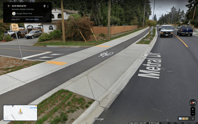
Is the driveway to the shopping centre carpark part of the road or is it part of the footpath? Most people – motorists and pedestrians – don’t realise that driveways are part of the footpath. And what about crossing side streets adjoining main roads? Who should give way to whom?
Sometimes it’s difficult to tell because the visual cues are confusing. If the footpath section has a steep camber towards the roadway it looks like the road. And sometimes there are hazard warning tactile markers where the driveway goes over the footpath. So it looks like the road. Also, the colour of the driveway is often different to the adjoining footpath.
Augustus Brown discusses the issues in his article about continuous footpaths at driveways and side streets. Drivers crossing the footpath to or from a driveway must give way to people walking. Drivers must also give way to people crossing the road when turning at intersections.
To highlight the priority for people walking, footpaths should be designed to give a clear visual cue that drivers need to slow and give way.
Image from the article
Design principles of continuous footpaths
Footpaths should be visually uninterrupted at the crossing point
Footpath pavement material should be consistent
Footpath pavement should remain level at the crossing
Narrow kerb ramps should lift crossing vehicles to the height of the footpath
Images from the article
Clearly marked continuous footpaths and cycle lanes give priority to both cyclists and pedestrians.
Brown’s article has several examples of well designed treatments of footpaths across driveways and side streets and some drawings with more information. The title of the article is, Continuous Footpaths at Driveways & Side Streets.
Architects play a critical role in creating environments that are aesthetically pleasing and also sensory-friendly. But how can architects design and organise elements such as acoustics, lighting, colour and space planning to make this possible? A magazine article on designing with autism in mind has some answers.
Architects can design clear circulation paths, minimise clutter and visual distractions. Distinct zones for quiet reflection provides comfort when needed.
The article begins with an overview of some of the current thinking about autism and autistic people. However, there is debate over whether it is a disorder, as in Autism Spectrum Disorder, or just a different way of being.
The article briefly covers acoustics, lighting, colour, and space planning and distribution. There is an image of an autism friendly group home describing the common areas. This information is applicable in any building and the features are welcoming for everyone.
People who are neurodiverse often struggle to shed the the idea that they have some kind of disorder. A medical diagnosis is part of the problem – they become a category, a label. This is particularly the case for people with autism. And there are no two people alike. But what they do share in common is a relatively high suicide rate. Why would this be the case?
Richard Woods explores how the social model of disability can be, and should be, applied to this group. But it might not be enough. Negative language is a major barrier to inclusion based on the medical diagnosis label. Woods argues that the social model fails to explain how any disability is experienced by individuals.
Categorisation under a label is limiting and does little to shift community attitudes and improve individuals’ mental health. In conclusion, the paper calls for the “full emancipation of the autistic population”.
Neurodiverse advocate Siena Castellon, wrote a book for teenage girls based on her own experiences. In a New Scientist article Siena relates the common misconception that she should look different in some way. Because she doesn’t, most people think that she can’t be autistic. This is not a compliment. You can see more of Siena’s story in the New Scientist article, Autism isn’t a defect – here’s why we should embrace neurodiversity. There are more links in the article for further reading.
Voices of autism in a book
The autism research field has changed a lot in the last 20 years. We now know the impact the research process itself has on people with autism. With this in mind, a new version of a text book has sections written by autistic contributors from all walks of life.
There is a separatelink to the discussion on how the authors went about including people with the lived experience of autism. This link also gives a short chapter by chapter review of the book’s content.
The title of the book is, Autism: A new introduction to psychological theory and current debate. It’s by Sue Fletcher-Watson and Francesca Happe.
Gender refers to the social, cultural and economic attributes and roles associated with being male, female or non-binary. These attributes can significantly influence how individuals experience and navigate spaces. This is how we end up with “gendered spaces”. Understanding these nuances is essential for creating inclusive and equitable environments.
The traditional division of labour can influence spatial patterns. For example women bear the primary household tasks which can affect their travel patterns.
A short article by Kavita Dehalwar highlights three aspects that require consideration in spatial planning. Safety and security, universal design and accessibility, and participation and decision-making.
Safety and security
Women and transgender individuals may experience harassment which reduces their perceptions of safety. When this occurs it restricts freedom of movement and limits social and economic activity. Lighting, surveillance mechanisms can mitigate safety risks and engender a better sense of safety.
Universal design and accessibility
Gender-sensitive design considers how spaces are used by men, women and non-binary individuals. Gender-neutral facilities accommodating diverse identities and preferences reduces stigma and discrimination. Taking a universal design approach includes accessibility and convenience for everyone.
Participation and decision-making
Gender dynamics also influence participation in decision-making processes. Marginalised groups are often underrepresented in planning processes. This results in policies and intervention that inadvertently fail to address their needs. Co-designing with marginalised groups is one way forward.
Design impacts on the way we can navigate the world and participate. Gender equity in design is yet another element of designing inclusively.
Rights, responsibilities and opportunities should not depend on gender. Treatment of women, men, trans and gender diverse individuals are often subject to stereotyping or generalisations about roles. But for many designers and policy makers gender equity is a new concept. So the Gender Equity in Design Guidelines are a great help.
The City of Whittlesea in Victoria produced the Guide. As a local government authority the guide focuses on community facilities. It introduces the case for gender equity and has a focus on issues for women. While there is an emphasis on safety and easy access for women with children, gender diverse groups are included.
What the guidelines cover
Many of the features capture the essence of universal design. The twenty page document covers site planning, concept design and documentation for:
Community centres
Maternal and child health
Youth facilities
Community pavilions
Aquatic and major leisure facilities
The Guidelines acknowledge that any building project goes through several stages and has different stakeholders. Consequently, it only covers planning, concept design and detailed design and documentation. The construction phase is dependent upon the follow-through from planning and design.
The aim of the Guidelines look through a gender lens and is therefor not prescriptive. Consequently, regulatory standards and building code compliance and accessibility are outside the scope of the document.
Gender Inclusive Urban Planning
A city that works well for women, girls, and gender non-conforming people of all ages and differing levels of capability supports economic and social inclusion. The World Bank ender inclusive planning and design is:
Participatory: actively including the voices of women, girls, and sexual and gender non-conforming people
Integrated: adopting a holistic, cross-cutting approach that centres gender throughout and promotes citizen-city relationship building
Universal: meeting the needs of women, girls, and gender non-conforming people of all ages and abilities
Knowledge-building: seeking out and sharing robust, meaningful new data on gender equity
Power-building: growing the capacity and influence of under-represented groups in key decisions
Invested-in: committing the necessary finances and expertise to follow through on intentional gender equity goals
Chapters cover the rationale for gender inclusion, foundations of planning and design, processes and project guidelines, case studies and further resources.
Urban planning and design shape the environment around us — and that shapes how we live, work, play, move, and rest. This handbook highlights the relationships between gender inequality, the built environment, and urban planning and design.
This collection investigates gender-sensitive spaces that challenge the complex social and material structures that shape inequities of access and inclusion in the urban environment.
Designing Gender Sensitive Spaces for Consenting Cities: Practices and Provocations centres intersectional, gender-sensitive approaches to design in the urban environment as an integral strategy in combating spatial inequities.
This volume offers new thinking and practical approaches to demonstrate how design might shift towards safer and more inclusive cities for women, gender-diverse people, and LGBTIQ+ communities. It includes design-led methods, case studies, activist interventions and processes of resistance.


 People who are neurodiverse often struggle to shed the the idea that they have some kind of disorder. A medical diagnosis is part of the problem – they become a category, a label. This is particularly the case for people with autism. And there are no two people alike. But what they do share in common is a relatively high suicide rate. Why would this be the case?
 Neurodiverse advocate Siena Castellon, wrote a book for teenage girls based on her own experiences. In a New Scientist article Siena relates the common misconception that she should look different in some way. Because she doesn’t, most people think that she can’t be autistic. This is not a compliment. You can see more of Siena’s story in the New Scientist article,
  The autism research field has changed a lot in the last 20 years. We now know the impact the research process itself has on people with autism. With this in mind, a


