Microsoft infographic: Permanent, temporary, situational disability
A light-hearted tone is no cover for the serious nature of accessibility. Hampus Sethfors explains “the dad-thing comes with a ton of accessibility needs”. Carrying a baby means the loss of one or both arms and hands. He also found he had less brain processing capacity. As Hampus says, accessible design is parent friendly design, and he explains why.
Holding a baby is a classic example of situational disability as described in the Microsoft Inclusive Design Toolkit. However, smart phone voice control and access to a headset means he can listen to a podcast. Other parent disabilities are mostly related to having less brain processing capacity. Sleep deprivation and constantly thinking about keeping a baby alive are just two factors. Captions on Netflix means he can keep the sound down or off completely.
This blog post is written in a lighthearted way, but there are important messages that all designers should heed. The access lab bloghas easy to read content and is a great example of how to write more inclusively. Most of the articles are related to digital technology, but the principles are valid in other fields of design.
There’s nothing like asking potential users what they think of a new product. Even better if you involve them in the design process. But sometimes it’s not possible and designers resort to personas. This is often the case in digital technology. The Inclusive Design Toolkit has a suite of 12 personas representing a broad view of potential users. Each one has a story to tell about their lifestyle and their connection to technology.
Many factors affect digital exclusion: prior experience, competence, motivation and general attitude about technology. The personas highlight these factors to make it easier for designers to be inclusive. Each persona has a description of their lifestyle, competency with technology, and physical and sensory capabilities.
The online resource is part of the Inclusive Design Toolkit with the option to download a PDF. You can take a deeper dive into the personas as a family set. This takes personas one step further by introducing family interactions. The Inclusive Design Toolkit also has an exclusion calculatorthat estimates the number of people unable to use a product or service.
The Inclusive Design Toolkit is based on thorough research over more than ten years. The personas were produced as part of a project to improve the inclusivity of railway journeys.
The team wrote a conference paper about using personas for product development. They assessed the task of carrying a tray of food across a cafe, taking into account how using mobility aids restricts hand use. The title of the paper is, Evaluating inclusivity using quantitative personas. The full paper is available by request from ResearchGate.
Graphic design covers all kinds of creative design and visual communications. The accessibility of graphic design should always be considered in the production of websites, brochures or Word documents. Fortunately there is a great handbook for accessible graphic design to help.
Graphic design covers creative design, visual communications, applied design and technology sectors. The text covers typography, digital media, web accessibility, Office documents, accessible PDFs, print design, environmental graphic design, colour selection and more. It’s relatively easy to read and has a logical structure. At the end is a list of publications, links to websites and tools to help.
There are so many little things that graphic designers can do to make their creations more accessible. The guide shows to make graphic creations accessible with little, if any, extra effort. The title of the guide is, AccessAbility 2: A Practical Handbook on Accessible Graphic Design,and comes from Ontario, Canada.
Beginning with some questions…
How do we plan a graphic design project to ensure it is as accessible as possible for the intended audience? What considerations do we need to make for accessibility across various media? And how does our desire to communicate effectively with people of varying abilities translate into specific design decisions?
This book is for a broad group of individuals, including professional graphic designers, clients, educators, students and many others.
The Web Accessibility Guidelines aren’t just for web designers and tech people. We all need to have an overall grasp of what they are about. As we do more online it is important we don’t make things inaccessible by mistake. Claire Benidig introduces the concepts of accessibility in UX design using the guide from Microsoft.
Cognition, Vision, Hearing, Mobility and Mental Health are all covered in an easy to read way. So, non-tech people can understand.
If we know about the basics of web accessibility, we can give a decent brief to a web designer. Then we will we can check if the Web Accessibility Guidelines were built in. Many designers still think of accessibility as an add-on feature.
Claire’s article is titled, Accessibility in UX Design. She says that accessibility is not confined to a group of users “with some different abilities”. Anyone can experience a permanent, temporary or situational disability. An example of situational disability is having just one arm free because you are holding a baby or the shopping.
Microsoft inclusive design principles state:
“Exclusion happens when we solve problems using our own biases. As Microsoft designers, we seek out those exclusions, and use them as opportunities to create new ideas and inclusive designs.”
It’s safe to say that everyone has experienced a website or app that is difficult to use. But little is known on how difficult interactions with apps and websites affect people with mental health conditions. UX design, or user-centric design, is associated with digital and website design. However, UX is not quite the same as co-design with actual users.
Danae Botha says that “a confusing UX could trigger anxiety” and repetitive tasks can make depression worse. Repetitive alerts are not great for someone with an attention disorder either.
Design for mental health reduces or eliminates features that can aggravate symptoms of a disorder. For example, automating menial tasks may decrease the risk of boredom-induced depressive symptoms.
In her article, Botha offers some tips for organisations and companies to minimise communication barriers. She covers many of the different apps available such as Teams, Jira Slack, and Miro and explains their pros and cons.
There’s been a few articles about working remotely and participating in online meetings. But there are a few nuances, little things, that need attention so that meetings are inclusive. An article fromthe Commons Librarysays it is not about the technical details. Rather, it’s about the culture and processes particularly for mixed face to face and online participation.
The article covers: – Meeting preparation – Collaboration tools – Meeting process – After the meeting
Some of this is basic, but the transitions in and out of lockdowns means more hybrid meetings – some face to face and some online participants. This is not easy for participants. Internet dropouts and other tech problems such as poor sound add to the mix of issues. This is where the chair’s role is very important because body language and facial expression are all helpful in making sure everyone gets to contribute.
For hybrid meetings, everyone in the room should be on camera. This can mean a rearrangement of the room and careful placement of the camera.
“In a hybrid meeting environment people who are on screen should be assigned a buddy who is in the physical room. Their buddy regularly checks in with them, talks to them on breaks, makes sure they can see and hear at all times. Buddies might even bring them to break/snack conversations so they don’t miss the in-room side conversations.”
Adjusting to online platforms for our work and social life during the pandemic was relatively easy for many. But for some, the situation isn’t so easy. This can be the case for people with dementia or those who get confused easily with anything tech. Zoom is relatively easy to use, but it is good to get some help. Dementia Australia has developed a useful guide and fact sheets that are useful for everyone.
Let’s Talk brochureis a general guide for including people with dementia in conversation.
In a media release, Dementia Australia reminds us that there are an estimated 459,00 Australians living with dementia. Most live in the community and need to use technology to stay in touch with family and health care professionals.
Editor’s note: For all professional meetings, remember that live captioning helps everyone get the message. It’s inclusive practice. The big advantage is the transcript that follows. It’s essential for webinars especially if they are made available after the event. It’s about being inclusive.
If you haven’t seen it in action, screen reader technology is not what you might expect. Experienced users listen at a speed most of us couldn’t contemplate. But screen readers are only as good as what they are given to read – it is a machine after all. The way web content is written, described and placed makes a difference to the efficiency of the reading device and the user.
Axess Lab has a four minute video of a how a screen reader works. If you haven’t seen this before it makes for fascinating viewing. In the video Marc Sutton explains some of the basics. The Axess Lab website also has advice for the more tech side of things as well for desktops and mobile readers.
Web designers might do all the right things in designing the site pages, but sometimes it is the document uploads where things fall apart for screen readers. For example, when you insert a table into a document, have you ever thought about how a screen reader might decipher this? Marc Sutton shows what happens and how to make it more accessible.
Vision Australia has a YouTube clip with a Jaws user explaining how it works for her. Nomesa blog site has additional information.
Screen readers work with the computer’s operating system and common applications. It relays information either by speech or Braille. The majority of users control things with the keyboard, not the mouse. If web pages are well structured, screen readers can interact easily. There are good reasons why websites should suit screen readers.
Accessible forms, video and chatbots
As the digital age moves ahead we need to make sure we aren’t creating a digital divide between those who are up to date and those who aren’t or can’t be. The canaxess website has three on-line and downloadable fact sheets that provide some of the simplest but effective advice.
For example, in Principles of accessible video – don’t set to the video to scroll on opening. In Principles of accessible forms – don’t use an asterisk to indicate a mandatory field – screen readers announce “star”. In Principles of accessible bots – placing in lower right of the screen is difficult for keyboard users. For people who upload information or documents to their website, there are some good tips.For others who know about coding there is really helpful information.
Technology has advanced to a point where almost anyone can set up a website – no coding experience needed! It’s easy to get carried away with glitz, glamour, flashing signs and a swinging carousel of images. This is where user experience, or UX, comes into play. And let’s not forget web accessibility. Many of us have something to do with a website. So whether we contribute to one, manage one, or are commissioning one, there are some basics to know.
First some statistics. Seventeen per cent of users will not return after just one bad experience. Forty-eight per cent of users are annoyed by sites that aren’t mobile friendly.
The DreamHost blog has two articles, one explaining how UX works, and the other is about web accessibility. It’s a pity they weren’t joined up into one article. Accessibility is not an optional add-on. It should be considered from the outset of the initial design and be a continuous process for ongoing content.
While the UX articlefocuses on “target audience” and forgets this audience might need accessibility features, it has some useful advice. No need to get too bogged down with detail here. It covers navigation, content, animation, and responsiveness.
The article, 10 ways to make your website accessible is a good start for anyone new to the concept. It covers many of the basics such as colour choice, adding descriptions to images, and text size. Avoid tables for presenting data because screen readers can’t read them unless they are coded correctly. An accessible site expands the potential audience and helps with search engine rankings.
Editor’s note: We do our best with accessibility and rely on in-built coding with the free software we use to keep the site running. We receive no funding to run this service. However, we welcome feedback if you find specific difficulties with this website.
Almost anyone can create a website or add content these days. It doesn’t have to be an IT specialist. One the most basic accessibility features is colour contrast. No matter what level of vision we have, we all need contrast. But how much contrast is enough? And what about colour combinations?
Vision Australia has a colour contrast analyser and instructions on how to use it. The analyser is a tool for checking foreground and background combinations. It also has a function to simulate certain vision conditions such as colour blindness. There ismore information on their webpage. The contrast information is also useful for printed material.
For the more tech people, the Axess Lab website has links to seven free tools that help you measure color contrasts that meet the contrast requirements in the Web Content Accessibility Guidelines (WCAG). With almost everything in life being linked to the internet, it is important to make sure sites are fully accessible. Colour contrast is important for many with low vision, but accessibility does not have to equal boring. By going to the website you can see more on each of these seven free tools:
You might have heard of Easy Read or Easy English for documents. They are great examples of how to reach a wide audience of people regardless of their level of literacy. Now there is a great example of an Easy Read Website from Women with Disabilities Australia.
People can have low literacy skills for several reasons such as a brain injury through a stroke or accident, or a cognitive condition. People with English as a second or other language, and people not used to navigating websites also find Easy Read helpful. So we are not talking about a few people.
This particular website is focused on girls and women with disability. However, the information is good for boys and men as well. Large clear font, graphics, short headlines and few words make this easy to navigate. At the top of the page is a link to turn Easy Read off. But this doesn’t mean lots of words in tiny font. Also very easy to read.
The tabs list key topics: Your Rights, Lead and Take Part, Life Choices, Sex and Your Body, Safety and Violence. The also have a section on the other accessible functionsof the website. It includes other languages, screen readers and Auslan.
At last someone is living the message and has truly joined the dots between people with disability and website design.

 There’s nothing like asking potential users what they think of a new product. Even better if you involve them in the design process. But sometimes it’s not possible and designers resort to personas. This is often the case in digital technology. The Inclusive Design Toolkit has a suite of 12 personas representing a broad view of potential users. Each one has a story to tell about their lifestyle and their connection to technology.
 The
The 


 There’s been a few articles about working remotely and participating in online meetings. But there are a few nuances, little things, that need attention so that meetings are inclusive. An article from
 Adjusting to online platforms for our work and social life during the pandemic was relatively easy for many. But for some, the situation isn’t so easy.
  If you haven’t seen it in action, screen reader technology is not what you might expect. Experienced users listen at a speed most of us couldn’t contemplate. But screen readers are only as good as what they are given to read – it is a machine after all. The way web content is written, described and placed makes a difference to the efficiency of the reading device and the user.
 Technology has advanced to a point where almost anyone can set up a website – no coding experience needed! It’s easy to get carried away with glitz, glamour, flashing signs and a swinging carousel of images. This is where user experience, or UX, comes into play. And
 Almost anyone can create a website or add content these days. It doesn’t have to be an IT specialist. One the most basic accessibility features is colour contrast. No matter what level of vision we have, we all need contrast. But how much contrast is enough? And what about colour combinations?
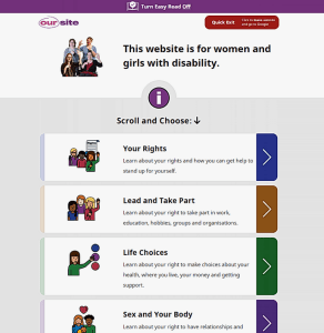 You might have heard of