Inclusive Design Toolkit for designers

five members of the inclusive design group stand behind a table with the toolkit displayed. Each person is holding a card with a word. The words spell out 10 years inclusive design toolkit.
Left to right: Joy Goodman-Deane, Sam Waller, Mike Bradley, Ian Hosking, and John Clarkson.

The Inclusive Design Toolkit has proved to be an invaluable tool for designers since it’s inception in 2007. The updated version includes the exclusion calculator which shows how many potential users might be excluded. This makes it a great toolkit for designers in any field.

The news bulletin from the Engineering Design Centre that produces the Toolkit and other resources has information on:

    • The tenth anniversary of the Inclusive Design Toolkit and what has been achieved in that time.
    • New exclusion calculator for better assessment for vision and dexterity.
    • E-commerce image guidelines for mobile phone viewing.
    • Impairment simulator software for vision and hearing is now very handy for showing how vision impairments look and sound.

Cover of the book Inclusive design toolkitThe Engineering Design Centre has made great progress in inclusive design. It began by working with business to show the benefits of including as many people as possible in the design. The design team continue to break new ground keeping users at the centre of the process

An article in the Inclusive Design Toolkit Bulletin explains how a student redesigned the chip packet for easier opening. A beer and a packet of chips is a simple pleasure for most. But if you can’t open the chip packet then not so pleasurable. This is a problem for more people than you might think. 

Two gadgets to help designers, gloves and glasses, are available. Using a pack of Post-it Notes, Sam Waller demonstrates in the video below how many people will find it impossible to remove the cellophane wrapping. A good example of including people with low vision and/or arthritis is good for everyone and increases market size.


Tool for overcoming bias in design

A magnifying glass is held over a grid montage of human faces. Overcoming bias in design.Everyone has a bias. Our biases can lead us to fall into the traps that create unintended barriers or inconveniences for users. Recognising biases in our outlook is the key to countering them in design processes. Airbnb Design has a tool for overcoming bias in design. 

It’s a human trait to hold on to initial evidence more strongly than information we gather later on. Then we fit our interpretation of the world to match that initial evidence, regardless of what else we might learn as time passes. This can prevent the process of designing inclusively.

Airbnb Design partnered with journalists from News Deeply and came up with a toolkit for designers. Another Lens is a research tool for conscientious creatives. “We believe that both designers and journalists have the responsibility to shine a light on their bias by asking the right questions, seeking conflicting viewpoints, and expanding their lens to build inclusive, global solutions”.  

Three principles underpin the thinking process: balance your bias, consider the opposite and embrace a growth mindset. All good principles for universal design thinking. The website tool is simple to use, poses critical questions and provides the thinking behind it. 

It’s the way the brain processes things

A globe atlas of the world sits on a desk and lined up in front are small dolls representing different countriesDr Belina Liddell argues that culture may affect the way your brain processes everything. And that is important. The term “culture” is a very complex web of dynamic systems – beliefs, language and values, and also religion, socio-economic status and gender may play a part too.

Liddel explains how culture makes a difference to the way we not only perceive things intellectually, but visually as well. All this is from the emerging field of cultural neuroscience.  Now we have new acronym to deal with, WEIRD – Western, Educated, Industrialised, Rich, Democratic. The article also discusses refugee populations. See the ABC science website for more on this interesting article. 


Occupational Therapy meets Industrial Design

Four people are standing leaning over a large table with pens and paper and looking at a laptop. They appear to be discussing something.Co-design has gained attention as a good way to increase accessibility and useability.  However, there is another way to tackle the issues – interprofessional learning and teaching. When occupational therapy meets industrial design in the classroom the end result is a great learning experience for all. Bringing designers to a better understanding of disability and accessibility remains a vexed issue. Many and varied attempts at teaching and learning have made some improvements. Some interdisciplinary work has also shown promise and perhaps it is worth building on this model. So this is what they tried at Thomas Jefferson University. A group of occupational therapy doctoral students were embedded in a masters industrial design course. The doctoral students delivered lectures and learning activities for the masters students. Over the eight months there was time for students to share knowledge more informally. Occupational therapy students were also able to provide insights for student design projects. The knowledge and insights gained by the masters students was nuanced and best measured qualitatively using mixed methods. They had originally hoped to quantify the knowledge gained. But perhaps this kind of learning is best measured by the accessibility of future designs.  The purpose, methods and outcomes are reported in an article published in the ‘Journal of Accessibility and Design for All’. The article is titled, Insights from an inaugural eight-month interprofessional collaborative co-design educational experience between occupational therapy and industrial design. The discussion and conclusion section is worth a read.

Abstract

The design of the built environment greatly impacts how all types of individuals and populations actively participate in their daily lives. Lack of access in the built environment for disabled populations remains a daily reality, negatively impacting engagement and life satisfaction, leading to isolation, loneliness, and depression. A university in the Northeastern United States sought to expand current constructs of the end-user and environment within a universal design (UD) perspective. On an eight-month inaugural interprofessional collaborative co-design experience, third-year occupational therapy doctoral (OTD) students were embedded in a first-year masters of industrial design (MSID) curriculum, which ran the course of the academic calendar (two consecutive semesters: Fall and Spring). Primary aims wanted to determine, via an interrupted timeseries quantitative design, if embedding OTD students within the industrial design curriculum influenced the MSID students’ prior assumptions, understanding of disability and enhanced their willingness to create more inclusive final products. Quantitative findings indicated that it was difficult to capture the meaningful change that occurred in the doctoral capstone program experience with the existing psychometric tools available. Anecdotal mixed-method findings indicated that informal interprofessional learning experiences in the classroom, such as lectures and learning activities created and facilitated by the OTD students and delivered in real-time, broadened and enhanced the MSID students’ knowledge surrounding disability and accessibility in a more nuanced way than the chosen quantitative survey tools were constructed to capture. A detailed literature review and description of the program have been provided, along with suggestions to capture meaningful outcomes for longer-term interdisciplinary collaborations.  

How to make a Universal Design Toolkit

How do you universally design a universal design guide or toolkit? Living the message is a key factor – if designing something to be inclusive, the process and outputs must be inclusive too. If not, key sections of your intended audience could be missing out on your information. After all, learners come in all shapes and sizes and different frames of reference. 

When devising a customer engagement toolkit, the Centre for Excellence in Universal Design in Ireland also documented their process and lessons learned. The document is focused on tourism, but the method and principles are relevant to any field of practice.

The title of the report is Lessons from Good Practices to Guide Universal Design Toolkits. However, with the update of the website this document is not readily found. Nevertheless, some of the content is mentioned below. 

At 100 pages this is a lengthy document. You might want to skip the first part and go directly to the section on Guidelines to Toolkit Authors, which is at the end. Each of the headings and subheadings form a guide to developing and designing instructional toolkits and guidelines for practice.  

Key points

Here are some of the key points from this section about the structure of the toolkit:

Step 1: ‘Perception’, the ability to understand information regardless of the user’s ability to see, hear or touch
Step 2: ‘Discoverability’, providing flexibility in use so that the user can find the information they want
Step 3: ‘Understanding’, how easy it is for the customer to interpret and understands how to use the content; regardless of the user’s experience, knowledge, language skills, or current concentration level
Step 4: ‘Use’, the design prevents from accidental or inadvertent actions, forms, controls and navigation are usable and the customer decides on how to use and act on the content presented

Living the message is an important point in the universal design world. Anyone who writes, educates or speaks about universal design and inclusive practice should live the message. For example, a slideshow presentation about universal design with tiny font is contrary to the message. 


Tourism Australia’s resources for accessible tourism

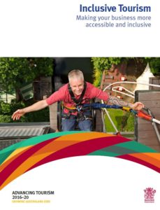
Front cover of Queensland inclusive tourism guide showing a man in a red shirt with his arms outstretched. Resources for accessible tourism.
Front cover Queensland Inclusive Tourism Guide

Tourism Australia has a list of resources for accessible tourism on their website. These resources are useful for both businesses and travellers. This is a growing sector and finally being recognised as an important part of the tourism economy. 

The resources for accessible tourism organisations are:

Accessible Tourism Toolkit 

Accessible Victoria 

Accessible Holiday Accommodation

Cangoeverywhere.com.au 

Getaboutable 

Inclusive Tourism (online training)

Inclusive Tourism: Economic Opportunities

PhotoAbility 

Queensland Inclusive Tourism Guide 

Studying in Australia 

Sydney for All 

TravAbility 

Travel For All 

Travellers Aid Australia 

Vision Australia 

Logo of Tourism Australia - Colourful kangaroo shape with blue upper case textTourism Australia explains accessible tourism as:

“Accessible tourism is the ongoing endeavour to ensure tourist destinations, products and services are accessible to all people, regardless of their physical limitations, disabilities or age.”

Understanding the opportunity for Australia in Accessible Tourism is a research study conducted in 2017. It is available on the Travability website.


UDL Through Real-World Examples

Sesame Street characters dancing in the street.
Sesame Street promotes diversity and inclusion. Image: ScribblingGeek on Pixabay.

Introducing Universal Design for Learning (UDL) into education settings is often met with a murmur of, “Oh no, something else that has to be done.” School teachers, early childhood educators and university academics all carry an extraordinary load. Taking on something new can feel burdensome, at times. One strategy to help this be less so, is to illustrate concepts of UDL through real-world examples.

This post, and a collection of future posts, will draw attention to principles of UDL in everyday life and pop culture.  And where better to start than with the Sesame Street?

Sesame Street and UDL

Features of Sesame Street relate to several the UDL checkpoints. This post explores Sesame Street and UDL Checkpoint 7.2, Engagement through optimising relevance, value, and authenticity.

For more than 50 years, Sesame Street has been entertaining children with an educational focus. Throughout its long history, it constantly sought to represent all people, both in front of the camera and behind the scenes. Just as UDL aims to make education inclusive and accessible, so too does Sesame Street.

Sesame Street creates its program to be appropriate for different racial, cultural and ethnic groups. Teaching about racial difference is one example, through its multi-coloured Muppets, and then more explicitly with the introduction of black characters.

Cultural responsiveness is shown through different focal points for different countries. Kami, a Muppet in the South African series, is HIV positive. His representation aims to support people to recognise themselves or promote understanding of others. Kami’s friends make explicit that HIV cannot be spread by touch or by being friends with someone who is HIV positive.

In the Nigerian series, the focus moves to religious and ethnic diversity. Diverse religious iconography, food, names and clothing have all been included to promote cultural responsiveness and relevance.

Muppets represent diversity

Creating a range of Muppets with diverse characteristics promotes personalisation and contextualisation. For example, Julia, being on the autism spectrum, characters of mixed race, and, characters with physical or neurological disabilities. 

Relating strongly to Checkpoint 7.2 of the UDL guidelines, these features of the Sesame Street characters help optimise relevance and authenticity. Through making its characters representative of the broader community, Sesame Street increases accessibility through diversity and inclusion – a great illustration for consideration in our formal education contexts.

See more of Lizzie’s posts on UDL for specific teaching and learning strategies. 

Visit the Universal Design for Learning section of this website for more information on UDL.

Designing healthy health facilities

A slide from the presentation showing a cafe area with large glass windows looking out to a garden.Hospital design is evolving. We have moved from the Florence Nightingale era focused on regimes and hygiene to one of patient healing. And not just in a medical sense. Knowing that building design impacts our sense of wellbeing, we have entered the era of designing healthy health facilities. This was the topic of Michael Walker’s presentation at UD2021 Conference. 

Michael’s presentation took a biophilic approach to designing health facilities. Biophilia is about increasing connection to the natural environment. This is achieved through the choice of building materials and/or direct connection to nature. He gave several examples of the design features that matter: 

“Natural shapes and forms – the use of botanical and animal motifs, natural forms such as shells and spirals, egg, oval and tubular forms and shapes that generally resist straight lines and right angles.

Light and space – the use of natural, filtered or diffused light, the incorporation of shadows, warm light, spatial variability, spaciousness and the connection of inside and outside spaces.”

Other factors to consider in hospital design are:

      • Wayfinding: Most people can be easily overwhelmed when trying to find their way in unfamiliar surroundings.
      • Entrances: Arriving at a healthcare facility can be challenging for people and their carers. If arriving by car, there will be concerns about safety and wayfinding.
      • Reception: Areas should be clearly identified and provide people the opportunity to identify that they may need help in navigating the engagement process. 

The presentation slides have more information on this aspect of designing healthy health facilities. Michael’s presentation is titled, Design Matters to Make Well Spaces, and  linked closely with Stefano Scalzo’s keynote address on universal design. 

New era in home design is good for business

A white labrador dog sleeps in the foreground and in the background the door is open showing level access to the alfresco.
Image courtesy Taylor’d Distinction

Everyone’s a winner in the upcoming amendments to the National Construction Code (NCC). These changes represent meaningful social change for Australia. They herald a new era in home design which is good for business as well as occupants. At last there is recognition that building design has a significant impact on the way we live our lives. So why has it taken so long for these amendments to happen? 

Housing sits in a complex web of regulations, financing, planning and market forces. The housing production system involves many stakeholders, all independent actors, but dependent on each other to maintain a level playing field. To complicate matters further, politicians decide amendments to the NCC. Consequently, the political dimension cannot be ignored. This is discussed further in the Sourceable article, A New Era in Home Design

But these changes will be good for business. With basic access features in place, modifications and renovations will become easier. Homeowners will be more willing to have modifications because it will minimise major works. Previous concerns over the value of their home will be reduced too. Smaller builders should get ready for this market.

However, the amendments to the NCC are not yet mandated. That should happen in September 2022, and there is some concern that industry will argue that this is too soon. 

There’s more work to do

Close view of the level entry to a doorway.
Image courtesy Taylor’d Distinction

In April 2021 state and territory Building Ministers agreed to include basic access features in new homes. But the Devil is in the detail. Before the changes to the NCC are mandated, a draft standard based on technical detail must be agreed. Consultation on the draft standard is currently open for comment.  Anyone can comment on the draft standard. The consultation period is open until 8 July 2021. 

To make it easier, ANUHD has shared a rough draft to help others with their comments and submissions. 

Accessible design is parent friendly design

Infographic showing three groups of disability: permanent, temporary and situational.
Microsoft infographic: Permanent, temporary, situational disability

A light-hearted tone is no cover for the serious nature of accessibility. Hampus Sethfors explains “the dad-thing comes with a ton of accessibility needs”. Carrying a baby means the loss of one or both arms and hands. He also found he had less brain processing capacity. As Hampus says, accessible design is parent friendly design, and he explains why.

Holding a baby is a classic example of situational disability as described in the Microsoft Inclusive Design Toolkit. However, smart phone voice control and access to a headset means he can listen to a podcast. Other parent disabilities are mostly related to having less brain processing capacity. Sleep deprivation and constantly thinking about keeping a baby alive are just two factors. Captions on Netflix means he can keep the sound down or off completely.

This blog post is written in a lighthearted way, but there are important messages that all designers should heed. The access lab blog has easy to read content and is a great example of how to write more inclusively. Most of the articles are related to digital technology, but the principles are valid in other fields of design.

Mapping how something gets built

Virginia Richardson ran a workshop at the UD 2021 on mapping how something gets built. Although local government is not the designer, it has many responsibilities for the project from start to finish. The question for the workshop was, how can we embed universal design in the process? 

Virginia began with a graphic showing an example of the number of stakeholders involved in house building. A line of complex manufacturing machinery used to show the complex process and number of stakeholders involved in mass market housing.

This concept was developed further in the workshop. It showed how many people get involved in a building project from a local government perspective. 

A linear machine picture has lots of coloured post it notes on it depicting all the people involved in building a park project.
Slide from the workshop

Virginia’s slides include the Draft Universal Design Policy and associated documents for the Mornington Peninsular Shire Council. 

There are more presentation slides and published papers on the UD2021 Universal Design Conference page .