Most people living with dementia live at home in the community, not in a facility. Dementia develops over time and people experience it differently. With the right supports they can live independently for several years after diagnosis. Thoughtful urban planning and design is part of the web of community supports. Samantha Biglieri discuses dementia and planning in her short article.
A short irregular grid pattern of streets to create identifiable intersections.
Streets with ample space for pedestrian with wide buffer zones between pedestrians, cyclists and motorists.
Variated architectural styles within the same development. Vary the landscape to provide unique landmarks. This includes mixed land-use, different styles of street furniture, public art and vegetation.
Development of memorable landscape features, open public squares and community facilities that promote social interaction and a sense of belonging.
Summary
Contrary to popular belief, over two thirds of Canadians with dementia live in the community as opposed to congregate living. This begs a question that has not been adequately explored in planning practice or academia: How can we as planners who deal with land-use, community design, and public consultation every day, understand and meet the needs of people with dementia (PWD), who are citizens just like everyone else? After examining existing work on the relationship between the built environment and PWD, I argue a dementia-specific approach to planning practice and research is needed in the Canadian context.
Diversity, equity and inclusion is easy to talk about, but how do you make it happen? Society and businesses make commitments to the concepts, but it needs more than policies. The WELL Building Standard is about diversity, equity and inclusion by design within the built environment.
The WELL Building Standard is a building certification that focuses on human health and wellness. The assessment method encourages active lifestyles, and building features such as natural light and good air quality. The Standard includes a set of strategies focused on improving quality of life through the design. The Standard now includes the The WELL Rating™.
Jack Noonan writes in Sourceable that when we design for inclusivity, everybody benefits. Two hundred advisors from 26 countries devised the The WELL Equity Rating™. This rating framework is designed to help organisations meet their diversity, equity and inclusion goals.
The WELL Equity Rating™ was developed through a design thinking approach. This included problem solving in collaboration with people from marginalised groups.
The WELL Rating™ gives organisations a framework to improve access to health and wellbeing and address diversity, equity and inclusion. It contains more than 40 features spaning six action areas:
WELL also addresses topics such as housing equity, modern slavery and issues of domestic violence. A new feature for the next edition will include colonisation and acknowledgement of traditional custodians of the land on which we live work and play.
University campuses have much in common, including the likelihood of getting lost and disorientated. This is largely due to the way each campus evolves with new buildings placed wherever land is available. That makes architectural wayfinding strategies impossible to follow. So if a university campus can come up with a good way of orientating people, it should be good for other situations.
There are a large number of buildings present on Edith Cowan University campuses which cannot be changed to accommodate intuitive, architectural wayfinding practices.
Wayfinding is essential for helping people to get out and about. Getting lost is not just inconvenient, it is stressful – especially if it causes a late arrival. The Wayfinding Signage Manualfor Edith Cowan University outlines how and where signs should be used, designed and built. It is a technical document with a destination hierarchy, application strategy and graphic standards. An access and mobility map and an active transport map are also included.
Wayfinding and signage for walkers
The Queensland Department of Transport and Main Roads also has a guide for people walking. This is another technical document offering specific guidance to wayfinding professionals. While walkers (and wheelers) have specific requirements they need to be woven into signage for cyclists. Well-designed wayfinding and signage encourages people to walk using routes that are safe.
People walking have specific wayfinding needs different from those riding bikes or motorists.
The guide for people walking has a section on accessibility and lists several design elements to support accessible wayfinding signage. The wayfinding manualdeveloped by the Cooperative Research Centre is referenced in this document. Although it was researched and developed in 2007 it remains an excellent reference.
Getting around QUT
Similarly to Edith Cowan University, the Queensland University of Technology (QUT) has a wayfinding signage manual. This rather lengthy document is also technical and was published in 2022. It begins with a wayfinding masterplan, signage principles and accessibility. It’s good to see accessibility at the beginning of the guide – this aspect is often left until last.
New residential developments in Queensland must be walkable and encourage physical activity. Specific legislation requires among other conditions, connectivity, footpaths and street trees. Blocks must be no longer than 250 metres and residents must be within 400 metres of a park or open space. To help with planning walkable neighbourhoods there’s a guide. The Street Design Manual for Walkable Neighbourhoods supports the Government’s policy. And Walkable, should also mean Wheelable.The manual is designed to help engineers, designers and planners to design more walkable and liveable residential areas. The Institute of Public Works Engineering Australasia prepared the guide in conjunction with the Queensland Government,The guide covers open space, lot design, street design, active travel, public transport, landscaping and much more. At 160 pages is it comprehensive. There is a brief mention of people using mobility devices, children, older people, and parents with strollers. These street and road design guides divides pedestrians into types of users according to their assumed demands. This implies that different people use different streets for different reasons. For example, only consider children in school locations. But children can be present on any street, and older people take children to school.
This post has four different smart cities playbooks. They are by UNHabitat, the Smart Cities Council, 3Gict’s Smart Cities for All, and the fourth is by two urban planners.
UNHabitat – People-Centered Smart Cities Playbooks webpage introduces a series of playbooks as basic components of their smart cities program. The aim of the playbooks is to empower local government to take a co-design approach to digital transformations. This is so that cities can work on sustainability, inclusivity and human rights for everyone. The playbooks are titled:
Centering People in Smart Cities
Assessing the Digital Divide
Addressing the Digital Divide
Shaping Co-creation and Collaboration
Infrastructure and Security
Building Capacity
Connected Games Playbook
The Smart Cities Council is on the front foot preparing their thinking for the Brisbane 2032 Olympic and Paralympic Games. They are focused on the digital aspects of the Games and have devised two smart cities playbooks.
Smart Cities Playbook No 1 sets the digital scene for the Games covering transport, facilities, housing and urban development.
Smart Cities Playbook No 2 provides guidance on the development of a South East Queensland Regional Data Strategy. Data is one the most valuable assets within the region but is undervalued and under utilised. The Strategy should support good governance and lead the implementation.
Five Pillars of Inclusive Smart Cities
A smart city uses communication technology to enhance liveability, workability, and sustainability. While the tech gets smarter it’s not getting more accessible. The most significant barriers to inclusion are lack of leadership, policy, and awareness, and limited solutions. James Thurston lists the five pillars in the Smart Cities for All Toolkit as:
Strategic Intent: inclusion strategy and leadership
Culture: citizen engagement and transparency
Governance & Process: procurement and partnerships
Technology: Global standards and solution development
Data: Data divide and solutions
The Smart Cities for All Toolkit empowers city leaders and urban planners to make their programs truly “smart” by being inclusive and accessible by design.
Toni Townes-Whitley, Vice President, Microsoft.
You can see a 13 minute video of one of James’ presentations that covers similar ground.
Busting myths about smart cities
Chelsea Collier and Dustin Haisler’sSmart Cities Playbook begins with myth-busting. The myths include: it’s all about technology; it’s only for big cities, it costs a lot; and only governments can do it.
The second part of their playbook focuses on best practices covering infrastructure, people and intelligence. The third part introduces seven steps to a smart-er community with practical worksheets for guidance.
Which street guide is the best? Well, that depends on which perspective you are coming from. Urban designers, transport planners, pedestrians and drivers all have a stake in streets. Here are four inclusive and accessible street guides from previous posts for reference.
If you plan cities for cars and traffic, you get cars and traffic. If you plan for people and places, you get people and places.
Attributed to Fred Kent
Global Designing Cities website has the Global Street Design Guide available for download. The guide has sections for designing streets for kids, and implementing street transformations. Launched in 2014, the Global Designing Cities initiative takes an international view. The website has a series of short films, and a guide for designing streets for children.
A Citizen’s Guide to Better Streetstakes a holistic look at street design from land planning and zoning to streets as public spaces. The main concerns of traffic engineers, such as safety and function are also covered. The guide was published in 2008 but the issues are current today. It is on the 880cities.org website.
The Guide to the Healthy Streets Indicators from the UK has information and checklists in an easy to use format. It focuses on walkability without the express inclusion of people using wheeled mobility, but alludes to them. The guide covers feelings of safety, places to stop and rest, not too noisy, shade and shelter, easy to cross roads, and pedestrians from all walks of life.
The American Society of Landscape Architects promotes green, universally designed streets. These safely separate pedestrians, cyclists, vehicles, and public transport and use strategies to reduce reckless driving behaviour. The video below indicates the sensory overload that busy streets can create for some.
Designing cities with AI: Should we?
Facelift is a new AI system that allows urban planers to redesign the look of city streets.
A FastCompany article explains how volunteers from 162 countries rated Google street images. Then the data was put through the AI process. The results were obvious – plazas are beautiful and construction sites aren’t. The next step was to create an interactive tool to generate before and after images – Facelift. Urban planners can use this tool to improve the design of existing places. But there is a question about this: is it beautification or gentrification?
The Post Pandemic Public Spaces documentary series is about the future of our public spaces and the influence of the pandemic. The documentary was produced as part of the the work of the Urbanism faculty at TU Delft.
Eight researchers discuss their views on the future of our public spaces in a series of interviews. The researchers walk the streets as they describe the lack of accessibility and unequal access to public space. The video is subtitled in English.
This video focuses on mobility. Other videos focus on behaviour, challenges, and the final one concludes the discussion.
We can all agree that the COVID 19 crisis has affected everyday life. It has forced inhabitants to change their routines and thus the use of public spaces and amenities.
From the abstract
The fourth episode of the series presents the topic ‘Inequality’. In line with last episode, it is important to remember how mobility relates to (in)equality. The measurements taken during COVID-19 outbreak, such as social distancing and staying home, has shown that not everyone has or can have the same pattern, and/or is able to have equal patterns.
Public spaces in different neighbourhoods have different qualities. The pandemic has shown that not everyone lives under the same conditions and has equal access to public spaces. Distances to recreational (green) spaces can differ greatly, there is unequal safety along the routes. Places to sit and stay and relax are also not equal.
Public space is subject to power structures and the distribution of resources, and are unequal almost by definition, and consequently access isn’t available for everyone.
Urban design and the wellbeing of older adults
Keeping mobile and active whether walking, riding or using a mobility device, is essential for staying connected and maintaining good mental health. The effect of poorly designed and maintained environments has a negative effect on the mental wellbeing of older adults. Depressive symptoms are more likely to develop if an incaccessible environment prevents getting out and about.
Gillepsie, LeVasseur, and Michael conclude their findings “support public policy to promote neighbourhoods with diverse amenities as a means to support mental health in older adults”.
The lack of diverse amenities within the neighbourhood was associated with depression among those older adults with greater mobility. Among those older adults with low mobility, we observed no difference in depression by amenity diversity.
The Victorian Government has updated their universal design policy which applies to the whole of government. Previously it sat within the health and building department. The policy is not just an empty statement – it has actions embedded. These actions begin with the procurement process for built environment projects.
Universal design is a design philosophy that ensures products, buildings, environments, programs and experiences are innately accessible to as many people as possible regardless of age, disability, background or any other differentiating factors”
Victorian Government
The policy is structured around the classic 7 Principles of Universal Design. The aim is for all Government departments and agencies to apply the principles to all stages of the project from the project proposal to the implementation and operation of the project. Specifically:
Undertake user engagement and co-design processes
Incorporate universal design principles into procurement and function briefs
Incorporate universal design principles into design standards
The summary document provides a detailed explanation of how each of the 7 principles might be applied.
The main document has more detail including how to apply universal design across the lifecycle of a project and co-design methods. The 7 Principles of Universal Design are expanded to include both good and poor examples of design outcomes. In short – what to do and what not to do.
Both documents are in Word format for easy access for all. This is also a good example of getting the message across with as few words as possible – another universal design feature.
The Victorian Government has been leading the way on universal design for some time. Other states could benefit from following their lead. See also Victoria’sHealth and Building Authority policy as well.
Inclusive Victoria – the Plan
The Victorian State Disability Plan has a great introduction that includes language and terminology. It acknowledges there is no one right, or universal way to conceptualise disability. That’s because people perceive disability in culturally specific ways.
Some people are proud to identify themselves as disabled, whereas others don’t want their disability to define them. Similarly, many autistic and neurodivergent people don’t see autism as a disability. They just see autism at a different way of interacting with the world. The State Disability Plan 2022-2026 is titled,Inclusive Victoria.
Victoria’s Autism Plan
The Victoria’s Autism Plan builds on their Absolutely everyone: state disability plan. It incorporates commitments to remove specific barriers faced by people in the autistic community. The plan is based on feedback from a parliamentary inquiry into the needs of autistic people and their families. Building helpful attitudes toward autistic people is a key element of Victoria’s Autism Plan.
The document begins with personal stories, which is pleasing to see because they are more revealing than statistics or diagnoses. It sets the tone for the rest of the document and acknowledges additional barriers faced by the autistic community.
A note on language
The term Autism Spectrum Disorder (ASD) is no longer the preferred term. Language is influential in changing community attitudes so choosing the right terms is important. Individuals and advocacy bodies were asked which term they thought should be used in the plan. There was general agreement that the term “autistic people” should be used. An important point – ask people what terms they prefer.
Key points in the plan
Specific barriers included:
lack of community understanding
accessing education that meets their needs
exclusion from employment opportunities
limited access to supports and services
additional barriers to inclusion for autistic people with intersecting identities
There are four ways to access the plan on the website: Full version in PDF, Easy English Version in PDF, a text version in Word, and an Auslan summary. Or you can download the full PDF version, Victorian Autism Plan.
Four generationsThere is much talk about population ageing but not much ‘doing’. Urban design is still stuck in age segmentation mode – separate places for children and older people. For example, playgrounds for children and senior citizen centres and ‘homes’ for older people. What we need is more multigenerational planning using universal design principles.Playgrounds with exercise equipment for “seniors” is the new thing. But grandparents have been taking children to playgrounds since they were invented. As it turns out, small children like the exercise equipment – it’s adventure play to them! But not all places meet the needs of both young and old. Planners need to simultaneously consider the different needs of young and old in future projects. That’s the advice of a briefing paper on Multigenerational Planning. Key issues are mobility and access to services, housing affordability, walkability, and density. Younger and older generations share similar safety risks, especially as pedestrians. Parents fear of crime is for their children and their own parents.
What can planners do?
Cross-generational collaboration is a good start, but it also has to consider other population dimensions. Migrants, people with disability, gender identity, and social and cultural inclusion. The key points in the briefing paper are:Keypoint 1: Multigenerational planning creates new coalition building opportunities. Different populations don’t always recognise their reliance on each other. Each age segment defends its narrow position creating missed opportunities.Keypoint 2: Civic participation and engagement is fundamental to multigenerational planning. Children and young people have their own wisdom and older people often have neighbourhood networks. Bringing them together provides better outcomes rather than engaging separately. Keypoint 3: Multigenerational planning users smart growth principles. Programs and smart growth policies that target older people and children provide multigenerational benefits. Keypoint 4: Multigenerational planning applies universal design principles. The guiding philosophy is to design spaces with the ability to meet the changing needs of users. Universal design promotes accessibility, safety, flexibility, functionality, simplicity, and comfort. Housing should meet basic access standards too so that everyone can visit each other at home. There is much more for planners in this fourteen page paper. The title of the briefing paper is, Multigenerational Planning: Using smart growth and universal design to link the needs of children and the ageing population. It was published by the American Planning Association.
Wayfinding is often considered as just signage instead of site or building legibility. A wayfinding system involves buildings, open space, lighting, and landmarks. It’s about providing consistent clues to help people navigate indoor and outdoor spaces. Wayfinding should be integrated into the design process in the early stages instead of being added as an afterthought. To help designers, the CRC for Construction Innovation has devised a wayfinding system audit checklist.The Wayfinding Systems Audit checklist provides guidance for designing wayfinding systems. There is a mix of Australian Standards, thoughtful design, and end user convenience. It includes:
The application of tactile ground surface indicators (TGSI)
Signage and graphic communication
Auditory communication
Maps
The audit checklist supports the Wayfinding Design Guidelinesalso produced by the CRC. The many photographs illustrate key points.
Some basic principles
Provide frequent directional cues throughout the space, particularly at decision points along journeys in both directions.
The design of decision points must be logical, rational and obvious to a sighted user, ensuring the directional cues relate directly to a building or landscape space. Ensure sequencing and that the priority and grouping of message signs is unambiguous.
Design and implement a ‘naming protocol’ by choosing a theme for segregating places and spaces. Use names and symbols easily remembered by users from diverse cultural backgrounds.
Consider incorporating information in multiple languages or incorporating pictograms when devising a naming protocol.
Ensure the physical placement, installation and illumination of signage is suitable for all users.
Published in 2007 by the CRC for Construction Innovation, supported by the Queensland Government. The CRC came to an end in 2009. The Australian Standard for Wayfinding (AS1428.4.2) was updated in 2018.The Victorian Department of Health also has a useful wayfinding checklist for hospitals and health facilities. Audit also in previous posthttps://universaldesignaustralia.net.au/systems-audit-for-wayfinding/
 Most people living with dementia live at home in the community, not in a facility. Dementia develops over time and people experience it differently. With the right supports they can live independently for several years after diagnosis. Thoughtful urban planning and design is part of the web of community supports. Samantha Biglieri discuses dementia and planning in her short article.


 New residential developments in Queensland must be walkable and encourage physical activity. Specific legislation requires among other conditions, connectivity, footpaths and street trees. B
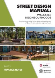 Real life examples are included in a


 Facelift is a new AI system that allows urban planers to redesign the look of city streets.


 Wayfinding is often considered as just signage instead of site or building legibility. A wayfinding system involves buildings, open space, lighting, and landmarks. It’s about providing consistent clues to help people navigate indoor and outdoor spaces.