
Easy Read is a good example of how less is more. But conveying messages in fewer words is more difficult than writing more words. Easy Read is for people with low levels of literacy. It’s mostly used for essential information such as health alerts and legal terms and conditions. Writing with minimal words is a skillset of its own. It’s not easy. But it does make you think about what you really need or want to say.
Proficient readers can use Easy Read versions to get the take-home message quickly and easily. That’s also why it’s universal design – it’s for everyone. However, Easy Read is not the same as Easy English – the example in the image. It has even fewer words and focuses on actions not just information. Cathy Basterfield says that Easy Read is not simple enough for some people and explains this in a simple poster analysing the difference
Easy Read not the same as plain English or plain language. Complex documents such as research reports are beginning to include a plain language summary. However, these require an average level of literacy. They are usually presented as a paragraph or a list of sentences in dot points. Easy English drills down further to the key words and concepts. The techniques include:
-
-
- a lot of white space
- directly relevant illustrations (not photos) to convey the meaning of the text
- short words and sentences
- minimal punctuation
- positive phrasing
- bullets to separate items in a list.
-
Editors can learn from Easy English
The Chartered Institute of Editing and Proofreading blog has a more detailed article. It summarises Cathy Basterfield’s presentation at their annual conference. She shows how editorial professionals can learn from Easy English.
Blog writer, Anna Baildon, said she learned a lot from the session and had her assumptions challenged. She said she could see “the links to plain English but it goes further”. The headlines she remembers are:
-
-
- It’s hard to write in Easy English
- Access to written information should not be a reading test. It should be enabling
- Unpacking the language so the meaning becomes accessible.
- Access to information is a right. ‘Access’ means that a person reads, understands and knows what they can do.
-
The Chartered Institute of Editing and Proofreading has a guide to Editing in Plain English.
Many people need it
More than 40% of the population has low literacy skills. In some remote parts of Australia and in institutions it is higher than this. There are several reasons why so many Australians need information in easy to understand formats:
– acquired disabilities
– lifelong disabilities
– poor educational outcomes
– psychiatric or mental illness
– dyslexia
– early school leavers
– older people
– different cultural backgrounds
– hearing impaired and/or people from the Deaf community
Accessibility and universal design needs to be considered at the outset of any project, not as an afterthought. Information formats such as brochures and websites are no exception. Some important government documents include an Easy Read version, but this is still rare.
Cathy Basterfield has pioneered much of the work on Easy English in Australia. People with high level literacy skills can grasp the key points with little effort. And there are times when people with good literacy skills need help. For example, the stress of a court hearing can temporarily affect one’s reading skills and level of understanding.
Cathy Basterfield presented a paper on this topic at the Australian Universal Design Conference, UD2021. There is a related post on choice of typeface or font for easy reading. Cathy has an Easy English blogsite that explains more. She did a lot of work for COVID-19 too.
There is an Easy Read version of the UN Convention on the Rights of Persons with Disabilities. The Bumpy Road website is a good example of Cathy’s work for interacting with the justice system.

 Why is some technology called “assistive” technology? After all, isn’t all technology assistive? It seems that any technology developed for people with disability is assistive, while other technology is just, well, technology. A report on the economics of assistive technology outlines the benefits of investment.
  Everything seems more difficult when life is spiralling out of control. And when you can’t understand the forms and documents people are asking you to read, it gets so much harder. Going to court to sort things out is very stressful and even more so if you don’t understand what’s going on.
  We hear people talk about the UN Convention on the Rights of Persons with Disabilities (CRPD), but how many of us have read it? It’s a big document and not easy to read. It covers every aspect of life and every person of every age. The CRPD matters to all of us. Eventually disability will touch each of us and our family members and friends.
 In the context of “leave no-one behind” the United Nations is keen to live the message of disability inclusion in its own operations. The UN can better support member states with their own challenges if they are practicing inclusion in their own operations.
  Who does the designing and what do they design? If the design works, users don’t think about the designer. But when the design works poorly, or not at all, the designer becomes the focus. “What were they thinking?” is the catch-cry. In spite of much research and literature on designing thoughtfully and inclusively, we still have a long way to go. So who do designers design for?
 Who thought of kerb cuts in the footpath? 30 years ago policy makers couldn’t understand why anyone needed kerb cuts in footpaths. “Why would anyone need kerb cuts – we never see people with disability on the streets”. This is part of the
  Courts and justice systems across the world are going through a digital transformation. It’s happening behind the scenes and up front. But are these systems and processes inclusive? A survey in 2018 revealed that court administrators don’t know about the advances in inclusive solutions. With the current pandemic, reliance on technology has increased. So this matter is more urgent now.
 Access Easy English has
  “Inclusion” is a word used widely, but what do we mean by this? How does it happen? Who makes it happen? Given that we are not inclusive now, it has to be a futuristic concept – something we are striving for. If we had achieved it we would be talking about inclusiveness, and we wouldn’t be writing policies and advocating for it.
 A conference paper
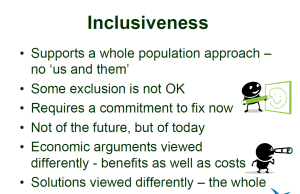 supports a whole population approach. Economic arguments and solutions are viewed differently. Inclusiveness is not a contest of rights and not one group giving something to others. All costs and benefits are measured from this perspective.