Colour blindness not just genetic

Colour blindness is an eye condition that changes the way people see colours. It doesn’t seem like a big thing to people who have normal colour vision. But when it comes to reading things like maps, it matters a lot. Graphs, maps, diagrams and other graphic information types often rely on colour to differentiate between elements and features.

With genetic colour blindness, men are about 16 times more likely to be affected than women. Injury or disease can also affect the ability to see certain colours.

A pile of brightly coloured squares sit untidily on top of each other. The colours are very bright.

Apart from genetic reasons, some health conditions increase the risk of developing colour blindness later in life. Macular degeneration, glaucoma, diabetes, dementia, and Parkinson’s disease can all affect colour vision. Because it happens later in life it often gets unnoticed and undiagnosed. Some medications might affect colour vision too. For more, see My Vision guides.

You are at greater risk of colour blindness if you are a white male and have family members with colour blindness.

Red-green colour vision deficiency occurs in 1 in 12 males with Northern European ancestry. For women it’s 1 in 200.

A middle aged white man wearing glasses

The Axess Lab website has some great tips for making graphics more inclusive. For example, putting text into pie charts, and labelling goods with colours not just showing them. Colour contrast matters too as you can see in the picture below.

Pie chart with different colours and their respective labels.
A pie chart with labels
A group of people standing holding a pink banner with the words You are Not Alone, but you can't see the word NOT because it is in pale red and blends into the background colour
A serious colour contrast fail in real life

Colours that are accessible

Colour diagram showing the three different types of colour vision deficiency

Colour is an important part of designers’ creative work. When it comes to colour accessibility the creative path takes a few twists and turns. That’s because people who say they are ‘colour blind’ are not all the same. Most can see some colours, but not all of them. So how can designers choose colours that are accessible, especially in digital communications?

Adobe has a blog page that explains the importance of choosing colours. Four images show the three different versions of colour vision deficiency, which are:

  1. Protanopia: Referred to as “red weakness,” this variation of red/green color blindness results in individuals being unable to perceive red light.
  2. Deuteranopia: Also known as “green weakness,” this type of red/green color blindness renders people unable to perceive any green light.
  3. Tritanopia: People who suffer from blue/yellow color blindness have difficulty distinguishing between blue and yellow colors. This form of color blindness is far less common than its red and green counterparts.

Graphic designers will appreciate the colour wheels and ways to avoid a conflict of colours. Examples of good colour choices show that designs can still be attractive as well as functional. You can try out the online Material Design accessible colour tool that provides information on colour contrasts for visual material. 

Readability and colour choice

Colour choice is also a factor in readability. The video below shows how easily we can be deceived by our eyes. It shows how two different shades of grey are actually the same. That’s why you can’t rely on judging contrast by eye.

Which font to use? All of them?

New research from Adobe shows we have to re-think optimum fonts and typefaces.

Example of typefaces images.

First, font is not the same thing as typeface. What’s the difference? Typeface is a group of letters and numbers in the same design, such as Times New Roman. Font is a specific style of typeface, such as Italic or Bold, and in a particular size, for example, 10 or 16.

By simply changing the font readers can gain incredible reading speed. But there is no one-size-fits-all “best” font.

A woman is reading a book reader device similar to Kindle.

While reading speed is not something usually considered as a universal design concept, it is a related aspect. Ease of use and comfort for all is one of the tenets. And if you want to extend the attention span of readers then speed and comfort will help.

The study looked at a group of 352 participants aged 18-71 years. Forty-six percent were female, 22 percent bilingual and all self reporting they are comfortable reading English.

The study measured 16 common typefaces and their effects on reading speeds, preferences and comprehension scores. Similarly to an optometrists eye test they toggled letters to ask participants their preferred font.

Different readers read fastest in different fonts without losing comprehension. That means personalisation is the key.

a man is reading a tablet device.

On average an individual read 35 percent faster with their fastest font than with their slowest font. Comprehension was retained across all fonts. But no font was a clear winner for all participants. This means that devices will need to allow reader to personalise their font choices.

The other finding was that the fonts people say they prefer aren’t often the ones with which they read fastest. While there is no best font, there was some typefaces that worked best for older participants. This could be due to familiarity, or visual properties.

The title of the article is, The need to personalize fonts for each individual reader. It has some surprising results everyone should consider in their written and online communication. The title of the research paper is, Towards Individuated Reading Experiences: Different Fonts Increase Reading Speed for Different Individuals

From the abstract

In the context of Interlude Reading, we consider if manipulating font choice can improve adult readers’ reading outcomes. Our studies normalize font size by human perception and provide a foundation for understanding which fonts people prefer and which fonts make them more effective readers.

Participants’ reading speeds (measured in words-per-minute (WPM)) increased by 35% when comparing fastest and slowest fonts without affecting reading comprehension. High WPM variability across fonts suggests that one font does not fit all. We provide font recommendations related to higher reading speed and discuss the need for individuation, allowing digital devices to match their readers’ needs in the moment.

The art of typography for digital access

logo for Vision Australia Digital Access webinars.

Every time you write something you have an opportunity to consider typography for digital access. This is the technique of choosing and arranging type to make written language understandable and readable. The problem is, some typefaces make it difficult to distinguish separate letters. For example, 5AM can look like SAM, clear looks like dear, and turn looks like tum. Fortunately, Vision Australia has some practical help.

Writing for an app, a website, an email, or a presentation requires thought about the most readable typeface or font. And we have to consider things like payment terminals, keypads and logos. Several people might be involved in making and designing typography. For example, human resource teams and brand and marketing teams.

Vision Australia has a one hour digital access webinar divided into handy chapters so you don’t have to consume it all at once. The chapters are:

  1. Introduction to typography
  2. An inclusive lens on typography
  3. What to look for
  4. 8 accessible typeface tips
  5. Which font should I use?
  6. Typographic layout and styling
  7. Design with people with disability

8 Typeface Tips

  1. Choose fonts that have more space for lower case letters so that the main body of a lowercase letter has more room. 
  2. Choose typefaces that are more open – for example a bigger gap between the end curves of a ‘c’. 
  3. Fonts with larger white spaces between letters are really helpful.
  4. Typefaces with joined letters to look like script are confusing and difficult for screen readers.
  5. Some typefaces have letters and numbers that look the same such as upper case “i” and the number “1” and lower case “l”.
  6. Look at the horizontal spaces between all letters in a word of body of text. They can be too close or too spaced. 
  7. Limit using ALL CAPS text. This is due to the shape of the letters and the way we recognise text. Sentence case gives the word it’s shape.
  8. Avoid images of text because when you zoom in they get pixilated and fuzzy. Photos of text can’t be read by screen readers either.

One amusing point about screen readers trying to decipher the acronym FAQ’s: if the apostrophe is left out it reads “farq yous”. However, it emphasises the point of testing with screen readers.

Vision Australia’s advice is there is no one right font. You have to consider context, tone, audience and the content. And of course, the advice in the following chapter in the webinar.

An excellent webinar – one of a series that includes mobile app accessibility, online access policies, and more. 

Plug and Pray?: AI and inclusion

As we improve accessibility in the built environment, it is important to make sure we create and maintain accessible digital designs. A report from the EU, Plug and Pray? outlines the opportunities for emerging tech and people with disability. The report highlights the need to be inclusive and provides practical recommendations.

People with disability are often early adopters of new tech, but these new ideas can also come with unintended barriers for users.

Front cover of Plug and Pray report

The title of the report is, Plug and Pray? A disability perspective on artificial intelligence, automated decision-making and emerging technologies.

New opportunities

New technologies are emerging every day and hold a promise of greater inclusion for people with disability. For example, devices and operating systems that automatically adjust to the behaviour needs of the user. This is most useful for people with sensory and cognitive conditions.

Many technologies are in early stage of development, so the promise of greater independence needs a note of caution. However, the speed of digitalisation and AI poses risks of creating barriers to use. Another issue is the potential for infringing human rights and widening the equality gap.

Some people have more than one functional disability. For example, speech recognition software not understanding commands by a person with Down syndrome. So design issues are multi-faceted.

Regulating AI

The European Disability Forum has a position paper on this topic. The Forum welcomes the EU’s proposal for regulating AI in the EU. Briefly, the important points to consider are:

  • Accessibility of AI-based technologies and practices;
  • Protect persons with disabilities from potential AI-induced harm;
  • Strong governance mechanisms, human rights impact assessment, and accessible feedback, complaints and redress mechanisms;
  • The same legal standards for European AI used outside of the EU;
  • Involvement of persons with disabilities and accessibility experts in the development of European and national AI policies, as well as promote their inclusion in AI  projects and technical development teams.

Artificial Intelligence: A framework

The European Disability Forum has several publications related to human rights and inclusion. However, the European Union failed to ensure binding accessibility requirements in their new Artificial Intelligence Act.

Infographic of the proportion of 272 different stakeholder groups.A discussion paper was released in 2019 to encourage conversations about AI ethics in Australia. This paper included a set of draft AI ethics principles. CUDA made a short submission to the discussion. The Australian AI Principles are ready for testing and are:

    • Human, social and environmental wellbeing
    • Human-centred values
    • Fairness
    • Privacy protection and security
    • Reliability and safety
    • Transparency and explainability
    • Contestability
    • Accountability

It is good to see human-centred values and human, social and environmental wellbeing now included. A closer look shows that older people, people with disability, people from diverse backgrounds and children are included in these principles by virtue of including human rights. The Fairness Principle includes mentions of Inclusion and Accessibility. You can find out more detail in a list of insights from the consultations

Accessible graphic design

The text box reads Graphic design can be described as the language of vision but is this exclusionary in nature?

Graphic design is an essential element of communication.

Pictures, photos, infographics, icons – they all convey messages. It is often said that images say more than words. A bar graph gives a visual representation of statistics making it easier to understand. A photo of a landscape in a tourist brochure piques interest in a place. Readily recognised icons send instant messages, such as this is a train station or this is a toilet.

The way text is presented also sends messages. For example, a tiny faint font sends the message to people with low vision that they are not included. A busy page with tightly compressed text is readable but uncomfortable.

Images and text are essential elements in visual communication. The importance of accessible and inclusive communication is the subject of a masters thesis from Canada. The title is, Equitable access to public information and the role of the graphic designer. The author is Christine Woolley.

The text reads, appropriate measures must be taken to ensure people with disabilities can access information on an equal basis with others.

When graphic designers consider accessibility and inclusivity in their work, the result is a better experience for all…

Woolley’s research explores how graphic designers learn about, interpret and implement accessibility standards into practice. She used participatory research methods, often referred to as co-design. The outcome is a framework and a set of recommendations for supporting the graphic design industry in Canada.

The thesis discusses many aspects of accessible and inclusive design, and it’s role in equitable access to public information. Woolley has three main pillars of discussion.

  • Understanding the importance of access – the moral angle
  • Understanding industry standards and guidelines – the responsibility angle
  • Understanding accessibility legislation – the legal angle

The text reads, inclusive design recognizes people as individuals who are not all the same and prioritizes the needs of individuals who are often not acknowledged in current systems.

The framework and recommendations were designed through a collaborative process with participants and represent a collective need for industry support.

Findings

The findings identify opportunities on how the design industry can be supported in their accessible design journey, and in building capacity and motivation to go beyond the minimum requirements, to think critically about accessible design and pursue opportunities for innovation.


Viewing products online with Coles

Front cover of Coles Online Product Image Guidelines showing a family at the beach having a barbeque. Anyone buying or selling online wants the best possible view of the product. Buyers want to see relevant size and shape and key information. Sellers want the maximum number of sales. Making visual information clear, and easy to read and understand is key. Coles supermarkets has devised an image guide for suppliers to make products more readily recognised. So viewing products online with Coles should get easier for everyone. eBay sellers should also note.

The Coles guide is based on work carried out some years ago by the Inclusion Design Group at Cambridge University. This work is updated as they continue their research. The Coles guide is easy to read and gives instructions about images that suppliers should send them. These instructions are good for anyone who has a product or merchandise to sell. 

The guide covers the use of 2D and 3D images, out of pack images and lifestyle images. The Coles website will feature a first image with the brand with the option for further images with a click. This gives the opportunity to see front, back, left and right side of the product.

A previous post, Smart Phones and Shopping explained some of the background and has a video explaining how it all works. 


Importance of accessible software

Rows of computer code are laid over the face of a woman. representing accessible software.Few would argue the moral imperatives for web accessibility but actually doing it is another matter. And it’s not just about the warm fuzzies of inclusion – it’s good for business. Quintin Balsdon and Brian Best explain why software developers still don’t ‘get’ accessibility. They even go so far as to say some software developers aren’t even sure what it means. This means you can’t assume your new website will be accessible even if the developer says “it will meet access standards”. 

According to Best, some businesses think near enough is good enough. They don’t realise the scale of the issues because they think it affects a really small number of people. 

Apart from the moral benefits, accessible software creates a superior user experience for everyone. That’s a big business advantage when 80% of people just don’t come back to a difficult website or app. 

Practical tips for accessibility

Balsdon and Best make three points.

Shift your mindset: Acknowledge accessibility is not niche and that it’s an opportunity for innovation.

Process change: Educate your teams about the importance and look at your testing procedures. Code review is not enough – include user experience.

Ask the experts: For example, Open Inclusion’s website has a framework and a network of testers with different access needs. 

Every software team should have a network of people ready to discuss designs from the start and test as the software develops. 

And another thing…

Non-tech people are happy to engage a web designer to take care of their website. But how do you design a scope of works to get a good job if you don’t know what to ask for?  How do you know if the designer really knows about accessibility? 

The designer needs to demonstrate understanding of visual, auditory, cognitive, neurological, physical and speech needs of users. If they have a network of people with different access needs and actually practice user experience design (UX), so much the better. 

The title of the online article is, Accessible software solutions: Discover why inclusive software is so important for your people and your business


Making Accessible PowerPoint Slides

People are gradually getting the hang of putting alt text for their images in Powerpoint slides, but there is more to do. Sheri Byrne-Haber provides advice on making accessible PowerPoint slides by using the inbuilt accessibility checker. Some of her advice is reproduced below the screenshot of the accessibility checker. 

The screenshot below shows an example of the Accessibility checker tab in PPT

Screenshot of PPT slide showing accessibility tab for making accessible powerpoint slides.
Alt text is really important if the slide deck is being shared either in PowerPoint or saved as a PDF. It allows screen readers to access the picture descriptions. PowerPoint has a handy accessibility checker within the Review tab. It picks up any images without descriptions and a few other things.

Some presenters use only picture slides and in this case it’s essential to provide alt text descriptions. Providing the text of the speech in the notes section increases accessibility. The notes section is also the best place to put long descriptions rather than in alt-text. 

Use the master template for repeated images such as company logos. This hides the information from the screen reader so it doesn’t have to swipe through every time.  Graphics marked as decorative in the alt text box will allow screen readers will ignore them. 

Captioning is essential for videos, but people need to have choice in whether to use it or not. Not all videos need described audio, but first running the video with eyes closed will give an indication. Byrne-Haber’s article has many other useful tips. 

Model for ICT Procurement

Two open laptops facing each other with stylised bodies coming out of the screens to shake hands. Model policy ICT procurement. Accessibility and inclusion begins with procurement for any project. Often a scope of works is done by a non-expert to get the expert.  But if the scope isn’t targeted correctly, the consultants are committed to sticking to the scope in the contract. So, the consultants are “doing the thing right” but not necessarily “doing the right thing” for the intended outcome. Consequently, staff involved in procurement activities need to understand access and inclusion basics. That means co-designing of the scope of works to include accessibility requirements. 

The G20 Global Smart Cities Alliance  has a webinar and a model policy on their website about ICT Accessibility procurement. It states:

“Procurement policies are a critical lever in increasing accessibility. They set out the expectation, standards and criteria for how goods and services will be purchased, and through this the city can ensure the acquisition of universal designed products and services to safeguard the equitable development and participation of all.”

A procurement policy or code of conduct can: 

      • clearly document and ensure compliance with national legislation on accessibility and procurement, or
      • define a clear approach for ensuring inclusive and accessible services that demonstrates alignment with globally recognized standards, even if national legislation does not exist.

While the focus of the advice is on ICT procurement, the principles are applicable to other types of procurement. 

Model Policy

The model policy set out on this website looks very wordy and not an easy read. It’s aimed at city planners and policy makers in the context of smart cities. However, it does set out processes for tendering and contract management. It also includes a section on training, awareness and capacity building for all stakeholders. 

The model policy is worded in policy-speak so that cities and local government can copy and paste sections. The website has various Standards in an annexe and includes Definitions and policy references. 

The references include the UK Government policy and guide on accessible technology, and another from Chicago. Also included is the G3ict discussion guide for accessibility in public sector procurement. 

The model policy is available in English, Spanish and Japanese. A five minute video with James Thurston explains.

Karen Tamley, “The adoption of a policy like this is going really help your city to make sure that accessibility is part of your DNA”.

Readability and colour choices

Colour contrasts can be deceiving because we are subject to optical illusions. The video below shows how two different shades of grey are actually the same. That’s why you can’t rely on judging contrast by eye. Fortunately there are colour checkers to help with colour choices especially for websites. And why do you need colour contrast checkers? Because more than 8% of the population has colour vision deficiency (colour blindness). 

UPPER CASE is not good for readability

Colour choice is one factor in readability. Others include using sentence case. Using upper case or capitals does not convey important messages more urgently. The image shows that using upper case to indicate a low bridge did not stop a truck driver from driving under it. Upper case is harder to read because the shape of the words are unfamiliar. 

A semi-trailer is stuck under a bridge with the warning "low bridge" in upper case.

Colours for reading and learning

The processes of how we read text has an impact on how we take in information. Colour coding can help readers quickly identify key information and assist their reading and writing. Colour coding has gained popularity in classrooms to support student learning and reading.

The title of this paper is, What Color Scheme is More Effective in Assisting Readers to Locate Information in a Color-Coded Article?

From the abstract

Color coding, a technique assigning specific colors to cluster information types, has proven advantages in aiding human cognitive activities, especially reading and comprehension. The rise of Large Language Models (LLMs) has streamlined document coding, enabling simple automatic text labeling with various schemes.

This has the potential to make color-coding more accessible and benefit more users. We conducted a user study assessing various color schemes’ effectiveness in LLM-coded text documents, standardizing contrast ratios to approximately 5.55:1 across schemes. Participants performed timed information-seeking tasks in color-coded scholarly abstracts.

Results showed non-analogous and yellow-inclusive color schemes improved performance, with the latter also being more preferred by participants. These findings can inform better color scheme choices for text annotation. As LLMs advance document coding, we advocate for more research focusing on the “color” aspect of color-coding techniques.

Website readability

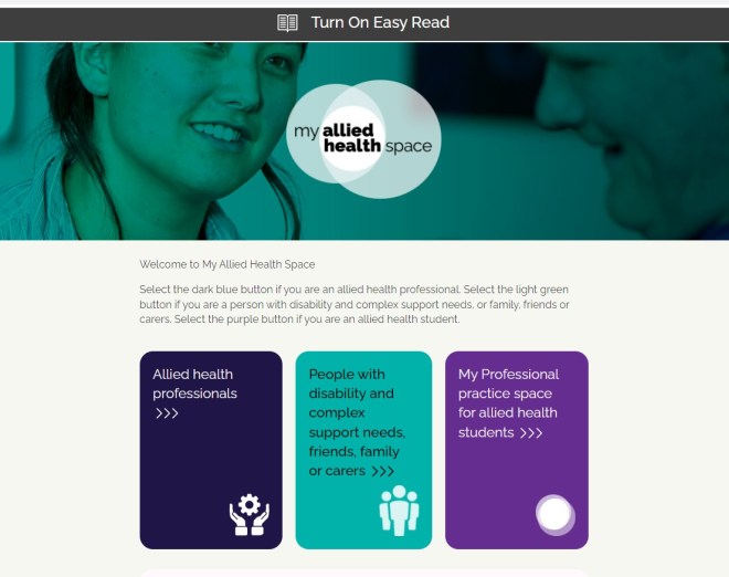
The most accessible websites are those that have an Easy Read option.  A good example is the My Allied Health Space. At the top of the home page is the symbol for Easy Read and this is where you click to turn it on.  Below is first, the standard webpage followed by the Easy Read webpage.

Screenshot of Allied Health Space standard format.

My Allied Health Space home page with option for Easy Read at the top of the page.

Screenshot my allied health space in easy read format.
My Allied Health Space with Easy Read option turned on

Thanks to Dr Em Bould, Senior Research Fellow at Monash University for the inspiration for this post. Dr Bould has great advice on this topic based on research.   

Accessible websites need accessible content

Close up view of a web page where content can be added. Accessible websites need accessible content.As our lives transition to digital formats it’s important to know some digital accessibility basics. Creating accessible websites is the first step. But accessible websites need accessible content too. If your Word or PDF documents end up on a website, will they be accessible? 

Gregg Vanderheiden from the Trace R&D Center has developed an Accessibility Masterlist which has more detail on accessible digital design. The Masterlist acts as both information and a checklist for developers and others.

The Masterlist is helpful for anyone engaging a web designer because it shows what needs to be considered.  Most web designers know about web accessibility and say they will meet the standards. However, standards are a minimum and tend to get tacked on at the end. Not the best solution – better to be integrated to avoid digital clunkiness. 

Some Quicksheets

Here are some of the 33 Trace R&D Center Quicksheets that summarise information:

What are Learning Disabilities?

Cognitive Disability

Accessible content – everyone’s business

A laptop is open on a desk and a tablet next to it. Accessible online content is everybody's business.You don’t have to be a technical expert to do simple things such as using a clear font and ensuring colour contrast. Describing images using the alt-text feature helps people with screen reader. It also adds to search engine optimisation which means Google will like you more. Captioning videos is essential because it is useful for everyone – it’s universal design. 

An easy-to-read magazine article from Canada explains more on their blog page, which is an example of clear text and plain language. The title of the article is, Experts calling on businesses to make their online content more accessible.

Web design is one part, uploaded documents also need to be accessible.Check out the WCAG for people who haven’t read them

A related resource is the Handbook for accessible graphic design. .